Clarks Global | Ecommerce
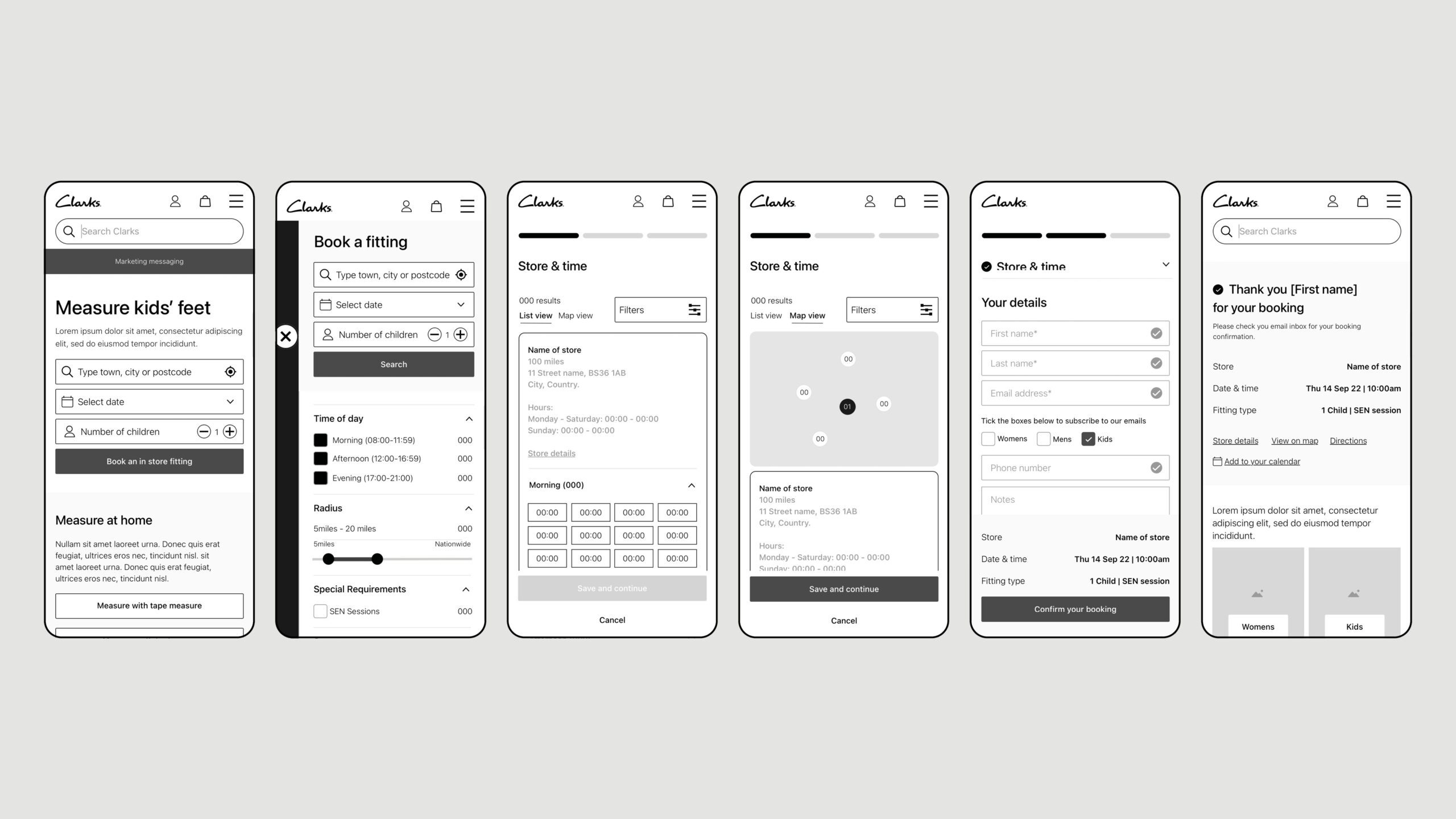
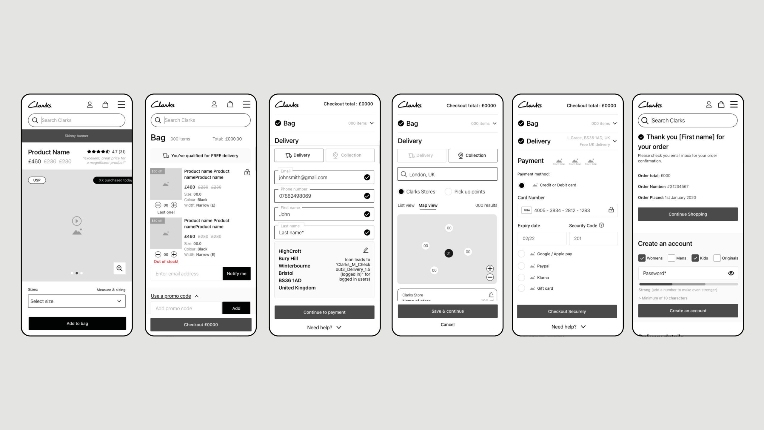
I led the design for Clarks, enhancing user experiences by refining the fitting booking and checkout processes. We created 200+ components for a consistent, accessible e-commerce platform.
Clarks Global | Ecommerce

UX, UI, Visual Design, Design System & Motion Design
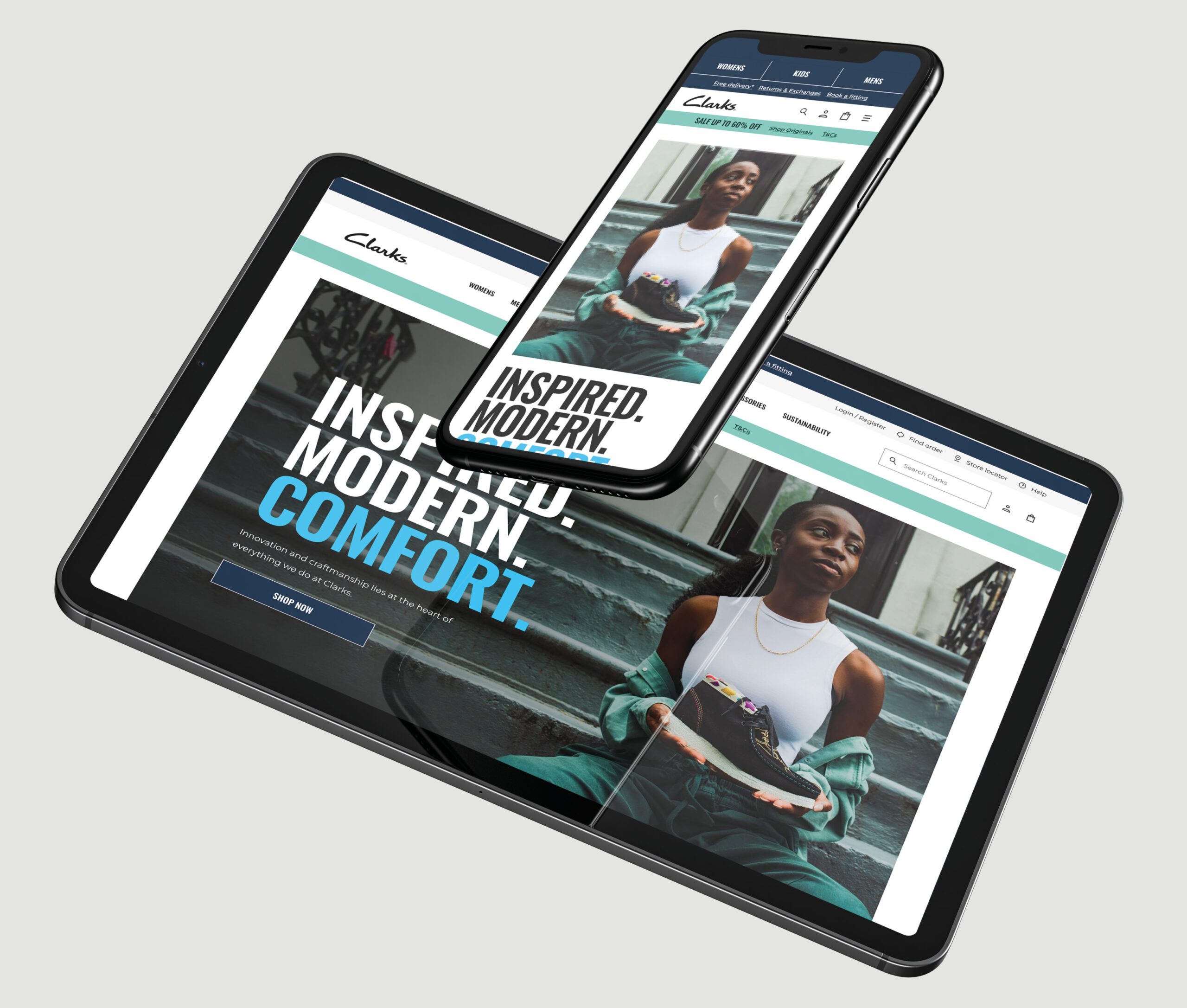
The Clarks Global eCommerce project was an ambitious initiative aimed at transforming the user experience across Clarks’ digital storefronts worldwide. With a strong focus on accessibility, the project ensured that all users, regardless of their abilities, could engage with Clarks’ digital platform seamlessly. This focus on accessibility, coupled with robust UX and UI strategies, helped to create an inclusive, user-centered online experience, which ultimately led to Clarks winning the MACH Impact Award for Best Retail Project and Best Overall Change.
🚩 The Problem
The primary challenge for the Clarks project was to revitalize their digital experience on a global scale, delivering a cohesive and engaging eCommerce platform while adhering to high standards of accessibility. The project demanded a detailed approach to accessibility compliance, ensuring that users with diverse needs could navigate and interact with the platform effortlessly. Additionally, the site needed to support varying international customer expectations while maintaining brand consistency and supporting Clarks’ expanding product range.
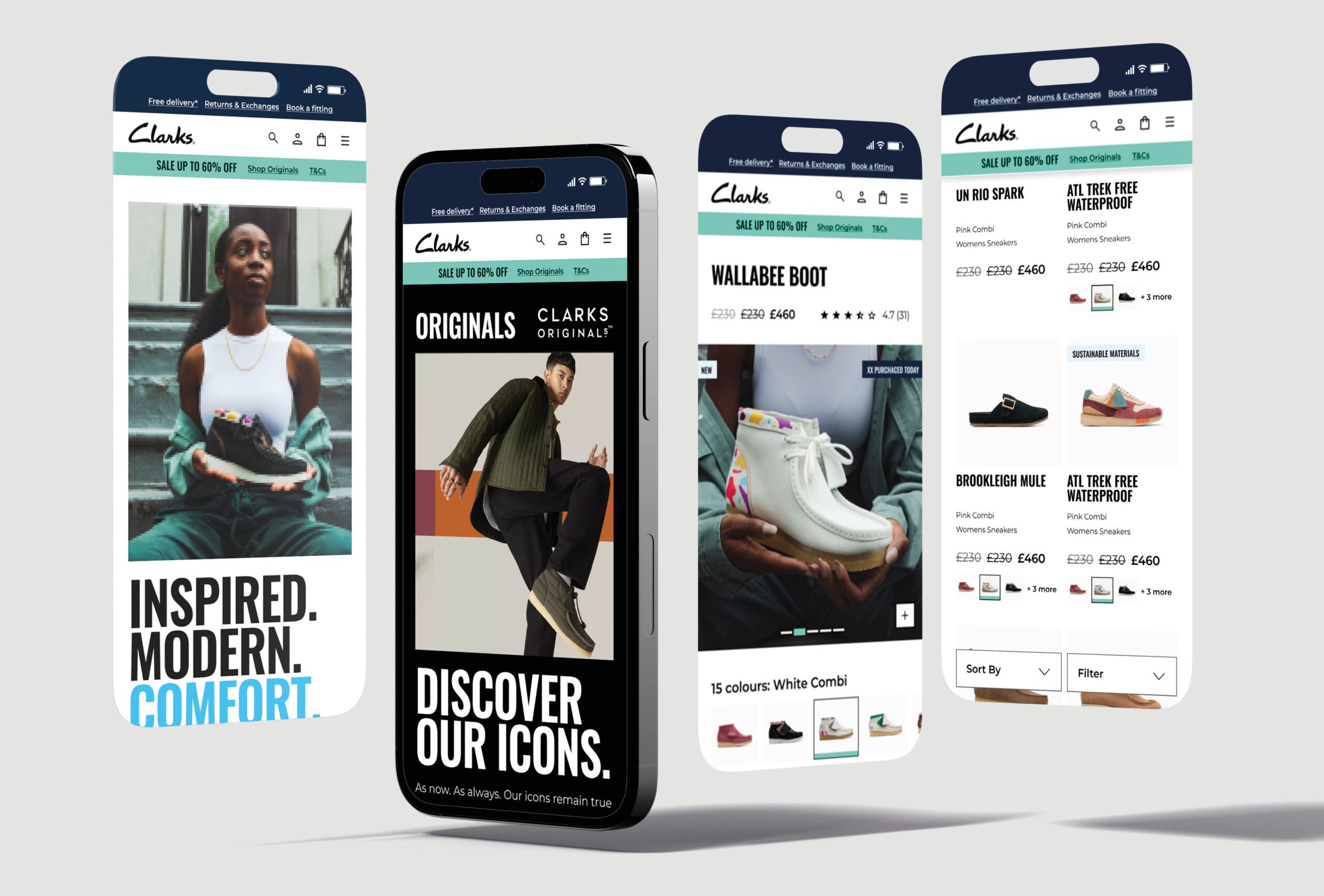
Summary
🎯 The Objective
The goal was to create a globally unified platform that would provide Clarks’ customers with a seamless, high-quality shopping experience, whether they were browsing on mobile, tablet, or desktop. Key objectives included making the platform accessible, improving overall usability, and establishing a scalable system that could support future growth and adaptability. Accessibility was crucial for Clarks to ensure inclusivity, and the UI design was crafted with WCAG compliance in mind to support visually and motor-impaired users with features such as keyboard navigability, optimised contrast ratios, and intuitive interactions.
👤 Involvement
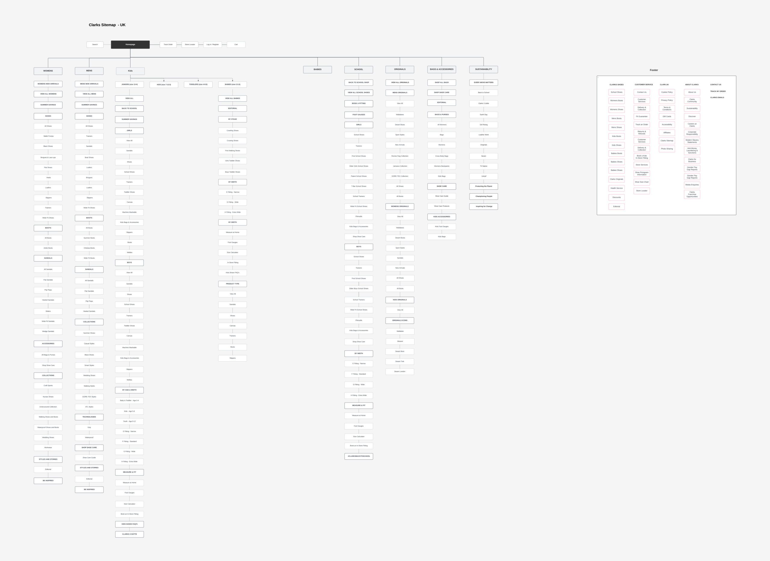
As the lead designer, I oversaw the design strategy, with an emphasis on creating a highly accessible and responsive interface. My role included defining UX flows and visual hierarchies that simplified navigation, enhancing accessibility by incorporating WCAG-compliant colours, typography, and interactive elements. I also led the team in developing a dynamic design system that not only streamlined Clarks’ digital presence across regions but also facilitated easy updates and expansion.
Working alongside Like Digital, I conducted thorough user testing sessions to validate the platform’s accessibility and usability for diverse user groups. Additionally, I collaborated with developers to ensure that the accessibility features were implemented correctly, creating a platform that was not only visually appealing but also met high standards of inclusivity and adaptability.
Conclusion
🚀 Results
The redesigned Clarks eCommerce platform was widely praised for its improved user experience and accessibility, demonstrating measurable enhancements in user engagement and retention across various regions. The project’s success in inclusivity and innovative user-centered design earned it the prestigious MACH Impact Award for Best Retail Project and Best Overall Change. These accolades underscore the platform’s impact on the retail industry and set a new standard for accessible, scalable digital retail solutions.
🏁 Conclusion
The Clarks Global eCommerce project represents a significant advancement in accessible design within the retail industry, demonstrating that digital innovation can go hand-in-hand with inclusivity. By creating a robust, user-friendly, and adaptable platform, the project not only met Clarks’ immediate goals but also set a foundation for ongoing digital success, ensuring a high-quality, accessible experience for every customer.
Contact

