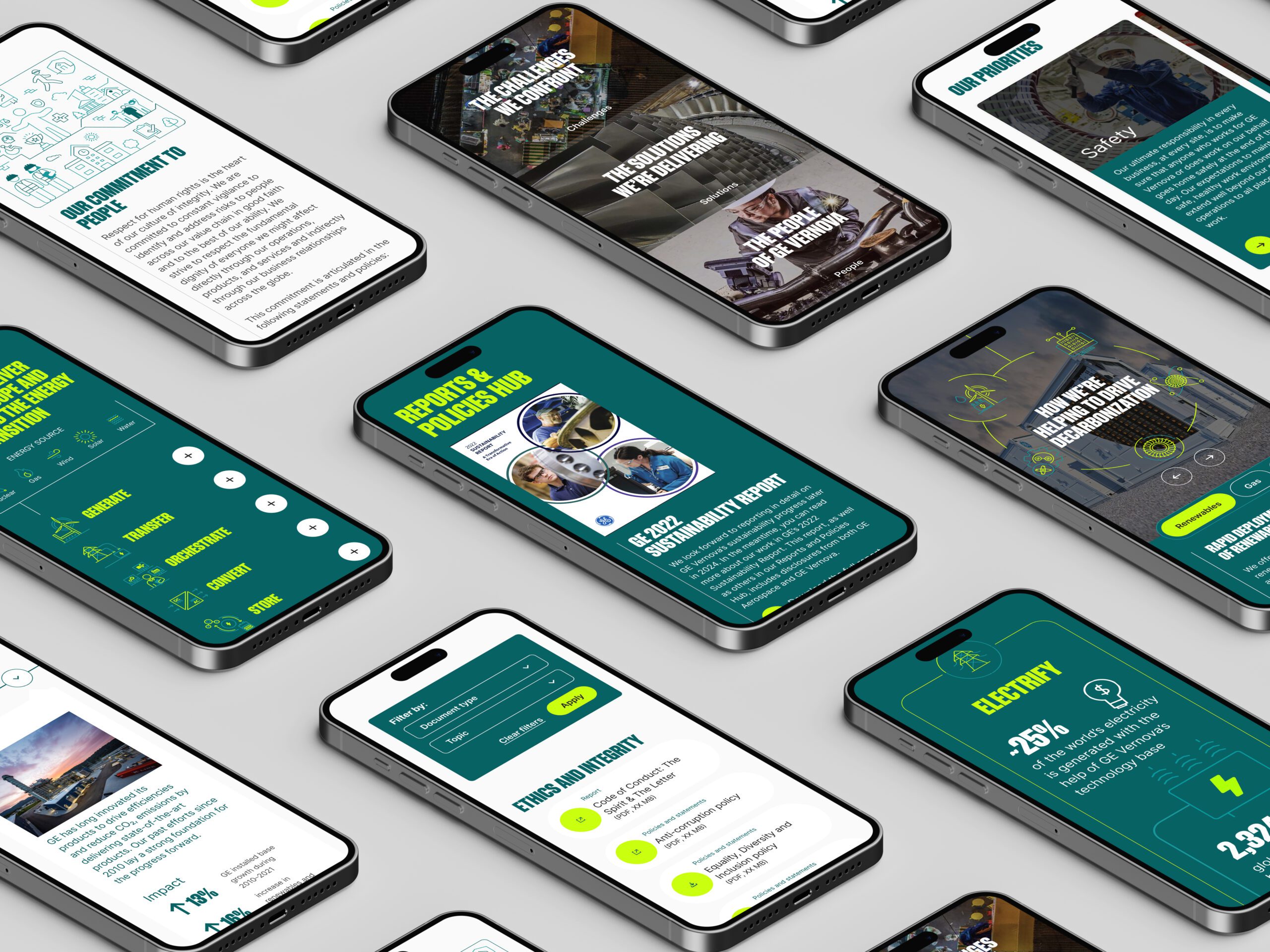
GE Vernova | Sustainability Website
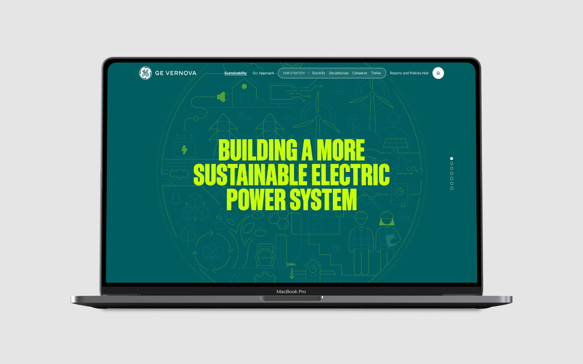
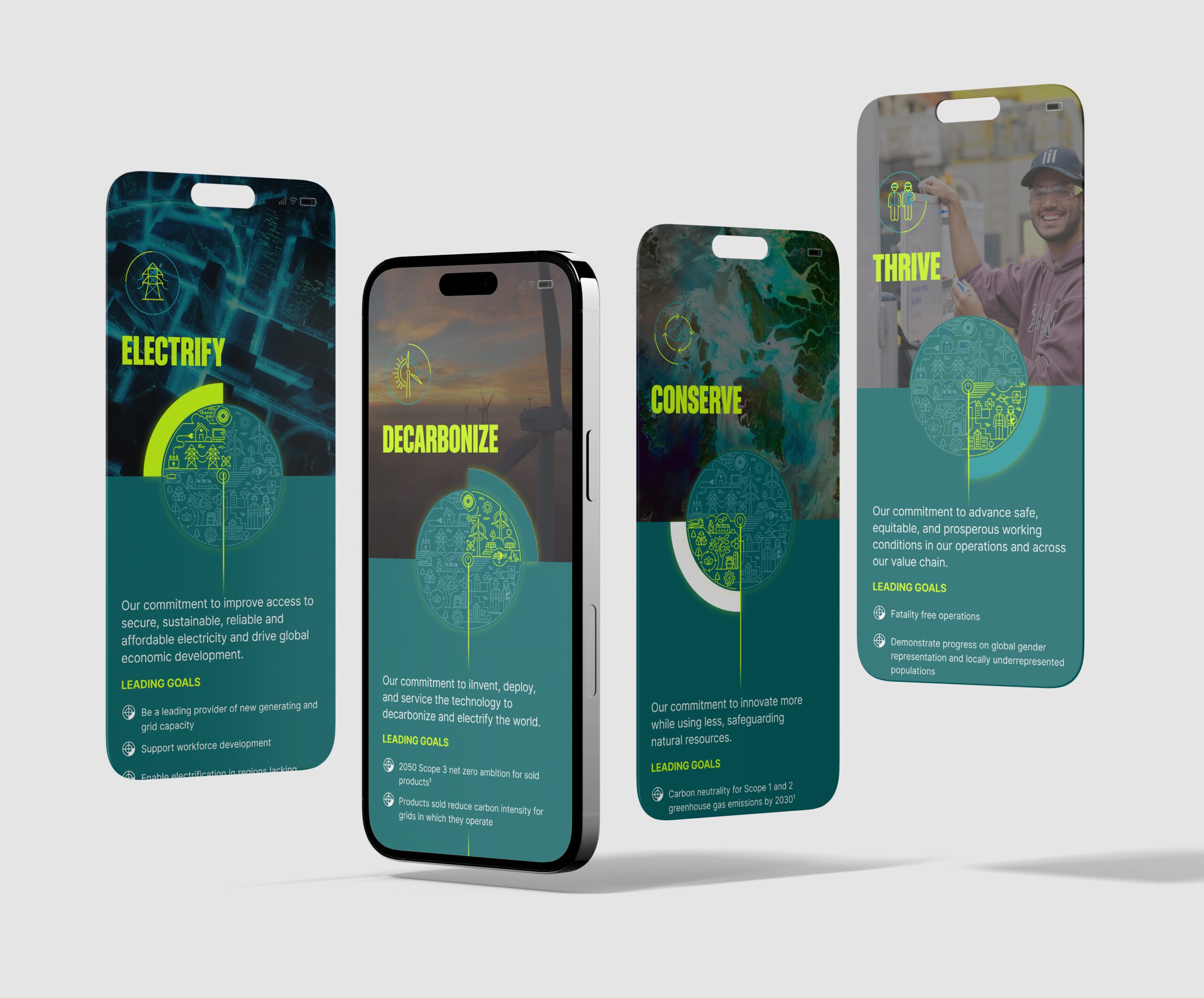
Leading the design for GEV’s sustainability site, running workshops to shape content architecture. Built an interactive, scalable experience with animations, linking key data to deeper report insights.
GE Vernova | Sustainability Website

UX, UI, Design System & Motion Design
GEV’s sustainability website aimed to effectively communicate their leadership in decarbonization and electrification to investors and stakeholders. The challenge was to transform complex report data into an engaging, easy-to-navigate website that retained the authority of their traditional PDF report.
🚩 The Problem
GEV’s annual report contains extensive data essential for investors but challenging to present online in a digestible way. They needed a platform that could balance quick access to key insights with the option to dive into the full report as desired.
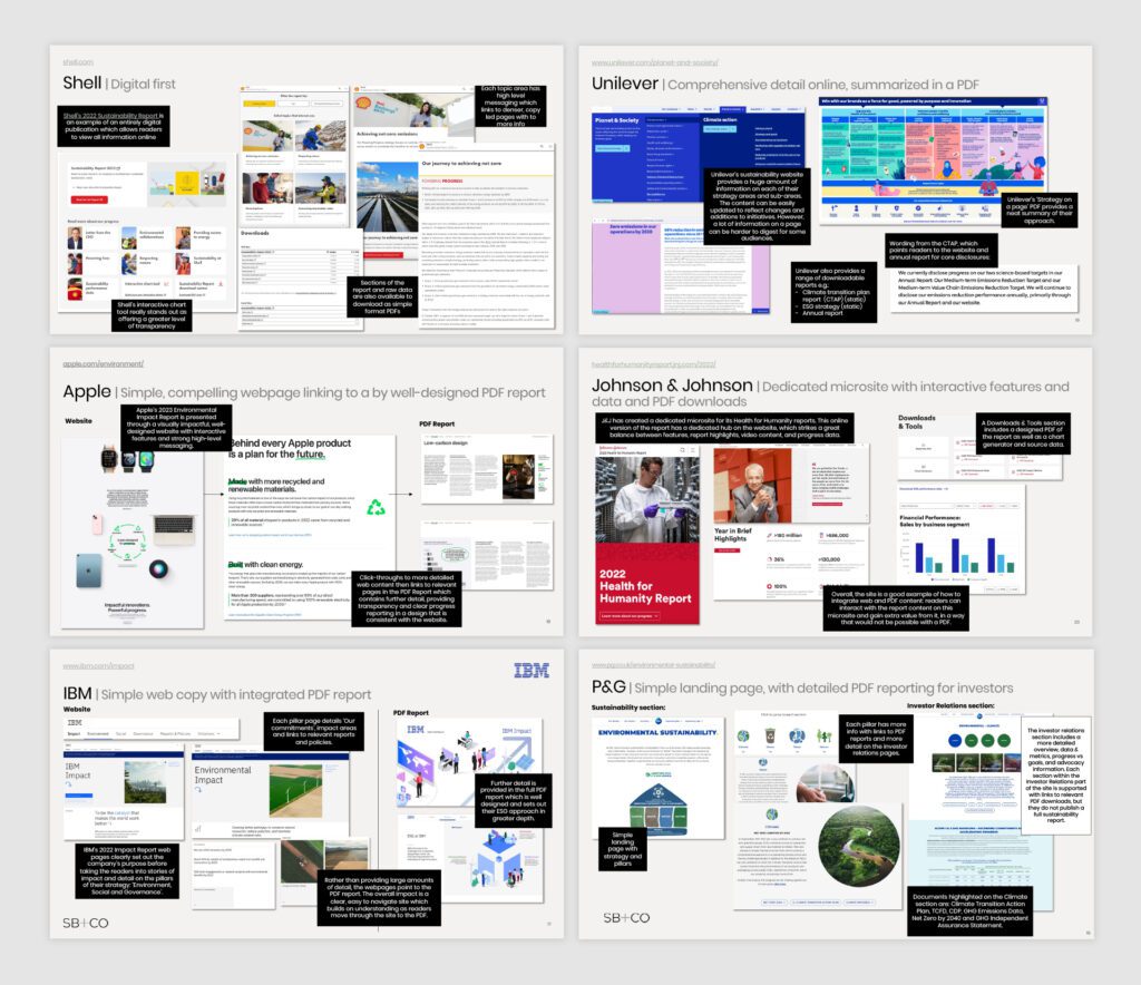
Summary
🎯 The Objective
To create a hybrid report website that features a blend of visual storytelling, animations, and deeper report links. The goal was to highlight critical points in an engaging way while giving stakeholders quick access to detailed information if needed.
👤 Involvement
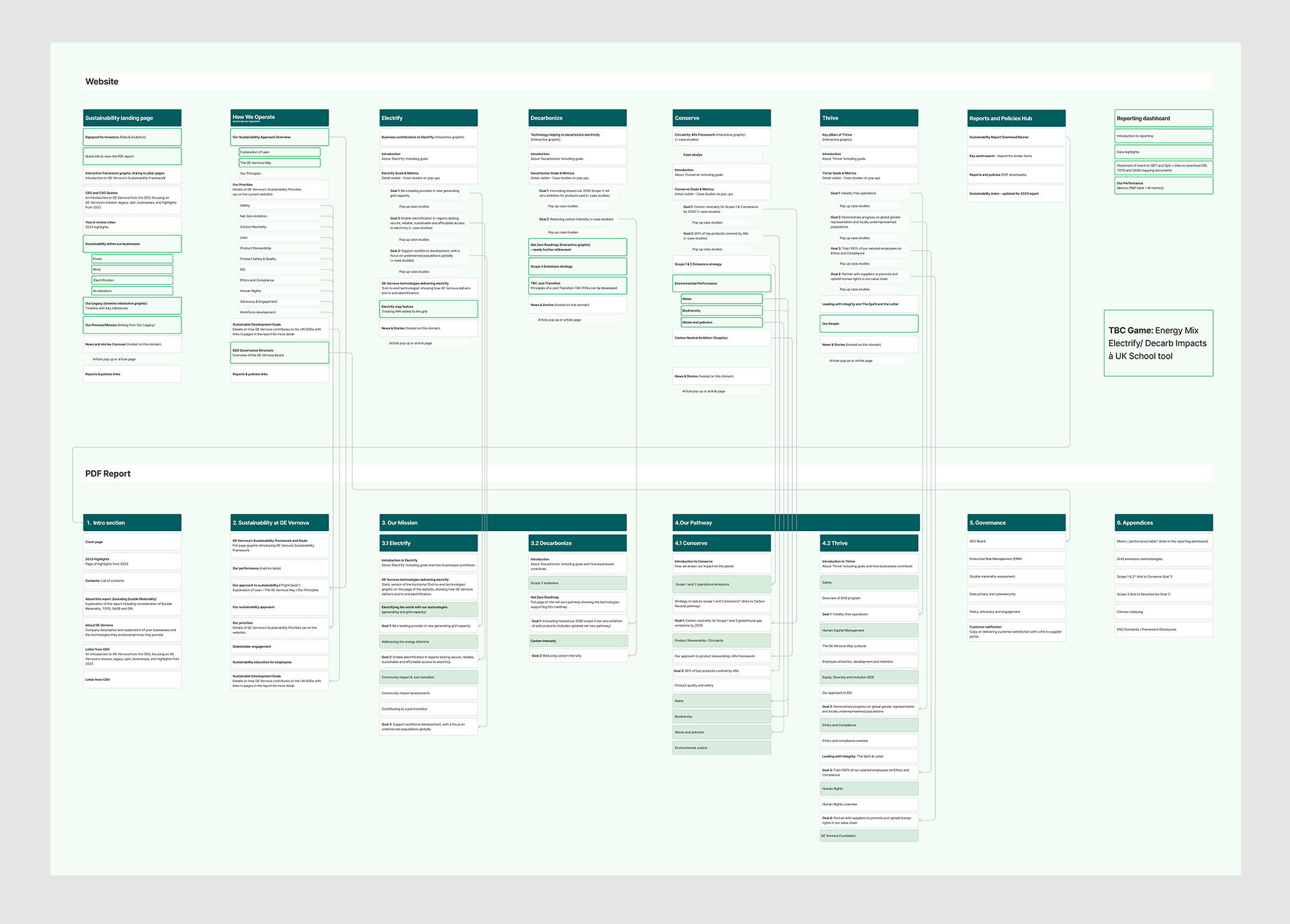
As the lead designer, I took charge from the initial scope through to launch. I organized a workshop with GEV’s stakeholders to align on objectives and gather insights, which helped shape the site’s content architecture and flow. This workshop provided the foundation for structuring the information architecture, focusing on clarity and accessibility for all users.
My role spanned wireframing, UI design, and developing all animations, including Lottie files and complex interactions, using Framer for prototyping. The design system I created detailed component documentation, ensuring that the design’s functionality and interactions were thoroughly mapped out for developers.
Conclusion
🚀 Results
The result is a sophisticated, animation-rich site that engages stakeholders while conveying GEV’s sustainability efforts. The hybrid report approach allows users to access core insights quickly, with the option to dig deeper as needed.
🏁 Conclusion
This project elevated GEV’s digital presence, transforming dense report data into a user-friendly experience. The design system, combined with the content architecture from our workshop, provides a solid foundation for future updates, ensuring consistent, impactful engagement.
Contact
