Noble Panacea | Ecommerce
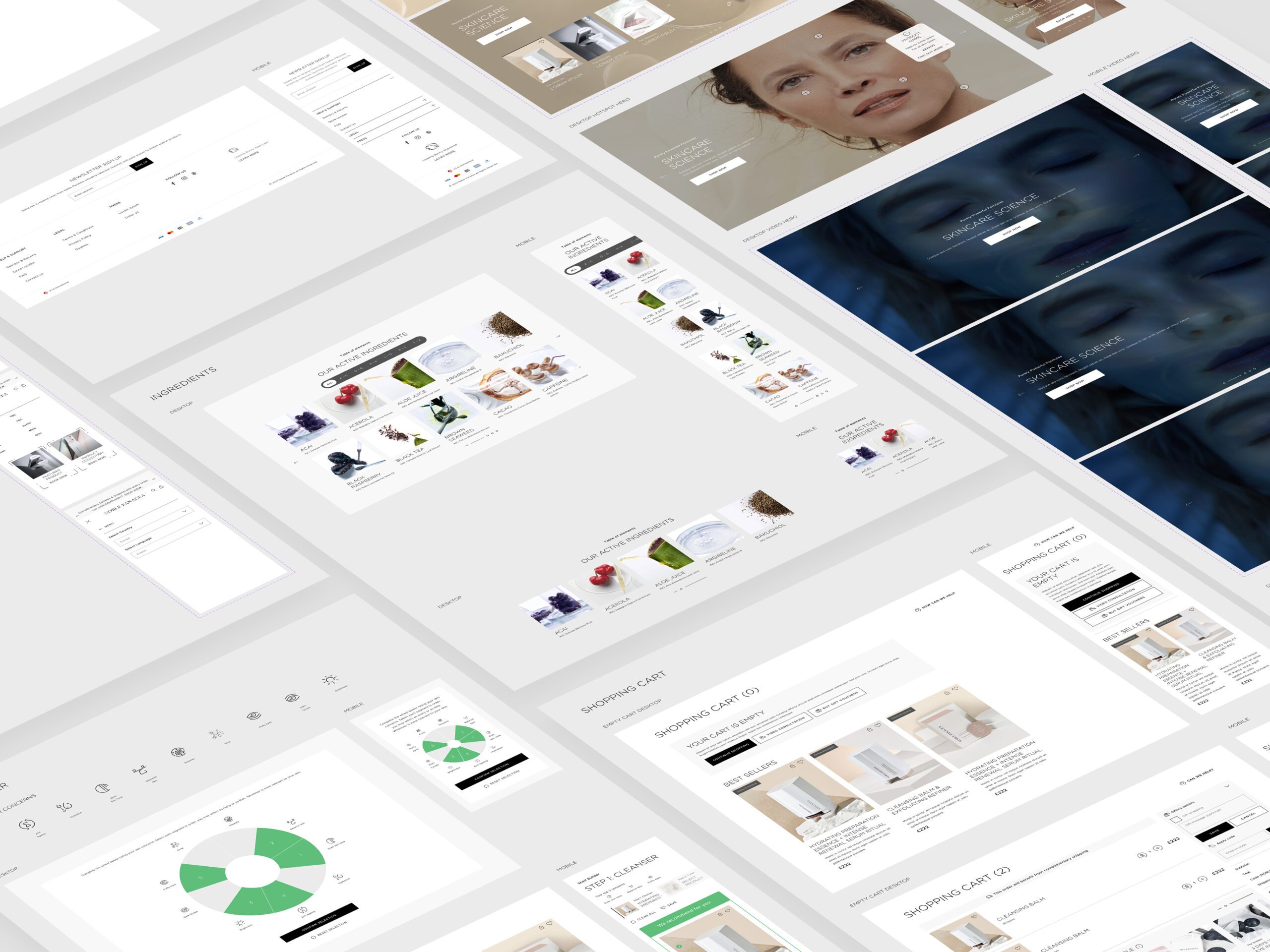
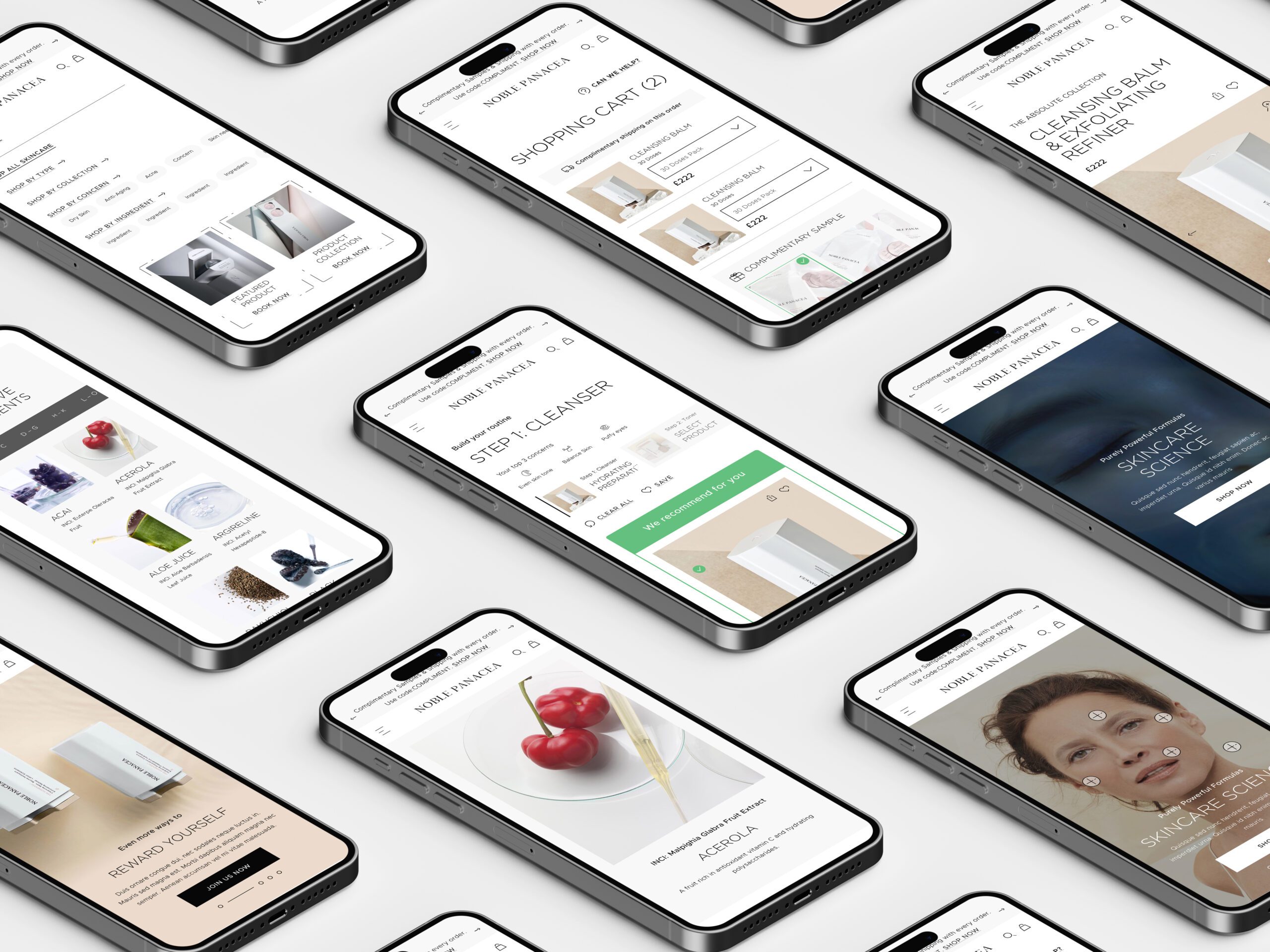
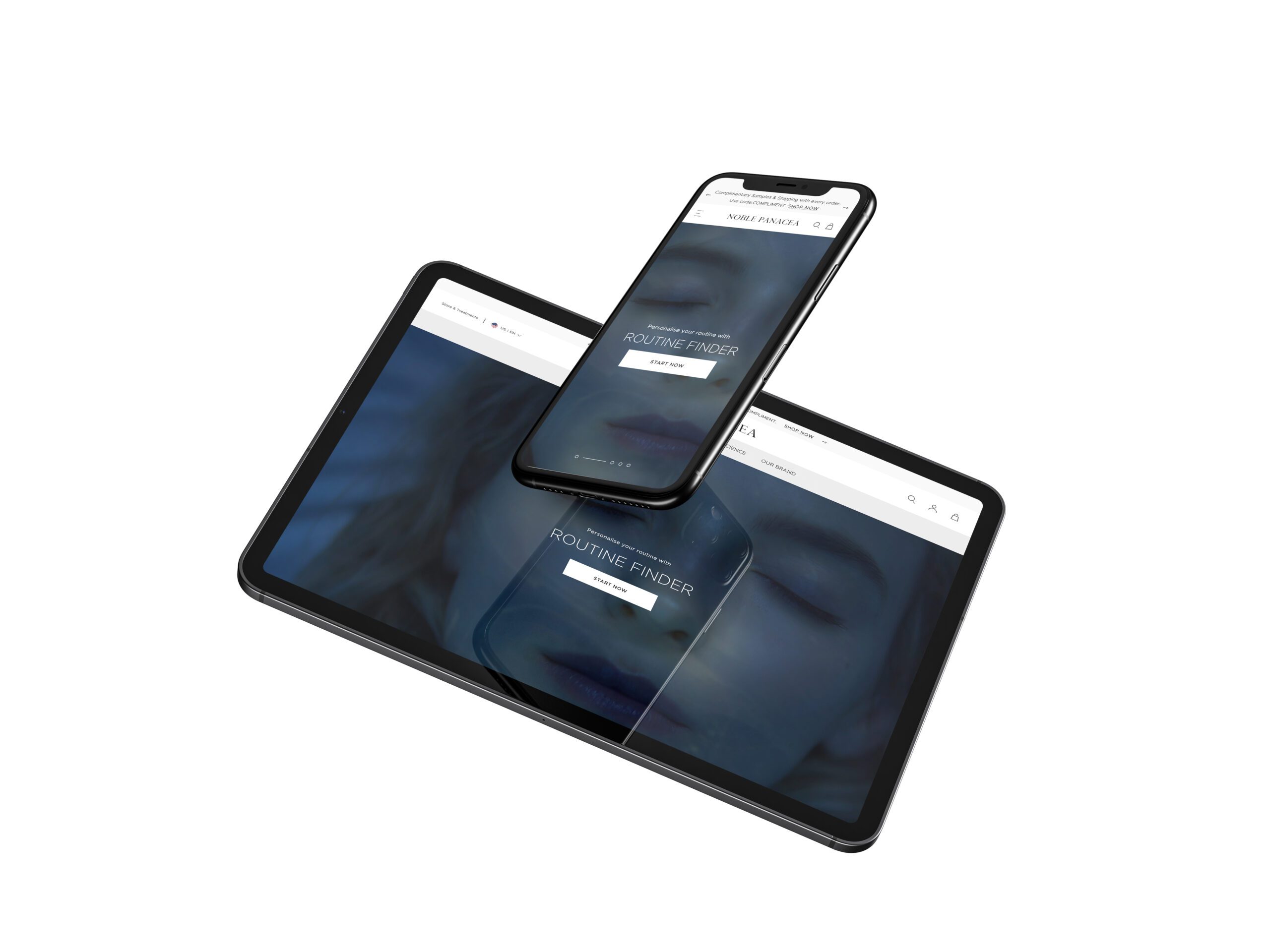
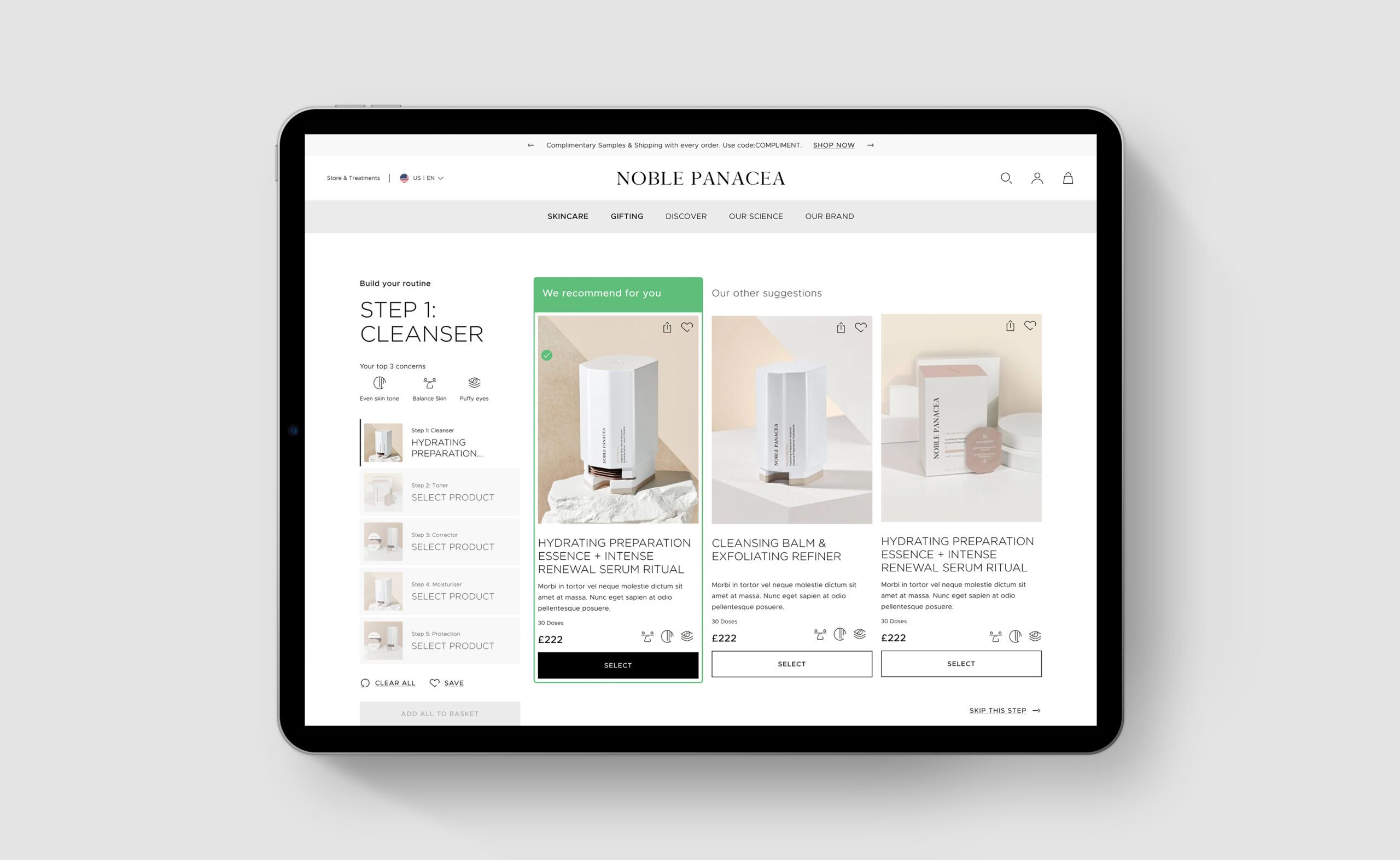
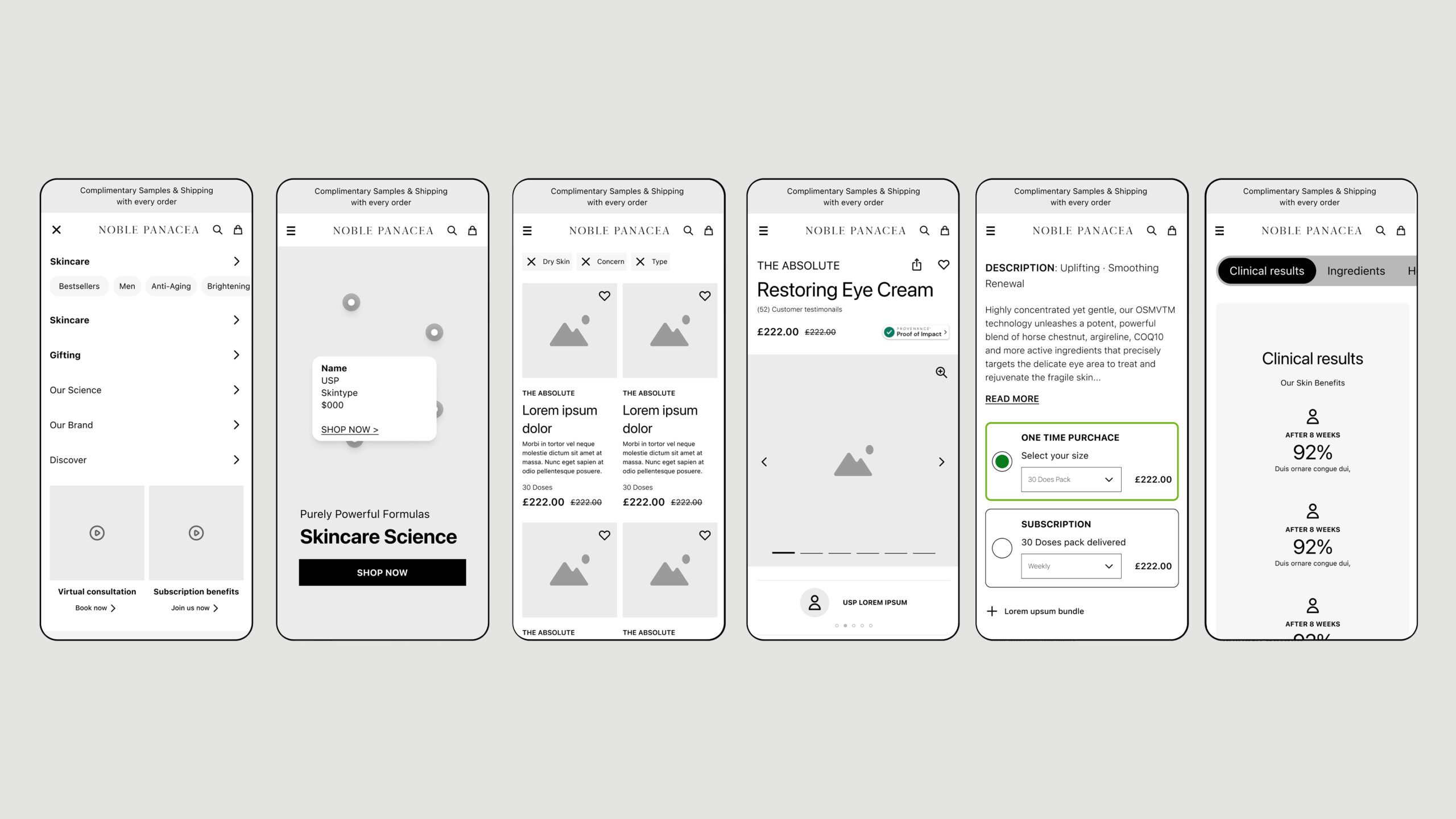
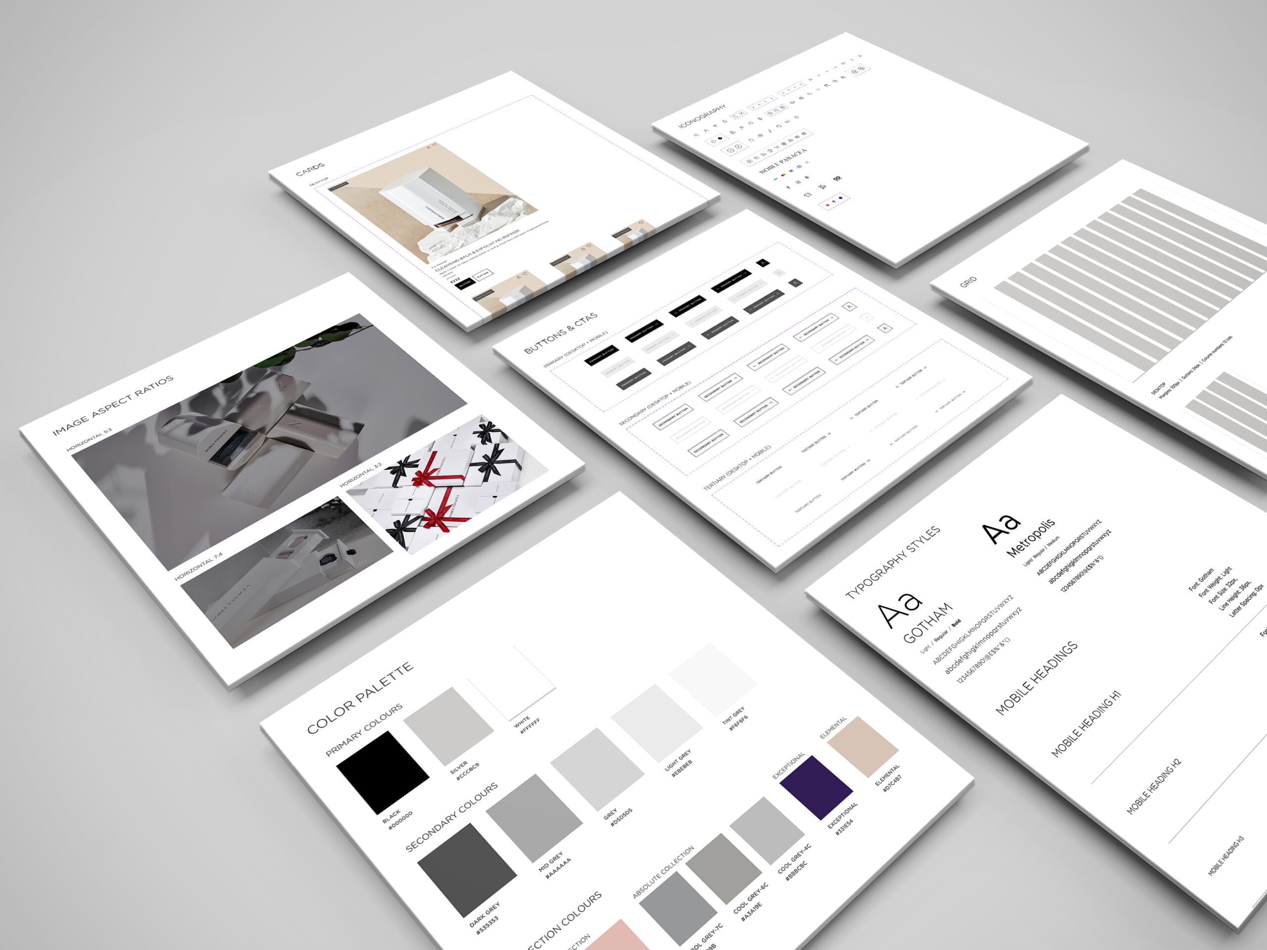
I led the redesign of NP, a luxury skincare brand’s website, focusing on elegant minimalism, user-friendly components, and a comprehensive design system to enhance the personalised shopping experience.
Noble Panacea | Ecommerce

UX, UI, Design System & Motion Design
Clarks, a global e-commerce company and retailer specializing in shoe manufacturing since 1825, engaged me to work alongside another designer at Like Digital. Our mission was to develop UX strategies and UI solutions focusing on key user journeys defined by the business.
🚩 The Problem
One of Clarks’ unique selling propositions (USPs) is the fitting booking process, but the existing user journey presented challenges. Additionally, a critical concern was the high drop-off rate during the checkout process, which needed to be addressed to enhance the website’s overall success.
Summary
🎯 The Objective
Our objective was to refine and simplify key user journeys, particularly the fitting booking and checkout processes. We aimed to streamline decisions for users and improve their overall experience on the website.
👤 Involvement
As the lead UI designer for this project, I could build a team to collaborate with me to deliver an effective user interface. Working with tight deadlines, I emphasised the importance of an efficient workflow. For the fitting booking journey, we simplified the process by allowing users to quickly select a store and view available time slots without advancing to the next step prematurely. For the checkout journey, we reduced the process to three key decisions: Bag, Delivery, and Payment, creating a single-page checkout that facilitated a smooth transition from start to finish.
The UI design drew inspiration from the Nike website, featuring a predominantly white colour scheme accented with vibrant colours for key call-to-action buttons. Accessibility was a priority, and we worked closely with an accessibility agency to ensure our designs were inclusive and effective.
Conclusion
🚀 Results
We developed over 200 components, each with various adaptations and functionalities, ensuring versatility while maintaining consistency across different regions. Each component was meticulously annotated to facilitate a seamless transition to development, including detailed animation requirements.
🏁 Conclusion
Through a collaborative and user-centered design approach, we successfully enhanced Clarks’ key user journeys, ultimately contributing to improved user experience and engagement on their e-commerce platform.
Contact
