SIRO Hotel | App
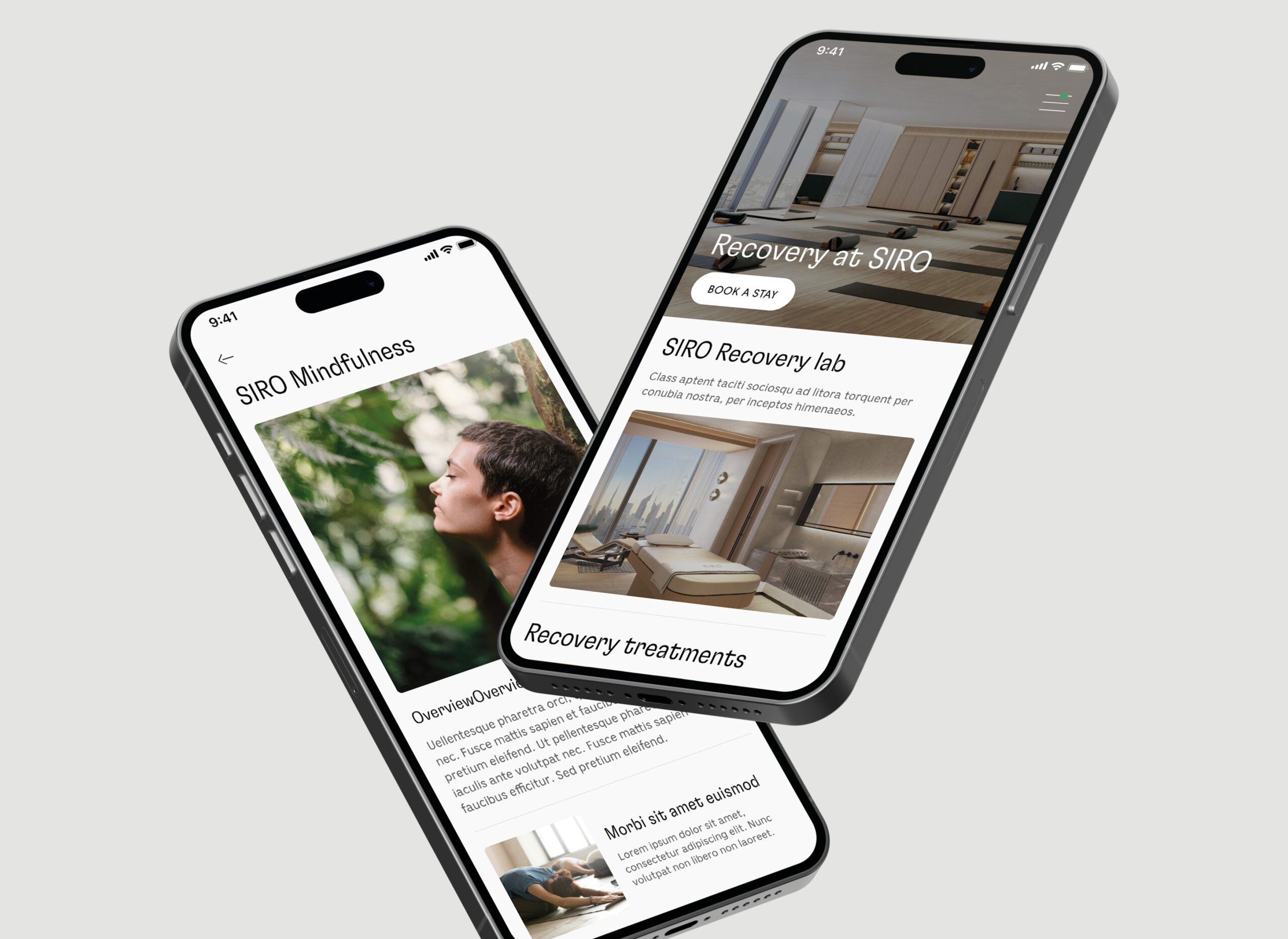
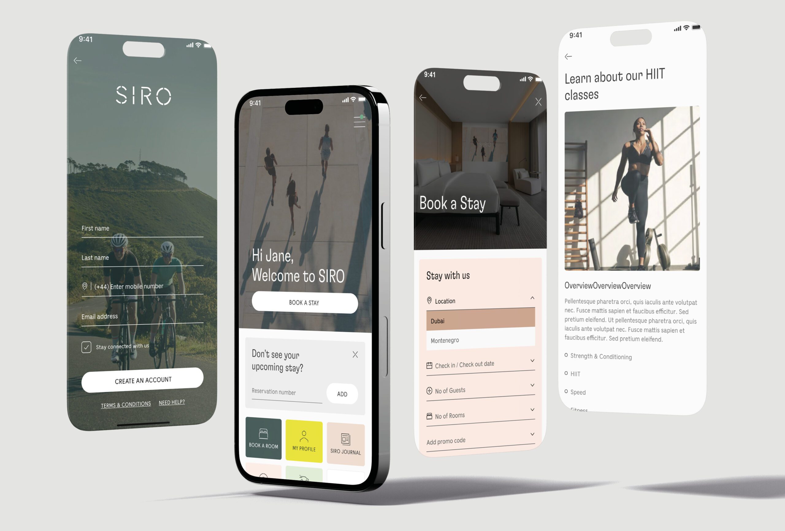
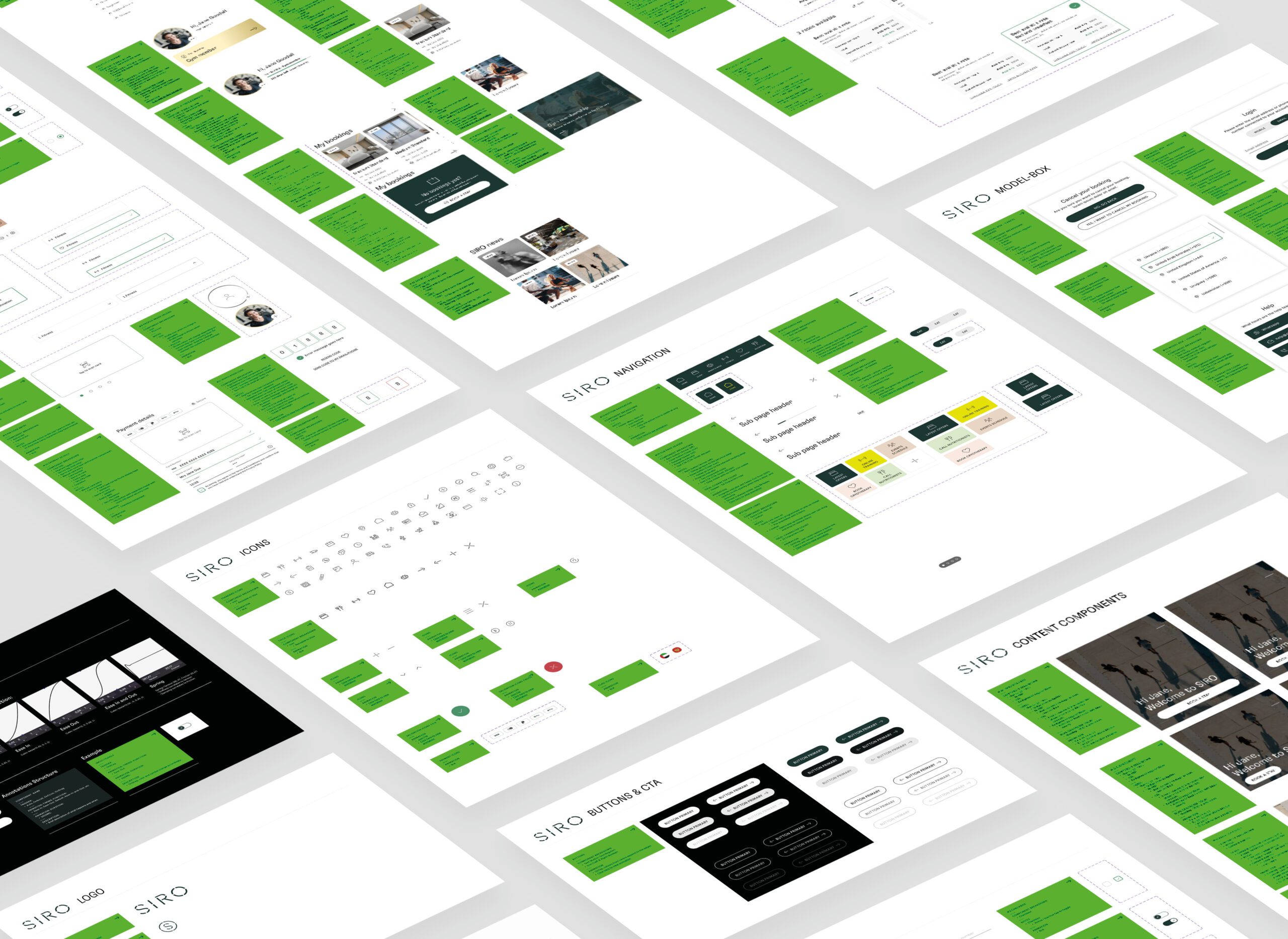
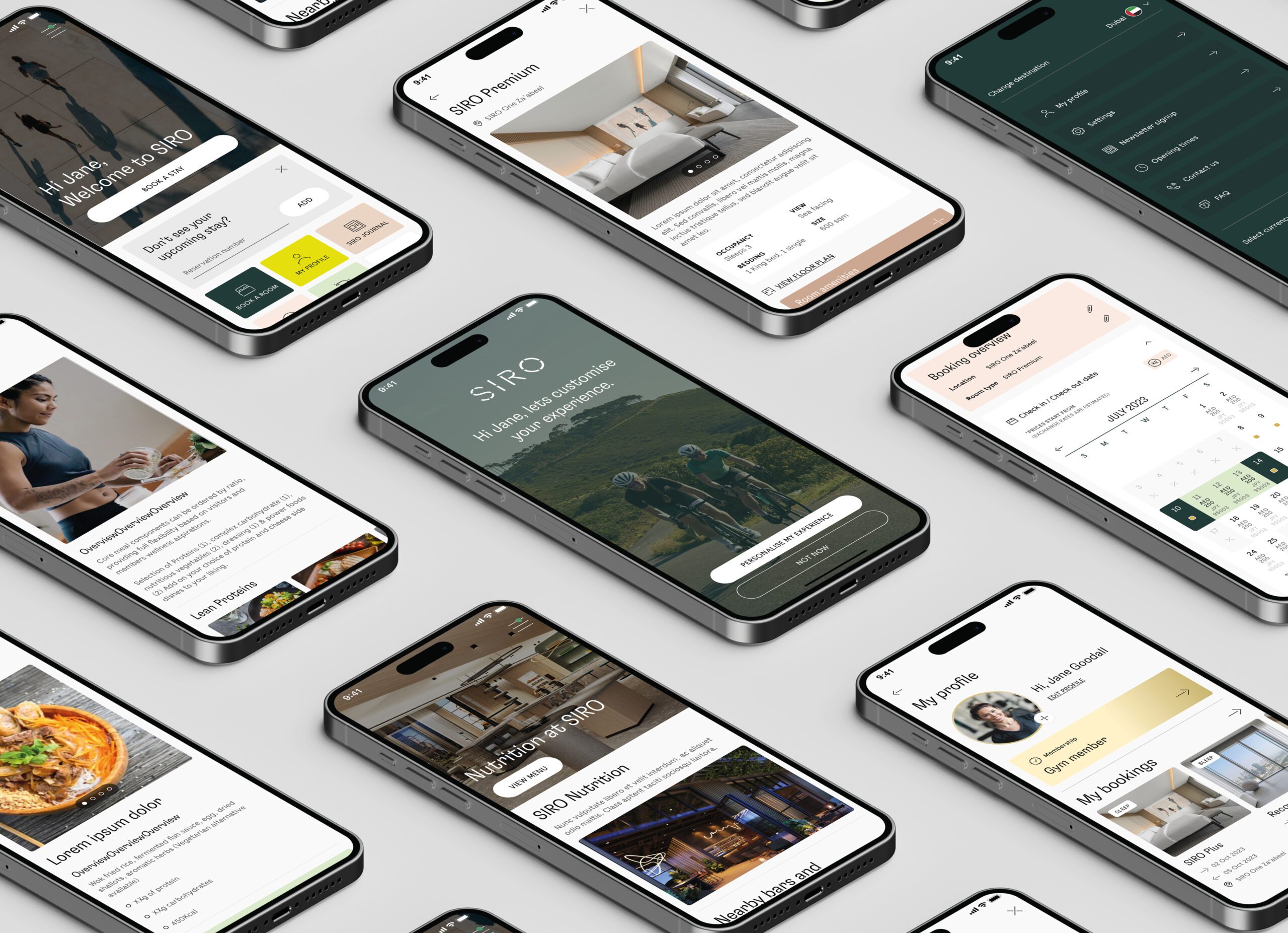
I led the SIRO project, creating UX strategies and UI solutions for a fitness and recovery app. We focused on intuitive design, booking functionality, and a comprehensive design system for brand alignment.
SIRO Hotel | App

UX, User flows, User mapping, IA, UI, Design System & Motion Design
SIRO is a luxury hotel brand aiming to provide a seamless, elevated experience for its guests. The hotel sought to create an app that would allow guests to access a range of services, including room service, concierge recommendations, and hotel amenities, all through a simple, intuitive interface. The app needed to reflect the brand’s high-end image while being highly functional and easy to use.
🚩 The Problem
The main challenge was creating an app that combined luxury with usability. While SIRO’s brand identity needed to come through in every aspect of the design, the app had to be user-friendly for all guests, including those who might not be familiar with technology. It also needed to integrate smoothly with hotel systems to provide a seamless experience, from check-in to in-room service requests.
Summary
🎯 The Objective
The goal was to design an elegant, intuitive mobile app that aligned with SIRO’s brand while enhancing the guest experience. The app needed to be both functional and luxurious, allowing guests to interact with hotel services with ease while reinforcing the brand’s high-end positioning. I aimed to create a product that simplified the hotel experience for guests while maintaining SIRO’s exclusive feel.
👤 Involvement
As the Lead Product Designer, I was responsible for overseeing the entire design process, from user research through to the final visual design. My primary focus was ensuring that the app not only reflected SIRO’s high-end brand but also provided an intuitive and seamless user experience. I worked closely with stakeholders, including hotel management and marketing teams, to ensure the app met the brand’s objectives and operational needs.
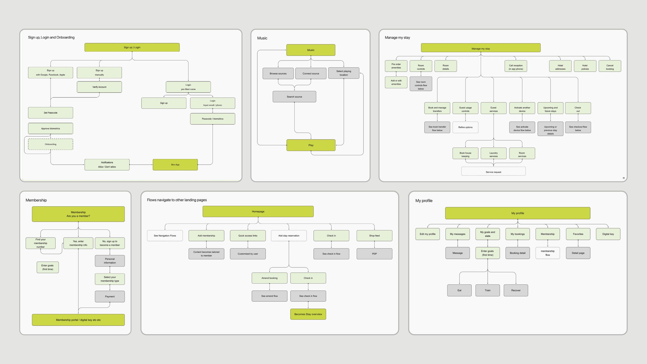
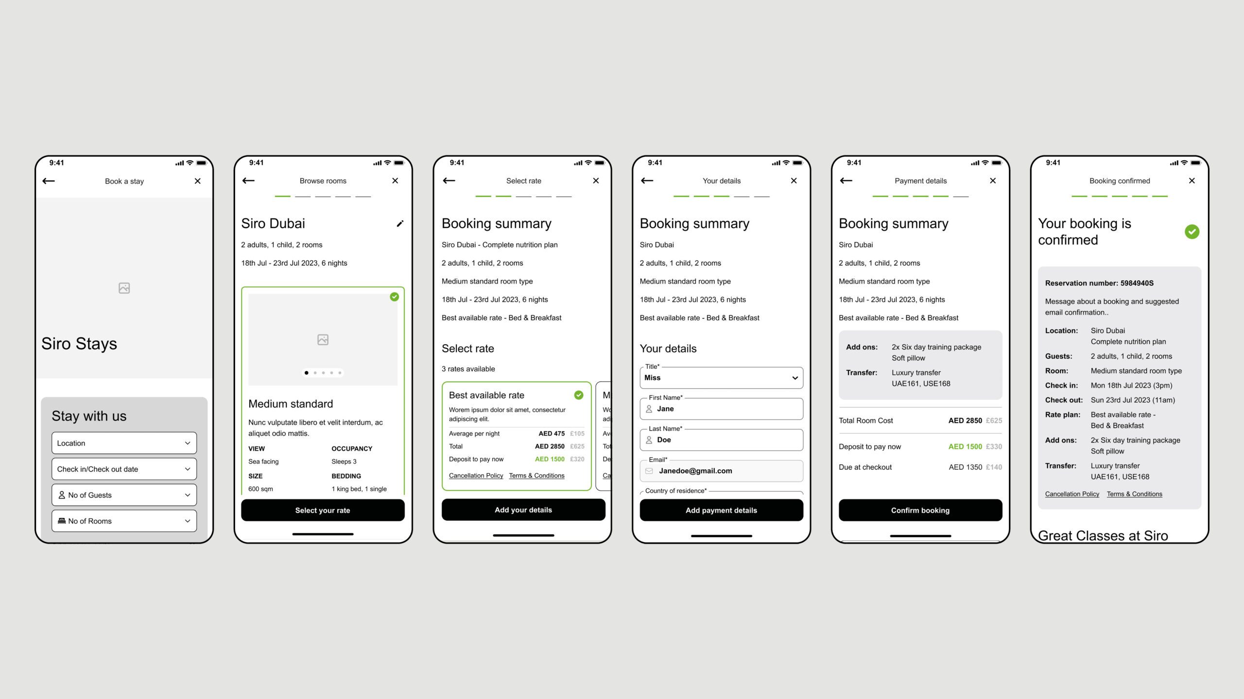
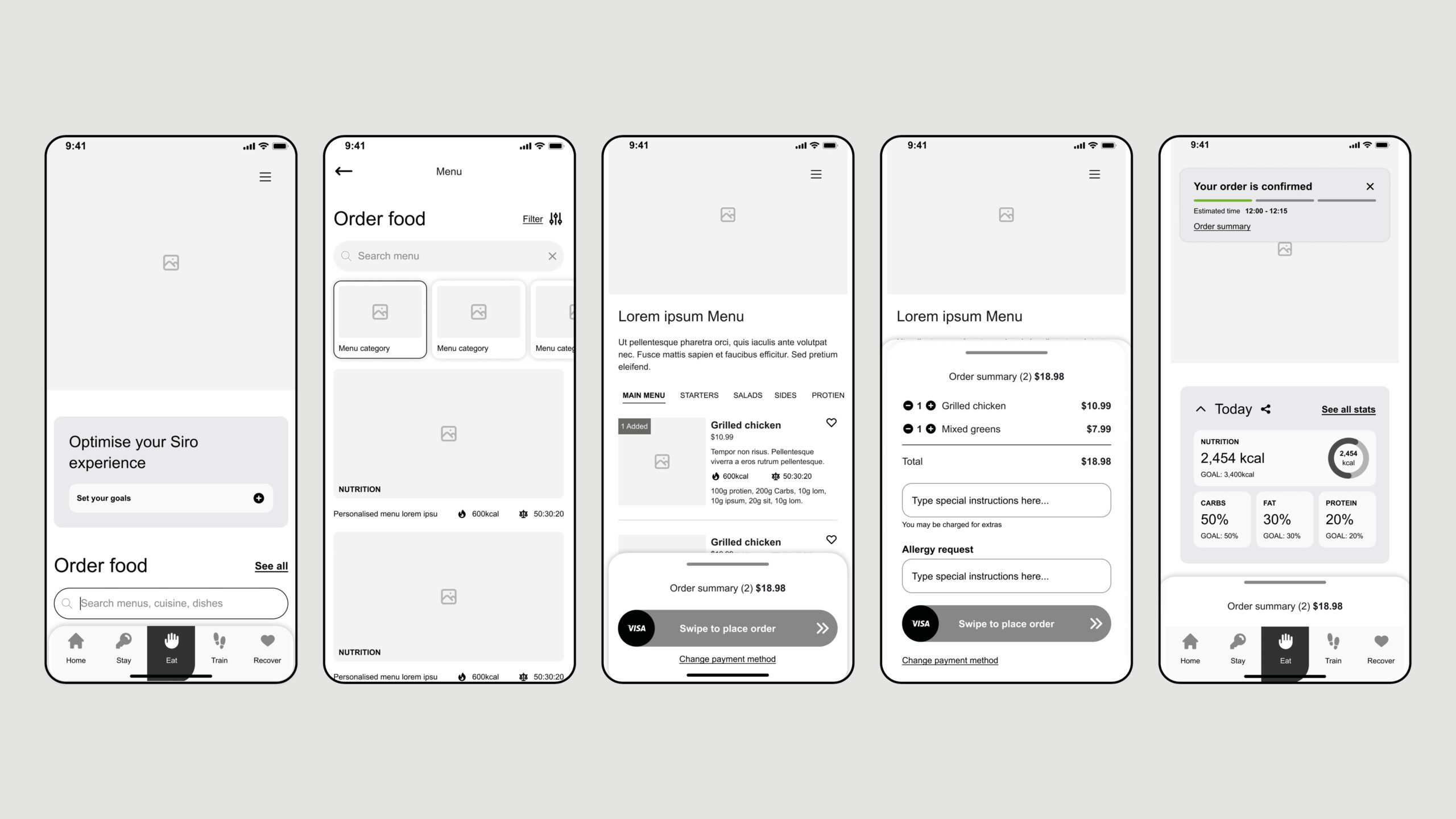
I led the user research phase, conducting interviews and usability tests with potential guests to better understand their needs and pain points. This research was crucial in shaping the app’s features, ensuring they were not only functional but also aligned with the guests’ expectations. Based on the feedback gathered, I refined the user interface and user flows, iterating on the design to create a more intuitive and efficient experience.
In addition to working closely with stakeholders, I also collaborated with the development team to ensure the design was technically feasible and aligned with the hotel’s internal systems. This partnership was essential in delivering a product that was both visually appealing and highly functional, enabling the smooth integration of various hotel services such as room service and concierge requests.
Conclusion
🚀 Results
The app was successfully launched, receiving positive feedback from both users and stakeholders. Guests found the app easy to use, with high levels of engagement, and appreciated its sleek, minimalistic design that reflected SIRO’s luxurious brand. It streamlined guest interactions with the hotel, making services like room service and concierge requests more accessible and efficient. The app helped reinforce the brand’s commitment to offering a modern, exclusive experience for its guests.
🏁 Conclusion
Working on the SIRO hotel app was an incredibly rewarding experience. It reinforced the importance of aligning design with brand identity while keeping user needs at the forefront. Through stakeholder collaboration, user testing, and a focus on high-end aesthetics, I was able to create an app that was not only functional but also reinforced the luxury experience that SIRO promises to its guests. This project deepened my skills in creating intuitive, brand-aligned products and demonstrated the value of user-centered design in a high-end hospitality setting.
Contact
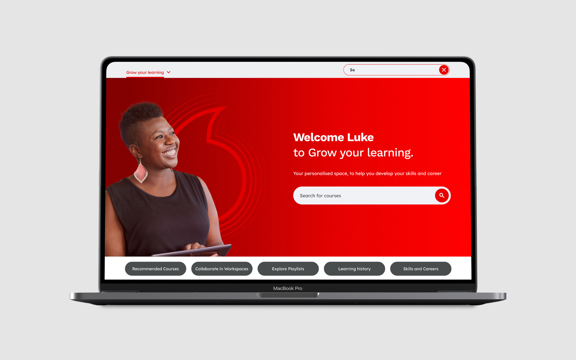
Vodafone | E-Learning platform

UX, User flows, User mapping, IA, UI
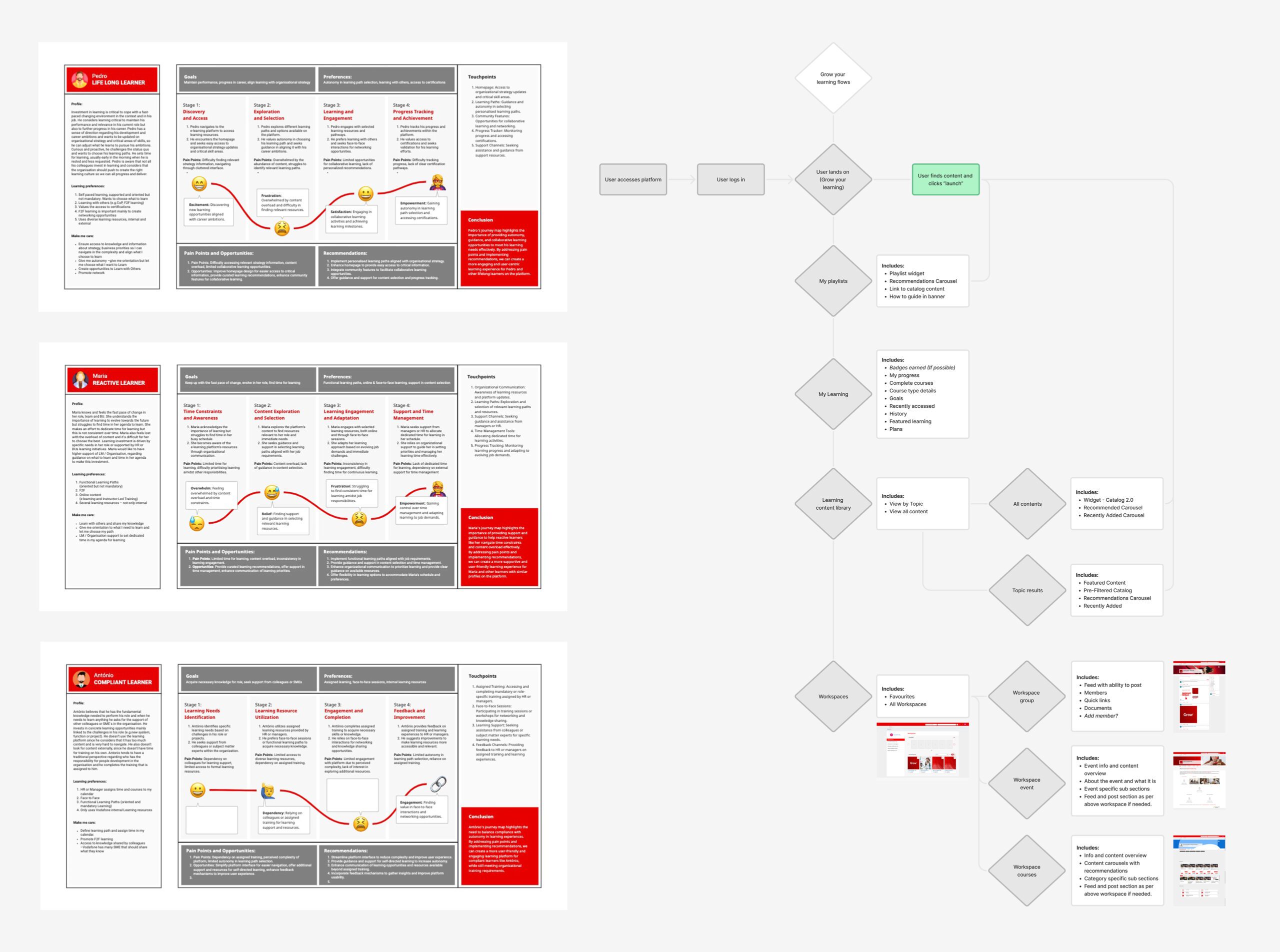
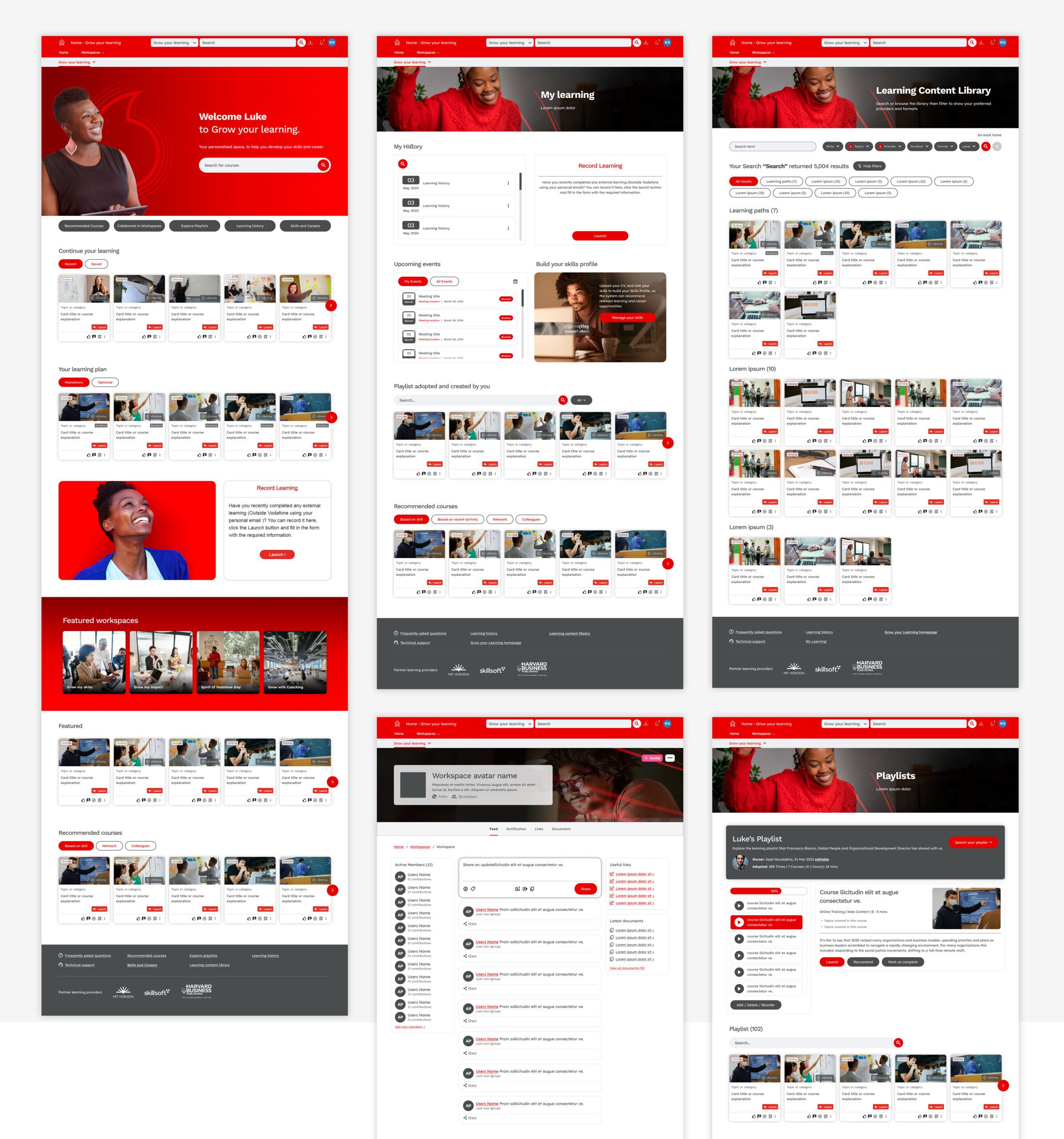
The project aimed to address significant usability issues on the corporate learning platform, which served users with varying learning approaches and needs. Feedback showed that users faced difficulties with navigation, identifying mandatory training, and finding relevant, personalised content. By refining these areas, we sought to enhance both ease of use and motivation, ultimately fostering a more supportive learning environment.
🚩 The Problem
The existing platform presented several usability challenges, including confusing navigation, unclear indicators for mandatory training, and a lack of personalization in the learning experience. Many users struggled to find content suited to their learning goals, with proactive learners feeling limited by generic recommendations, while less-engaged users missed clear guidance. Additionally, the interface lacked gamification elements, which could enhance motivation.
Summary
🎯 The Objective
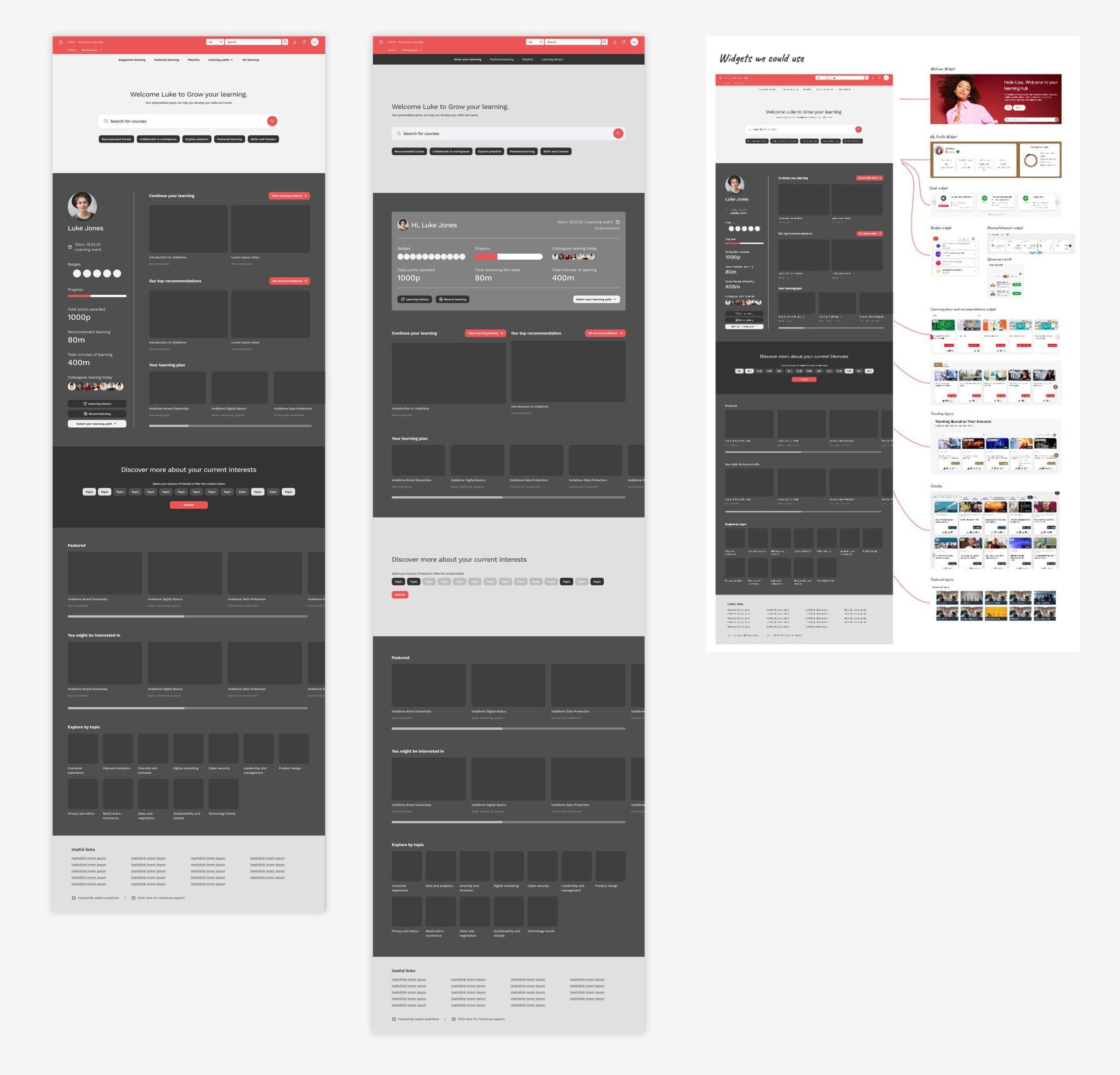
Our objective was to redesign the platform to be more user-centered and engaging, addressing key pain points identified through feedback. We aimed to simplify navigation, making it easier to find and access key learning resources. Introduce personalised recommendations to align with each user’s unique learning goals as well as adding gamification features, such as achievement badges, to increase course completion rates and overall engagement
👤 Involvement
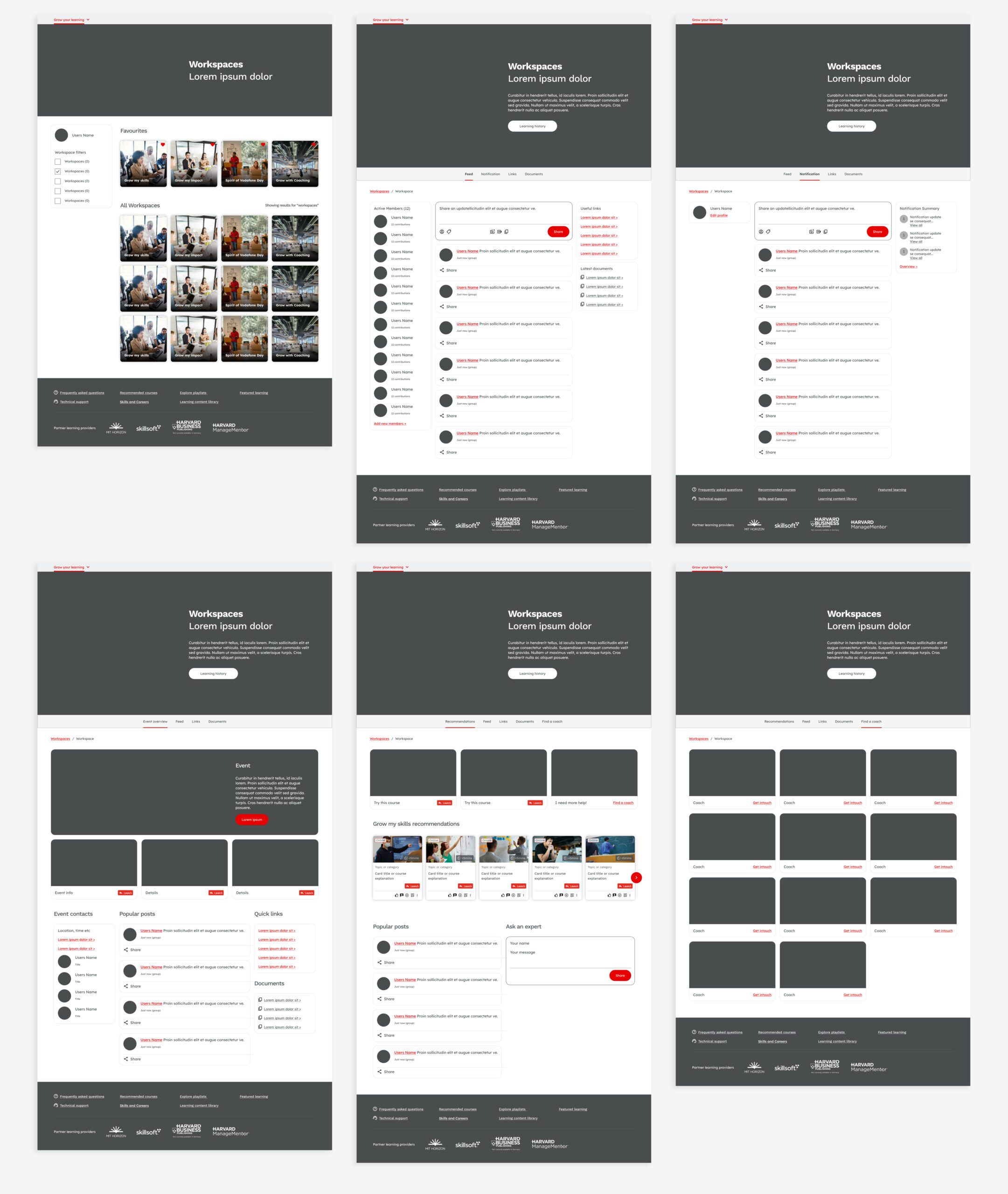
As the UX lead, I guided the project through each phase, from initial research to final design implementation. I conducted multiple rounds of user testing, analysing feedback across several sessions to identify patterns in user needs and frustrations. My role also involved close collaboration with product managers, developers, and stakeholders to ensure that our design solutions aligned with technical capabilities and strategic goals.
Conclusion
🚀 Results
The redesign achieved notable improvements in user satisfaction and engagement. Users reported clearer navigation and found it easier to identify mandatory training, thanks to newly added visual indicators. Personalised learning paths and recommendations were well-received, allowing users to engage with content that felt relevant to their goals. Additionally, the gamification elements helped boost course completion rates, as users responded positively to achievements and progress tracking.
🏁 Conclusion
This project transformed the learning platform into a more intuitive and engaging space that caters to diverse user needs. The iterative, feedback-driven approach not only improved user satisfaction but also laid a solid foundation for ongoing enhancements based on real user insights. The redesign succeeded in making the platform a more supportive and motivating enviro
Contact
