Clarks Global | Ecommerce
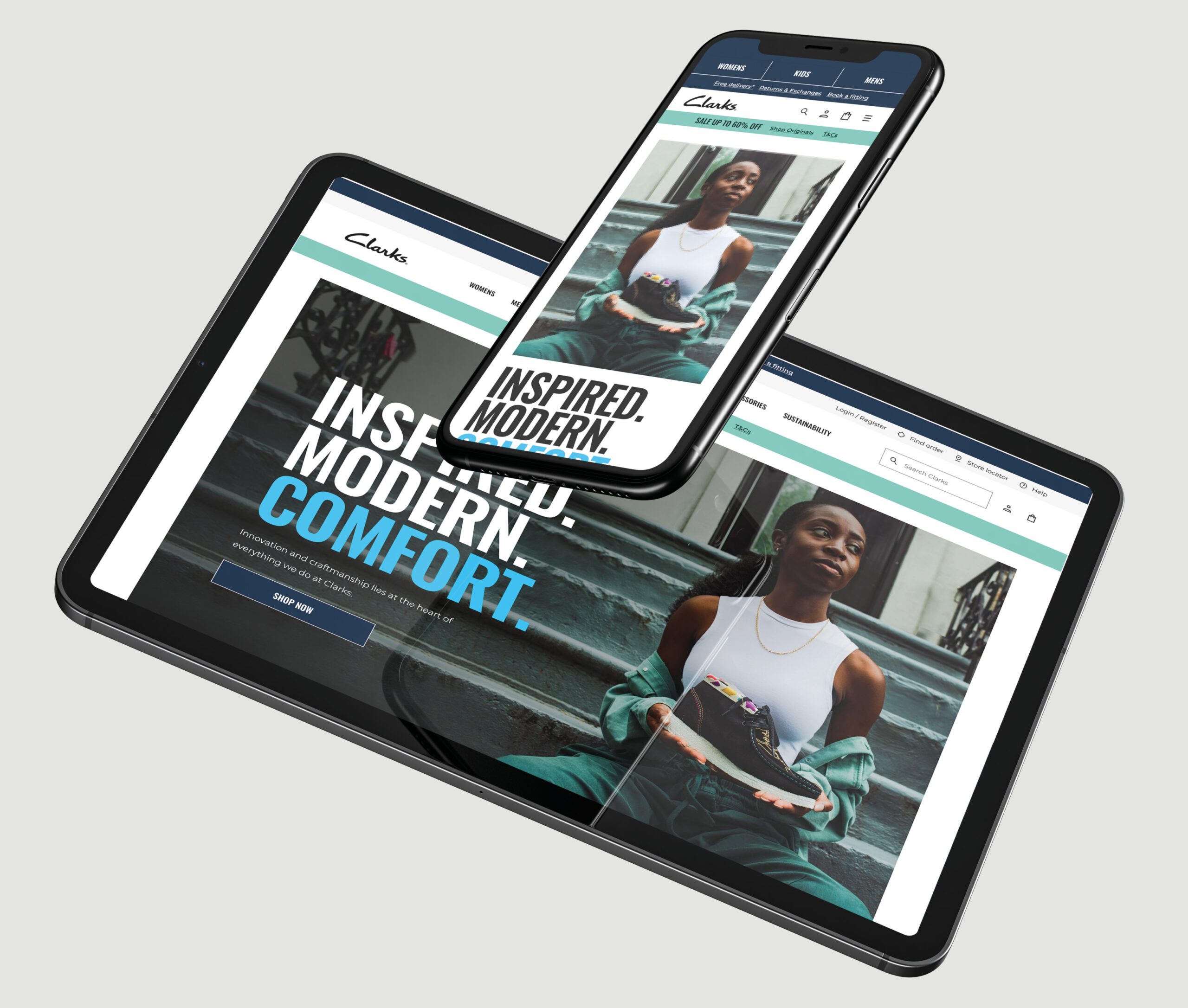
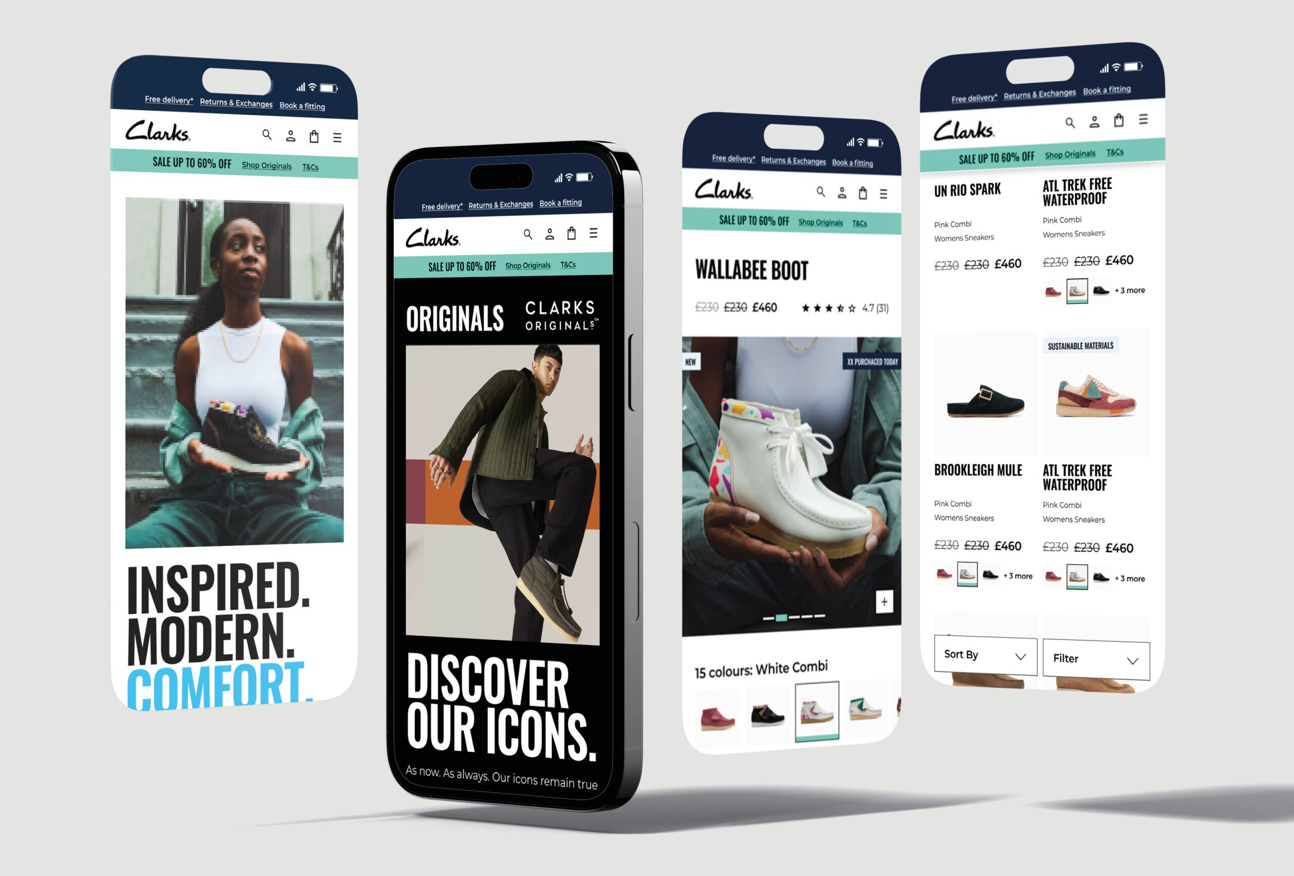
I led the design for Clarks, enhancing user experiences by refining the fitting booking and checkout processes. We created 200+ components for a consistent, accessible e-commerce platform.
Clarks Global | Ecommerce

UX, UI, Visual Design, Design System & Motion Design
The Clarks Global eCommerce project was an ambitious initiative aimed at transforming the user experience across Clarks’ digital storefronts worldwide. With a strong focus on accessibility, the project ensured that all users, regardless of their abilities, could engage with Clarks’ digital platform seamlessly. This focus on accessibility, coupled with robust UX and UI strategies, helped to create an inclusive, user-centered online experience, which ultimately led to Clarks winning the MACH Impact Award for Best Retail Project and Best Overall Change.
🚩 The Problem
The primary challenge for the Clarks project was to revitalize their digital experience on a global scale, delivering a cohesive and engaging eCommerce platform while adhering to high standards of accessibility. The project demanded a detailed approach to accessibility compliance, ensuring that users with diverse needs could navigate and interact with the platform effortlessly. Additionally, the site needed to support varying international customer expectations while maintaining brand consistency and supporting Clarks’ expanding product range.
Summary
🎯 The Objective
The goal was to create a globally unified platform that would provide Clarks’ customers with a seamless, high-quality shopping experience, whether they were browsing on mobile, tablet, or desktop. Key objectives included making the platform accessible, improving overall usability, and establishing a scalable system that could support future growth and adaptability. Accessibility was crucial for Clarks to ensure inclusivity, and the UI design was crafted with WCAG compliance in mind to support visually and motor-impaired users with features such as keyboard navigability, optimised contrast ratios, and intuitive interactions.
👤 Involvement
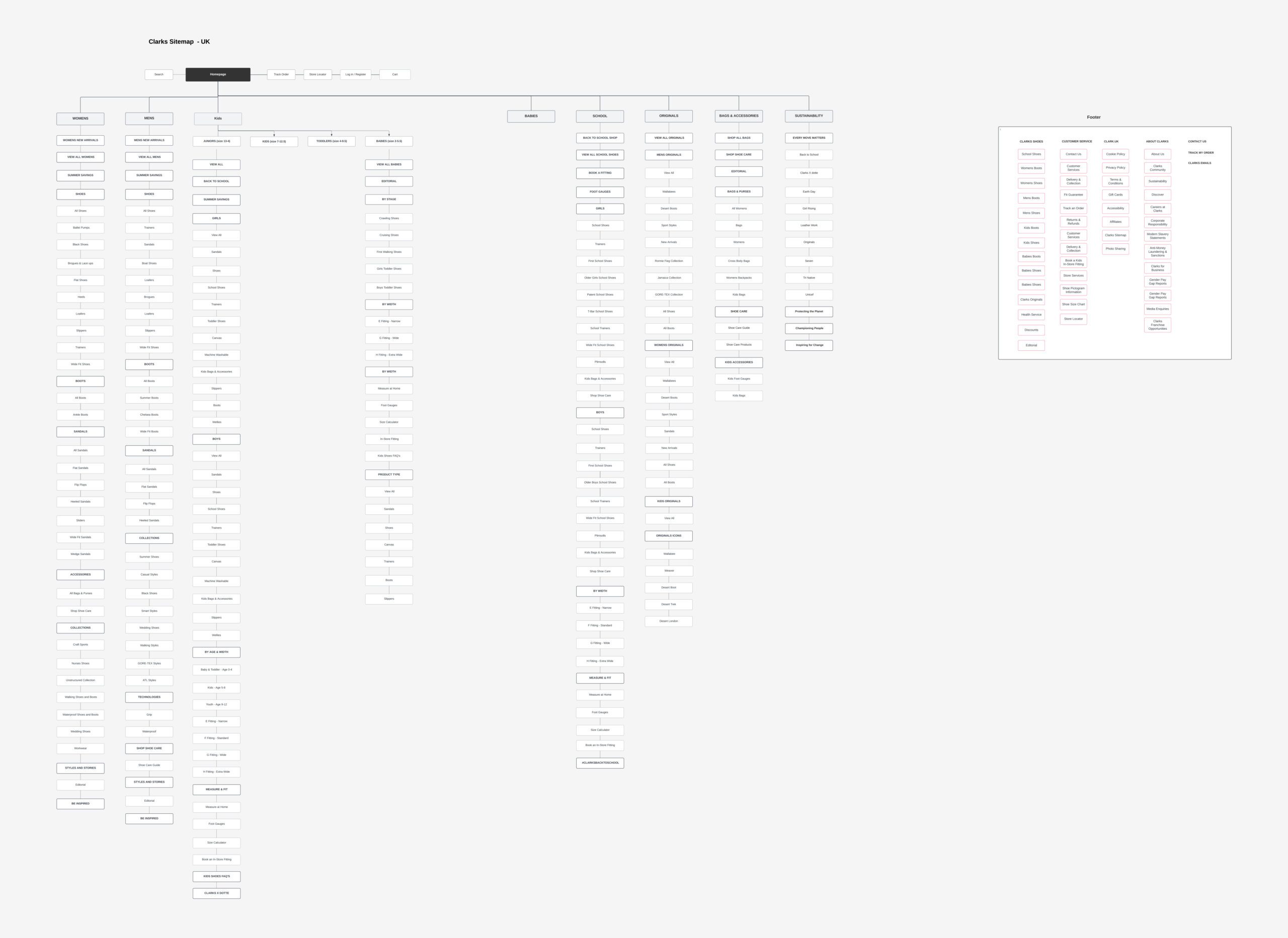
As the lead designer, I oversaw the design strategy, with an emphasis on creating a highly accessible and responsive interface. My role included defining UX flows and visual hierarchies that simplified navigation, enhancing accessibility by incorporating WCAG-compliant colours, typography, and interactive elements. I also led the team in developing a dynamic design system that not only streamlined Clarks’ digital presence across regions but also facilitated easy updates and expansion.
Working alongside Like Digital, I conducted thorough user testing sessions to validate the platform’s accessibility and usability for diverse user groups. Additionally, I collaborated with developers to ensure that the accessibility features were implemented correctly, creating a platform that was not only visually appealing but also met high standards of inclusivity and adaptability.
Conclusion
🚀 Results
The redesigned Clarks eCommerce platform was widely praised for its improved user experience and accessibility, demonstrating measurable enhancements in user engagement and retention across various regions. The project’s success in inclusivity and innovative user-centered design earned it the prestigious MACH Impact Award for Best Retail Project and Best Overall Change. These accolades underscore the platform’s impact on the retail industry and set a new standard for accessible, scalable digital retail solutions.
🏁 Conclusion
The Clarks Global eCommerce project represents a significant advancement in accessible design within the retail industry, demonstrating that digital innovation can go hand-in-hand with inclusivity. By creating a robust, user-friendly, and adaptable platform, the project not only met Clarks’ immediate goals but also set a foundation for ongoing digital success, ensuring a high-quality, accessible experience for every customer.
Contact


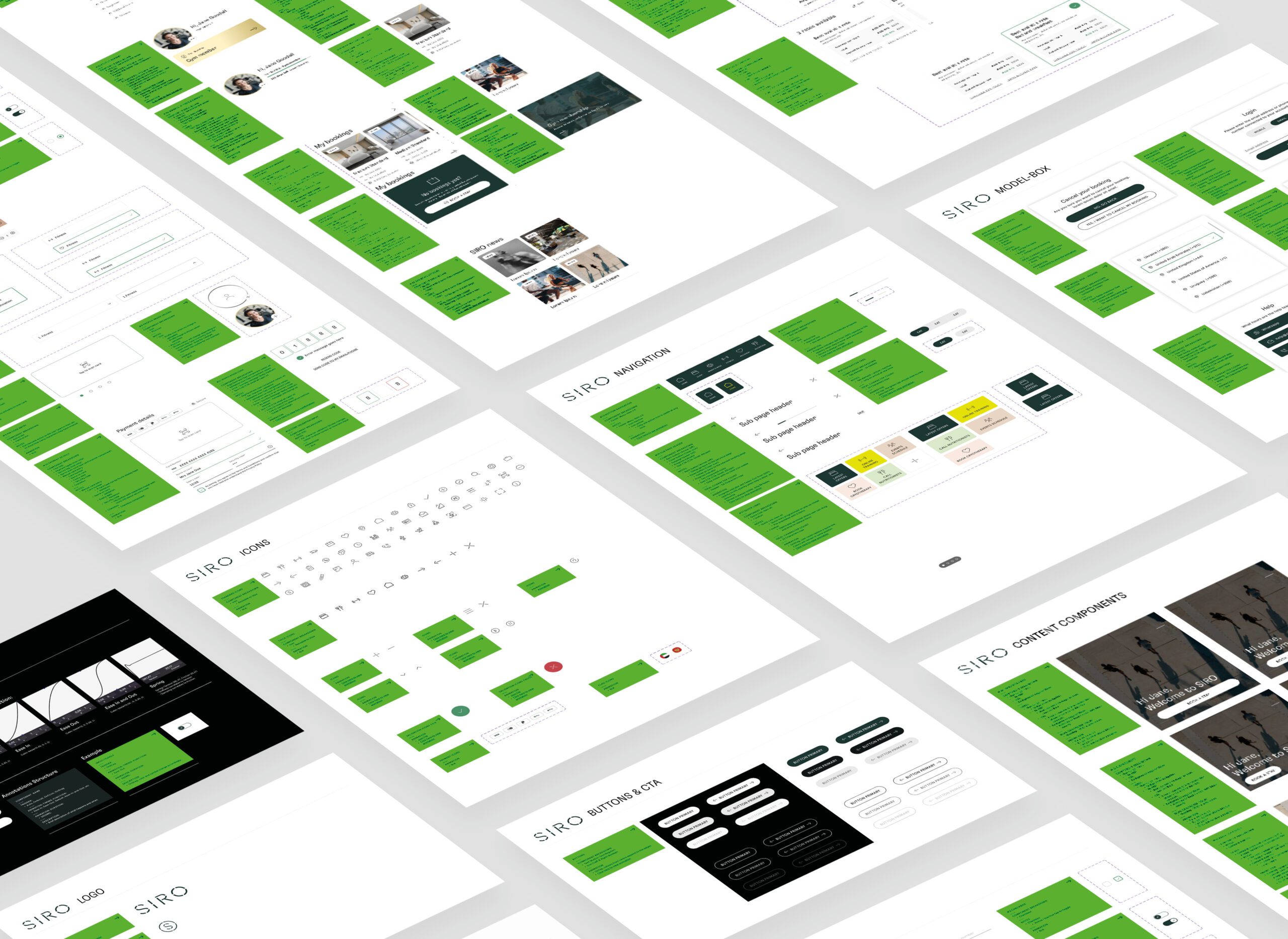
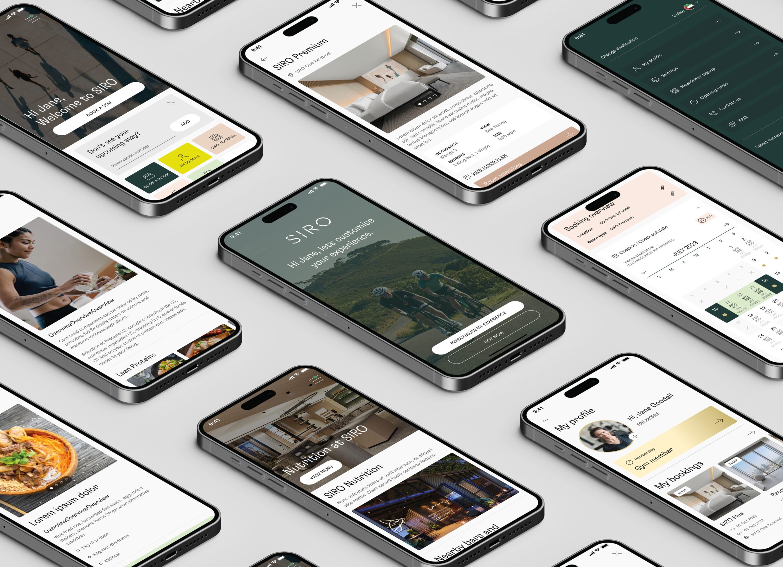
SIRO Hotel | App
UX, User flows, User mapping, IA, UI, Design System & Motion Design
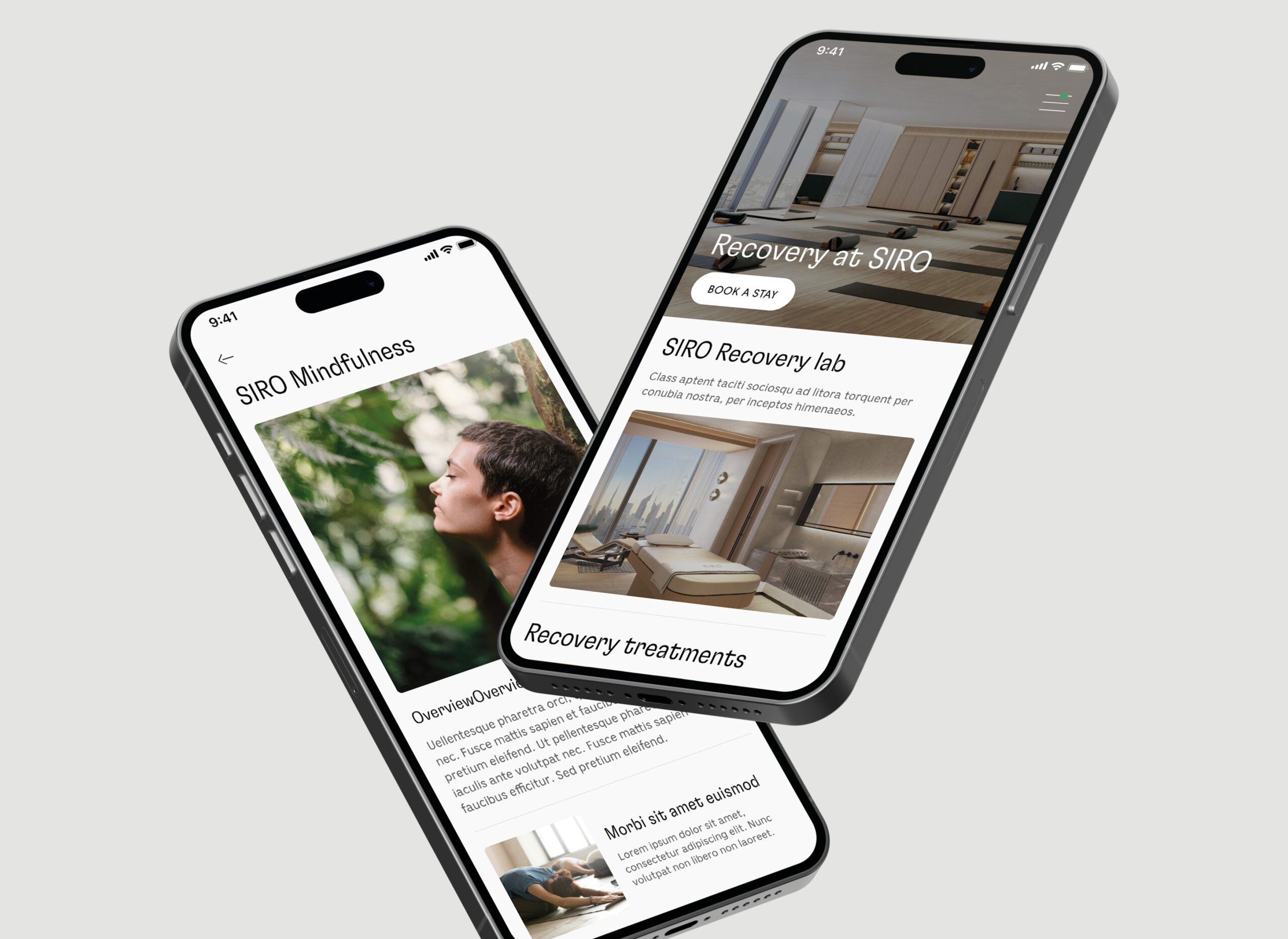
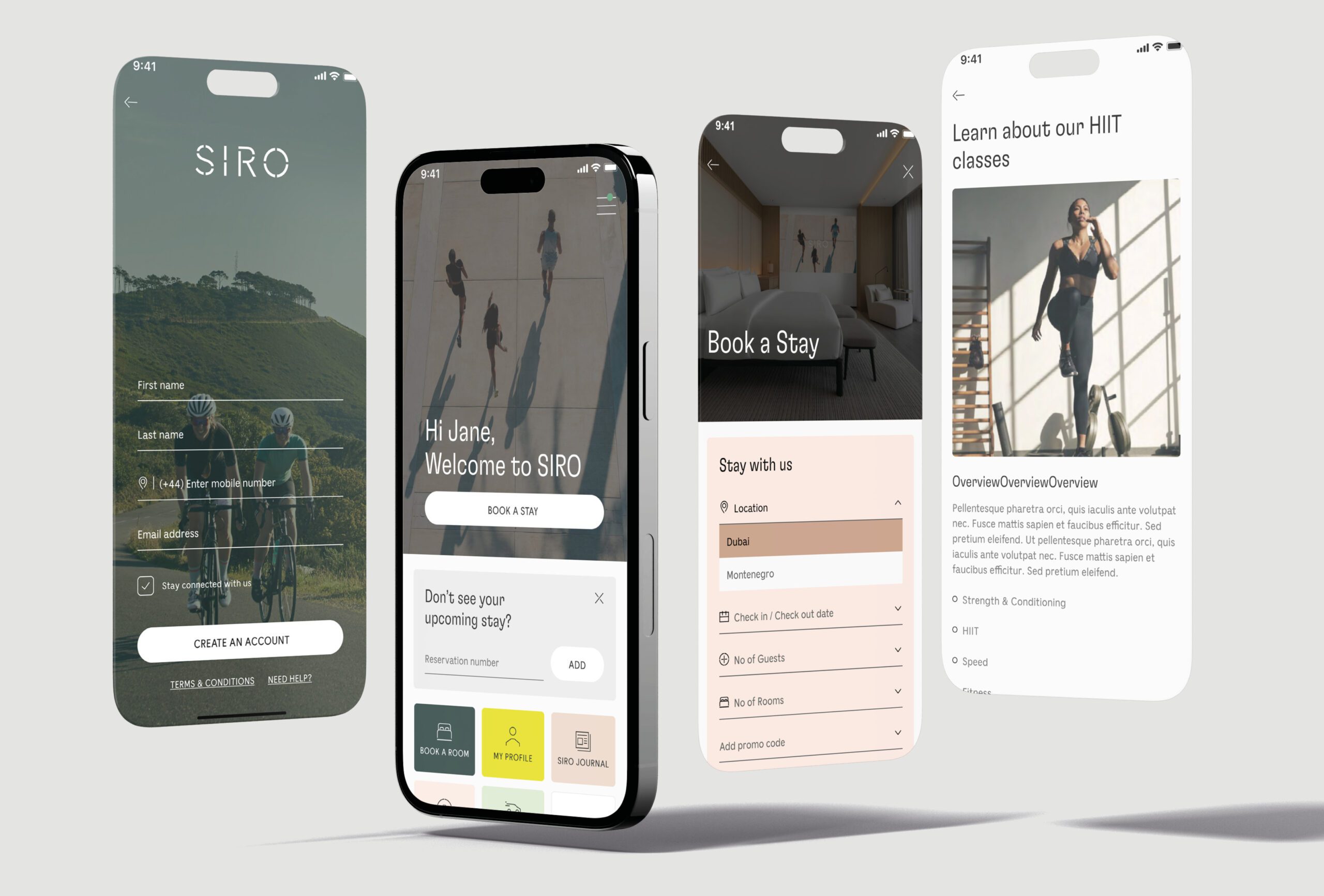
SIRO is a luxury hotel brand aiming to provide a seamless, elevated experience for its guests. The hotel sought to create an app that would allow guests to access a range of services, including room service, concierge recommendations, and hotel amenities, all through a simple, intuitive interface. The app needed to reflect the brand’s high-end image while being highly functional and easy to use.
🚩 The Problem
The main challenge was creating an app that combined luxury with usability. While SIRO’s brand identity needed to come through in every aspect of the design, the app had to be user-friendly for all guests, including those who might not be familiar with technology. It also needed to integrate smoothly with hotel systems to provide a seamless experience, from check-in to in-room service requests.
Summary
🎯 The Objective
The goal was to design an elegant, intuitive mobile app that aligned with SIRO’s brand while enhancing the guest experience. The app needed to be both functional and luxurious, allowing guests to interact with hotel services with ease while reinforcing the brand’s high-end positioning. I aimed to create a product that simplified the hotel experience for guests while maintaining SIRO’s exclusive feel.
👤 Involvement
As the Lead Product Designer, I was responsible for overseeing the entire design process, from user research through to the final visual design. My primary focus was ensuring that the app not only reflected SIRO’s high-end brand but also provided an intuitive and seamless user experience. I worked closely with stakeholders, including hotel management and marketing teams, to ensure the app met the brand’s objectives and operational needs.
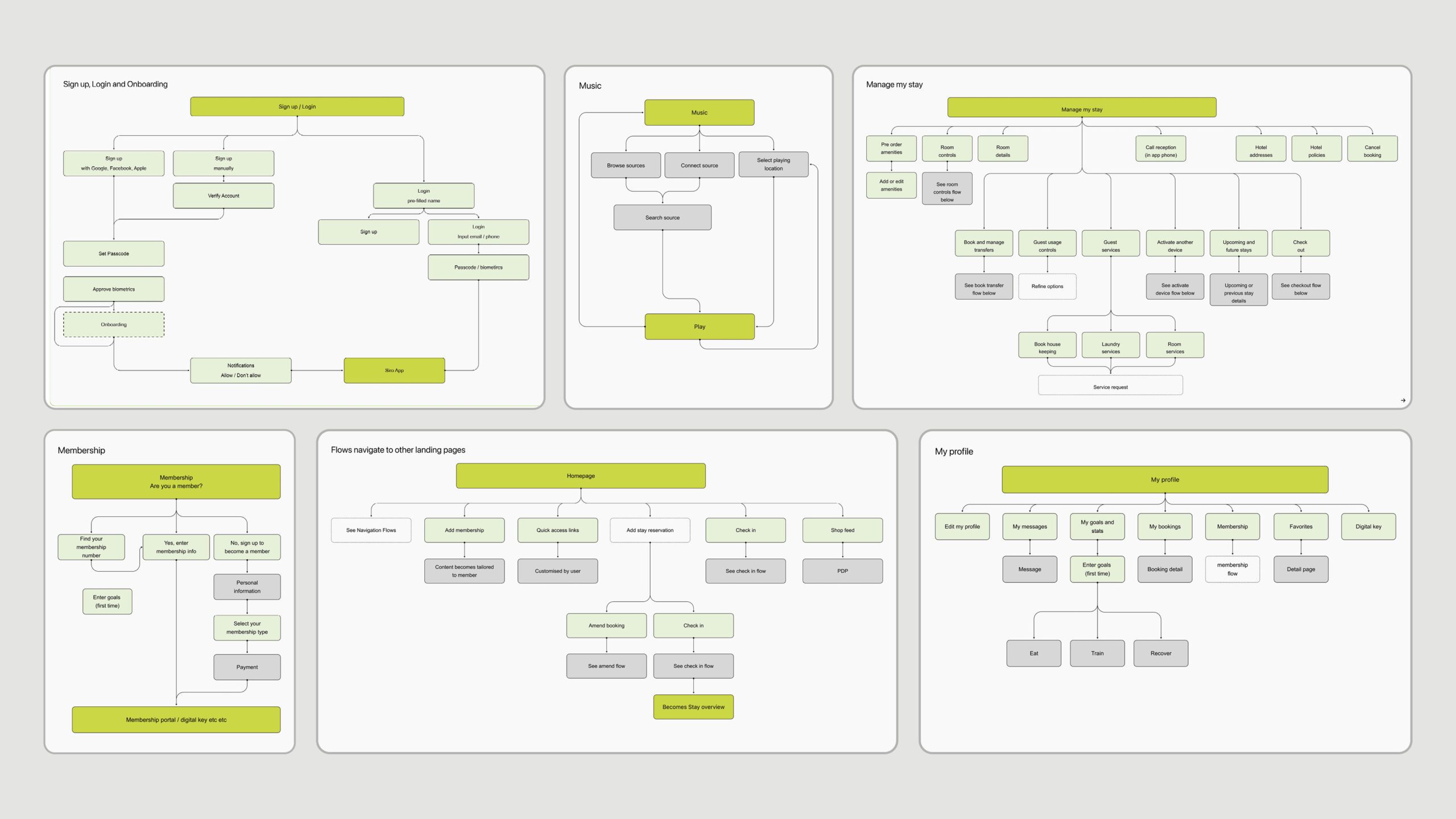
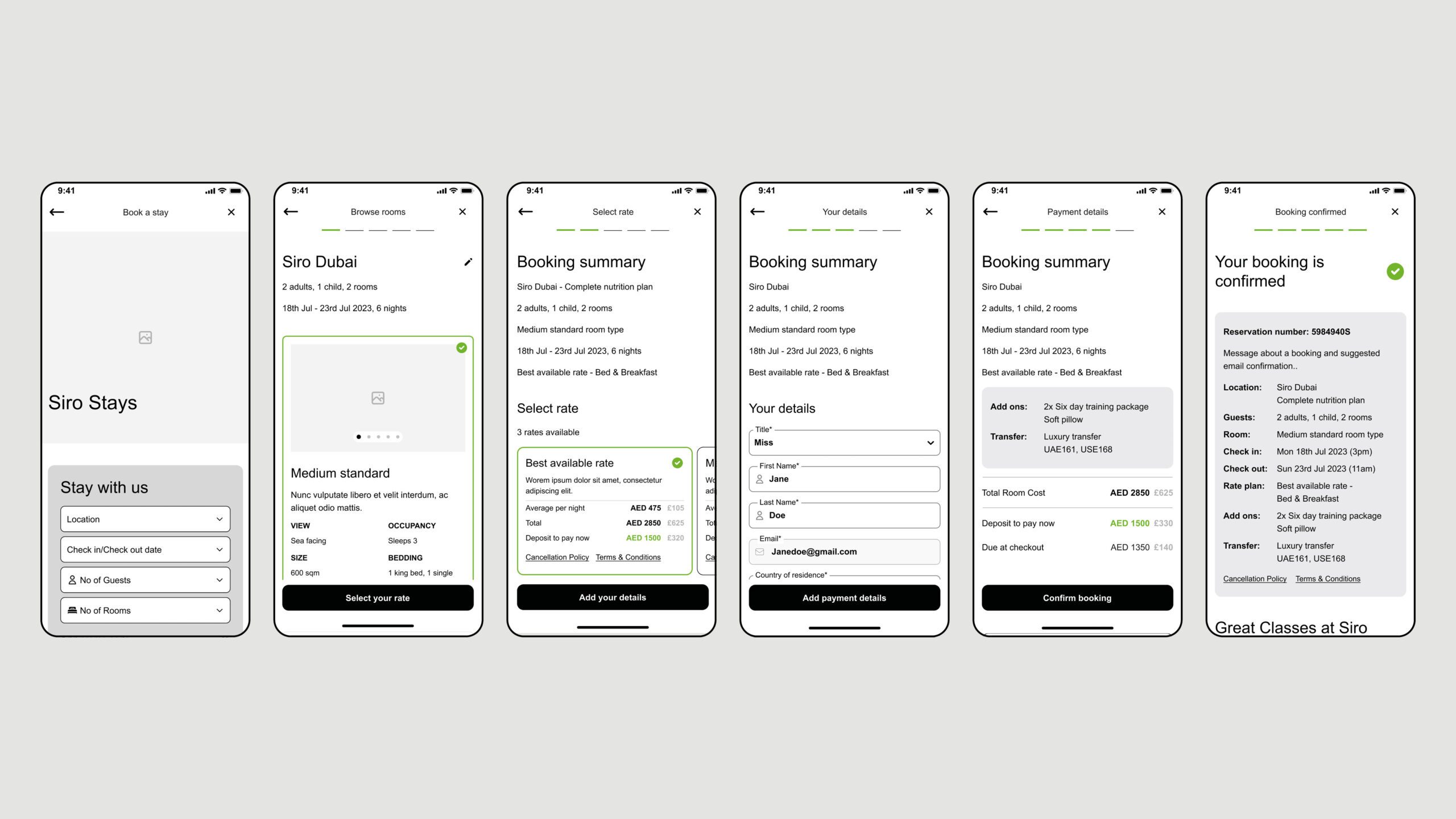
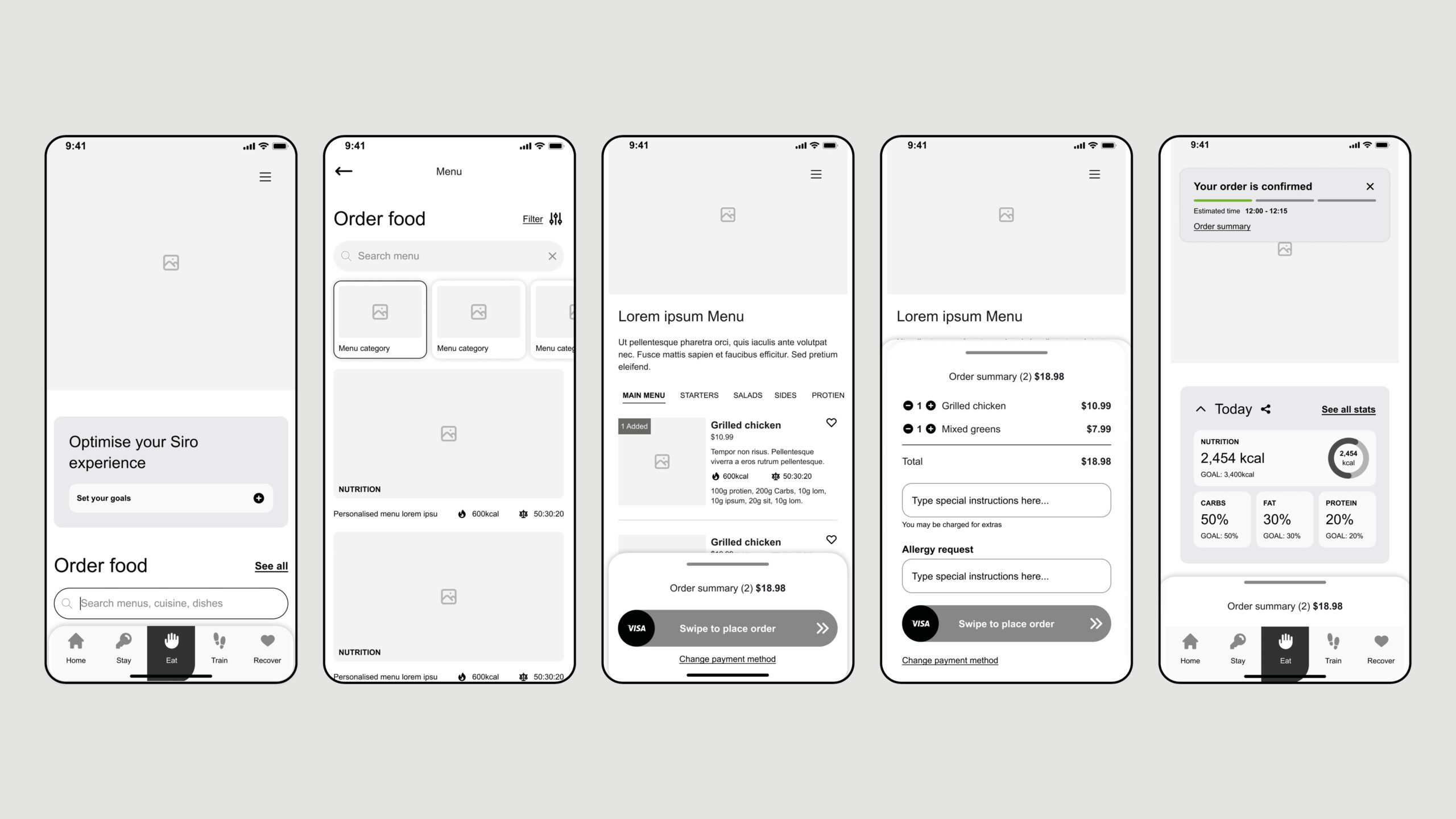
I led the user research phase, conducting interviews and usability tests with potential guests to better understand their needs and pain points. This research was crucial in shaping the app’s features, ensuring they were not only functional but also aligned with the guests’ expectations. Based on the feedback gathered, I refined the user interface and user flows, iterating on the design to create a more intuitive and efficient experience.
In addition to working closely with stakeholders, I also collaborated with the development team to ensure the design was technically feasible and aligned with the hotel’s internal systems. This partnership was essential in delivering a product that was both visually appealing and highly functional, enabling the smooth integration of various hotel services such as room service and concierge requests.
Conclusion
🚀 Results
The app was successfully launched, receiving positive feedback from both users and stakeholders. Guests found the app easy to use, with high levels of engagement, and appreciated its sleek, minimalistic design that reflected SIRO’s luxurious brand. It streamlined guest interactions with the hotel, making services like room service and concierge requests more accessible and efficient. The app helped reinforce the brand’s commitment to offering a modern, exclusive experience for its guests.
🏁 Conclusion
Working on the SIRO hotel app was an incredibly rewarding experience. It reinforced the importance of aligning design with brand identity while keeping user needs at the forefront. Through stakeholder collaboration, user testing, and a focus on high-end aesthetics, I was able to create an app that was not only functional but also reinforced the luxury experience that SIRO promises to its guests. This project deepened my skills in creating intuitive, brand-aligned products and demonstrated the value of user-centered design in a high-end hospitality setting.
Contact
United Nations, COP28 | App
UX, UI, Design System & Motion Design
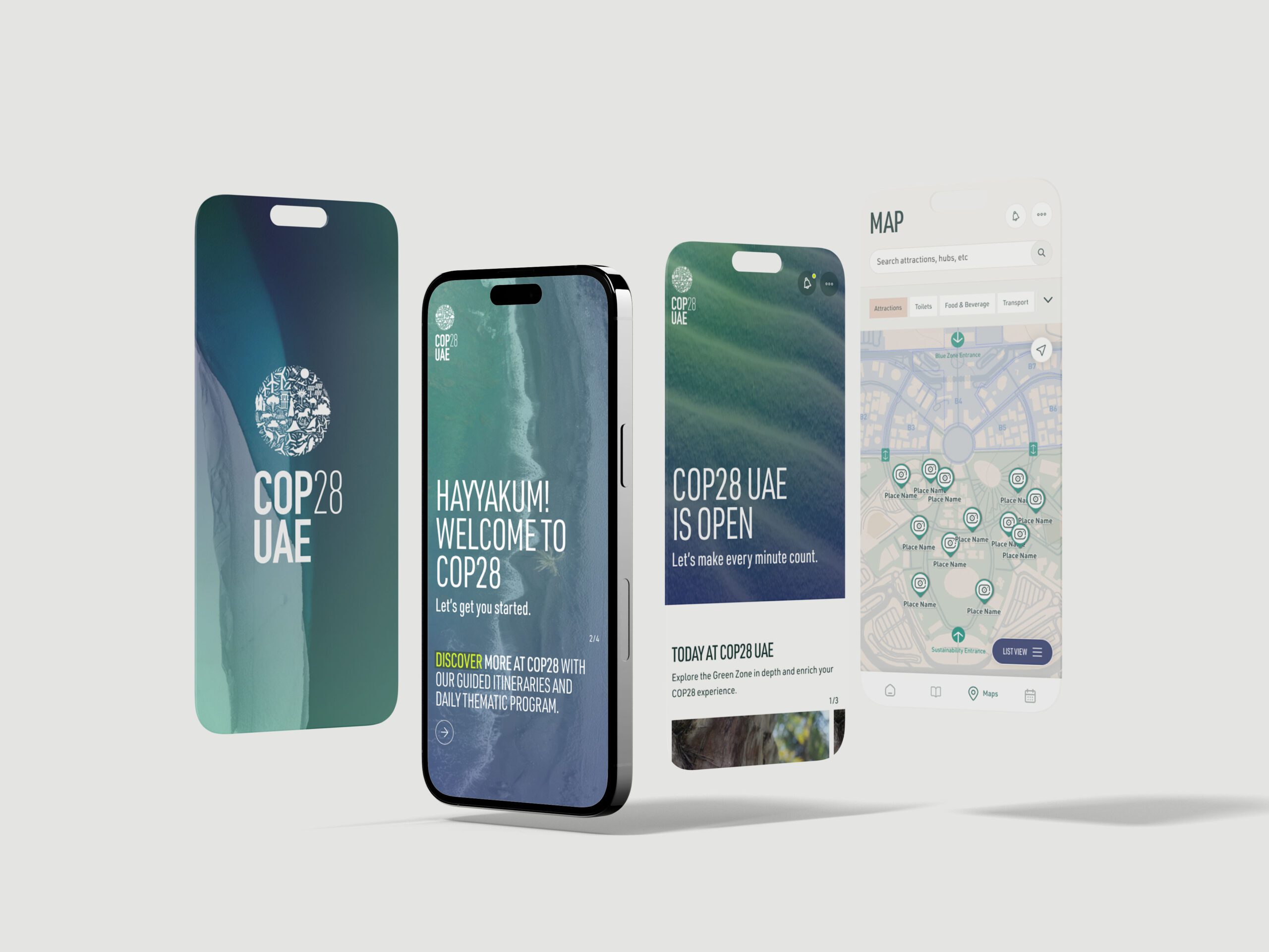
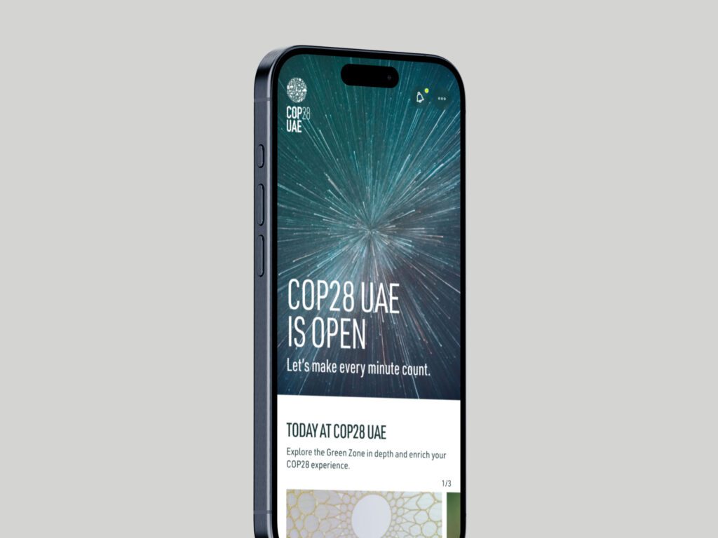
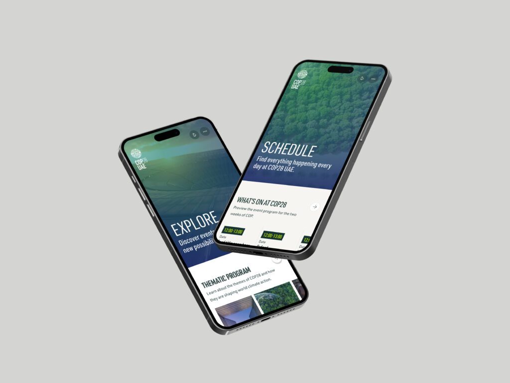
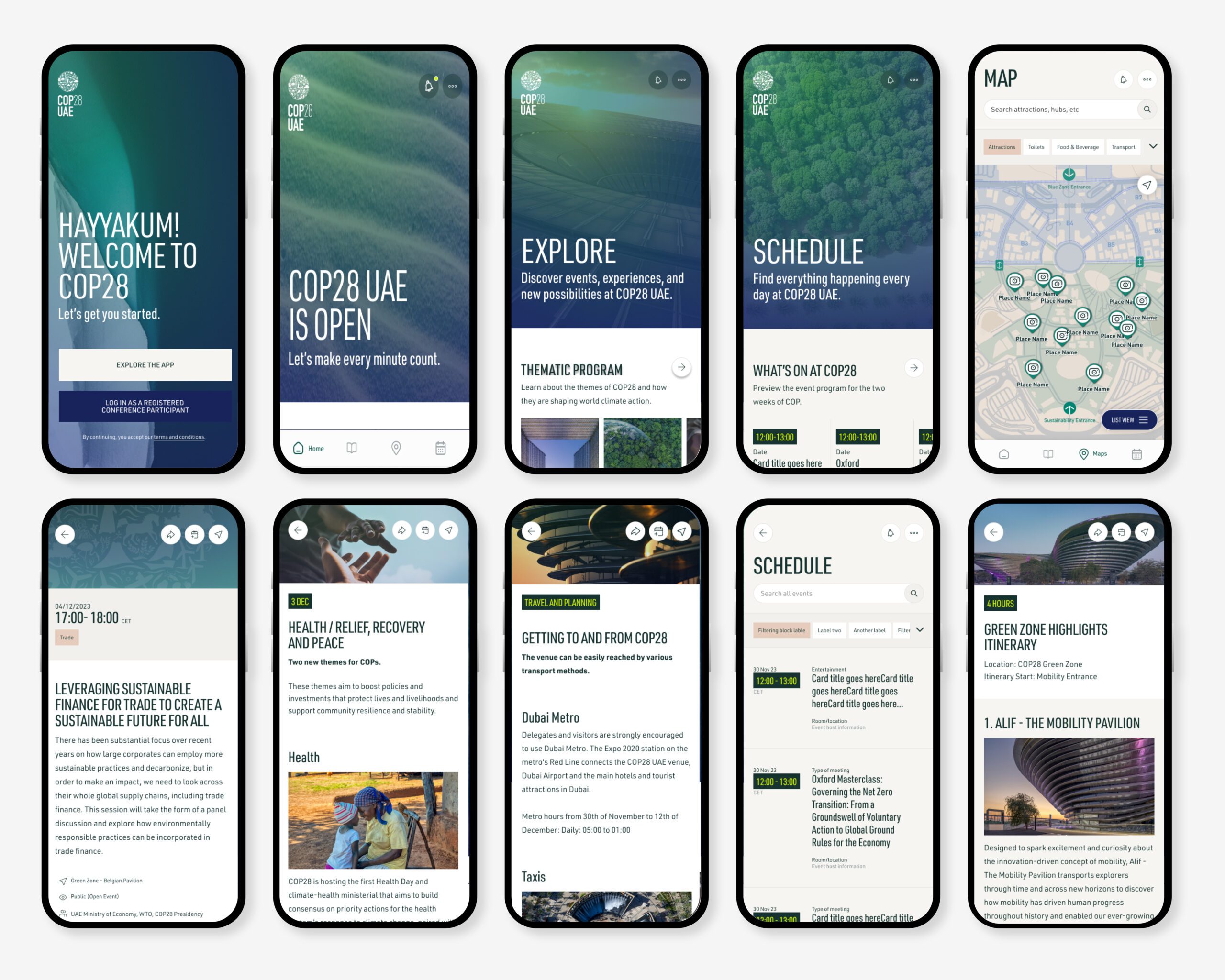
The COP28 app was developed to support the largest climate conference ever held in Dubai, providing an accessible, centralized, and engaging digital experience. Designed to appeal to a diverse audience, the app emphasized AAA compliance to ensure usability for all, from delegates to general attendees. The app achieved over 57,000 downloads, demonstrating high user adoption and engagement, and laid a robust foundation for future COP events by creating a scalable design system.
🚩 The Problem
The COP28 conference brought together world leaders, climate activists, and experts to address global climate issues. The digital platform needed to accommodate the diverse needs of thousands of attendees, centralizing event information while supporting robust engagement and efficient event management. Given COP28’s international reach, the app required an accessible, user-friendly structure that would deliver the organization’s key messages on climate action and ensure smooth, inclusive navigation.
Summary
🎯 The Objective
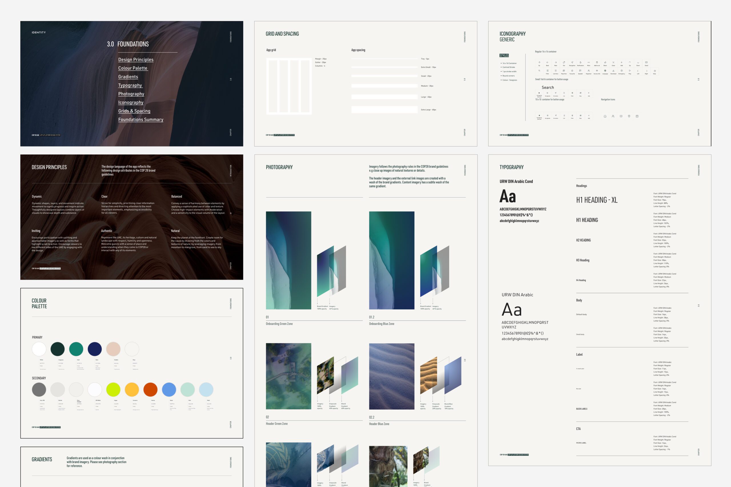
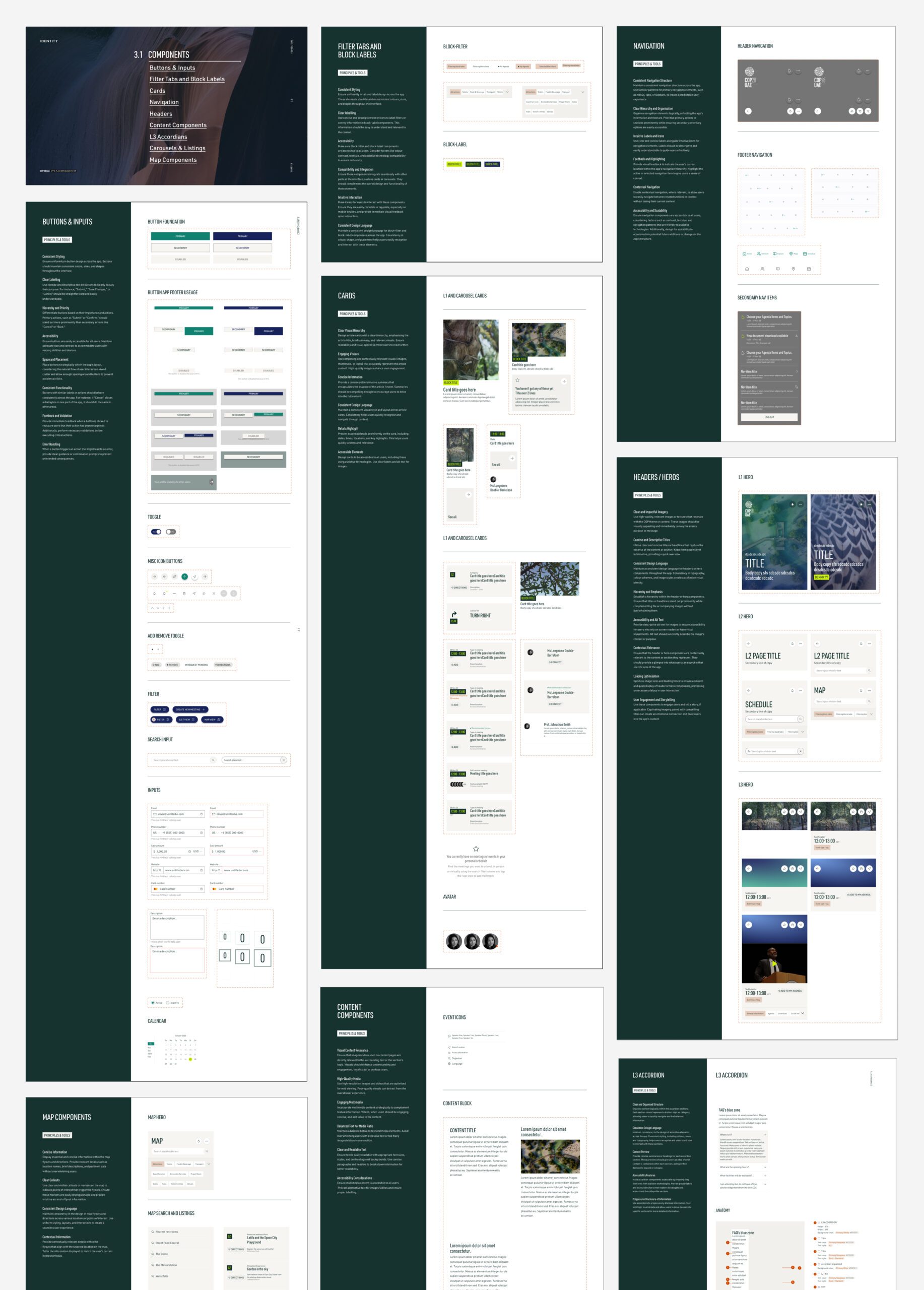
Our goal was to create a cohesive app that enhanced attendee participation, simplified event logistics, and could serve as a lasting framework for future COP events. An emphasis on accessibility was essential, as the app needed to support AAA standards, ensuring all participants could engage easily. By establishing a clear, adaptable design system, the app would provide a consistent, scalable foundation for years to come.
👤 Involvement
I led the design system, UI, and accessibility standards for the COP28 app, overseeing the entire UX design from user journey mapping to high-fidelity prototypes. A key component of this work involved structuring the app’s L1, L2, and L3 levels to clearly differentiate between landing pages, listing pages, and posts. This layered structure helped simplify the user journey, enabling attendees to navigate from general content to specific event details seamlessly. I conducted extensive user testing to validate this layout, refining each step to ensure a smooth, intuitive flow.
To ensure consistent accessibility, I integrated AAA-compliant color schemes, typography, and interactive components throughout the app. Additionally, I created detailed prototypes in Framer, featuring custom Lottie animations and interactions to illustrate complex functionality and guide the development team.
Conclusion
🚀 Results
The COP28 app was widely praised for its intuitive design, comprehensive accessibility features, and ability to serve a global audience. Key features such as an interactive event directory, real-time content feed, and dual access control allowed users to navigate and engage based on their specific access levels. With over 57,000 downloads and sustained user retention, the app demonstrated a high level of user satisfaction and engagement. The scalable design system established a strong foundation for future COP events, enabling quick iterations and ensuring cohesive, high-quality user experiences.
🏁 Conclusion
The COP28 app successfully addressed the event’s complex requirements, providing a versatile, user-centered platform that not only met the immediate needs of attendees but also set a standard for future conferences. The app’s scalable structure and accessibility-centered design offer a long-term, adaptable framework, helping COP achieve consistency and efficiency in digital engagement across future events.
Contact
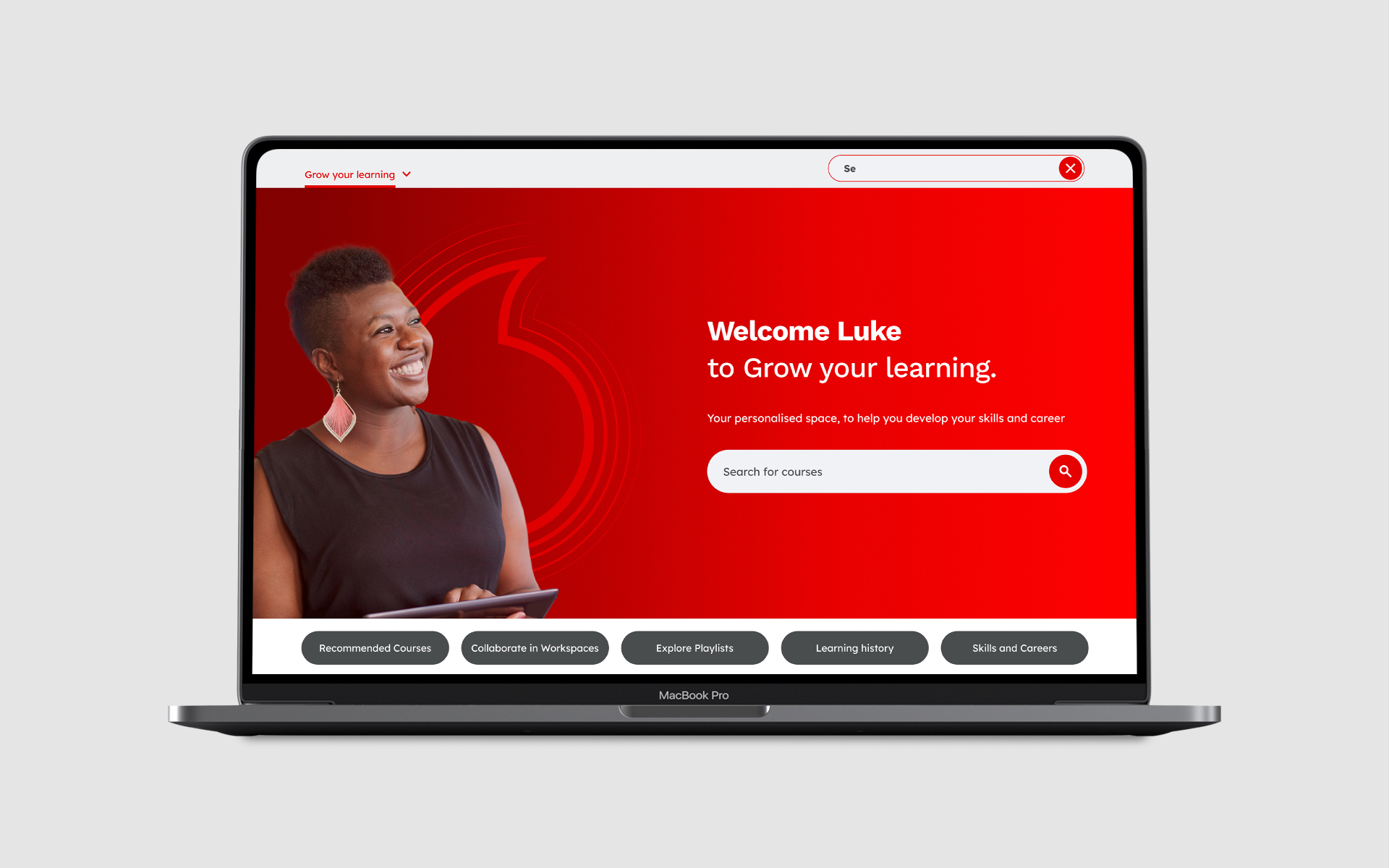
Vodafone | E-Learning platform

UX, User flows, User mapping, IA, UI
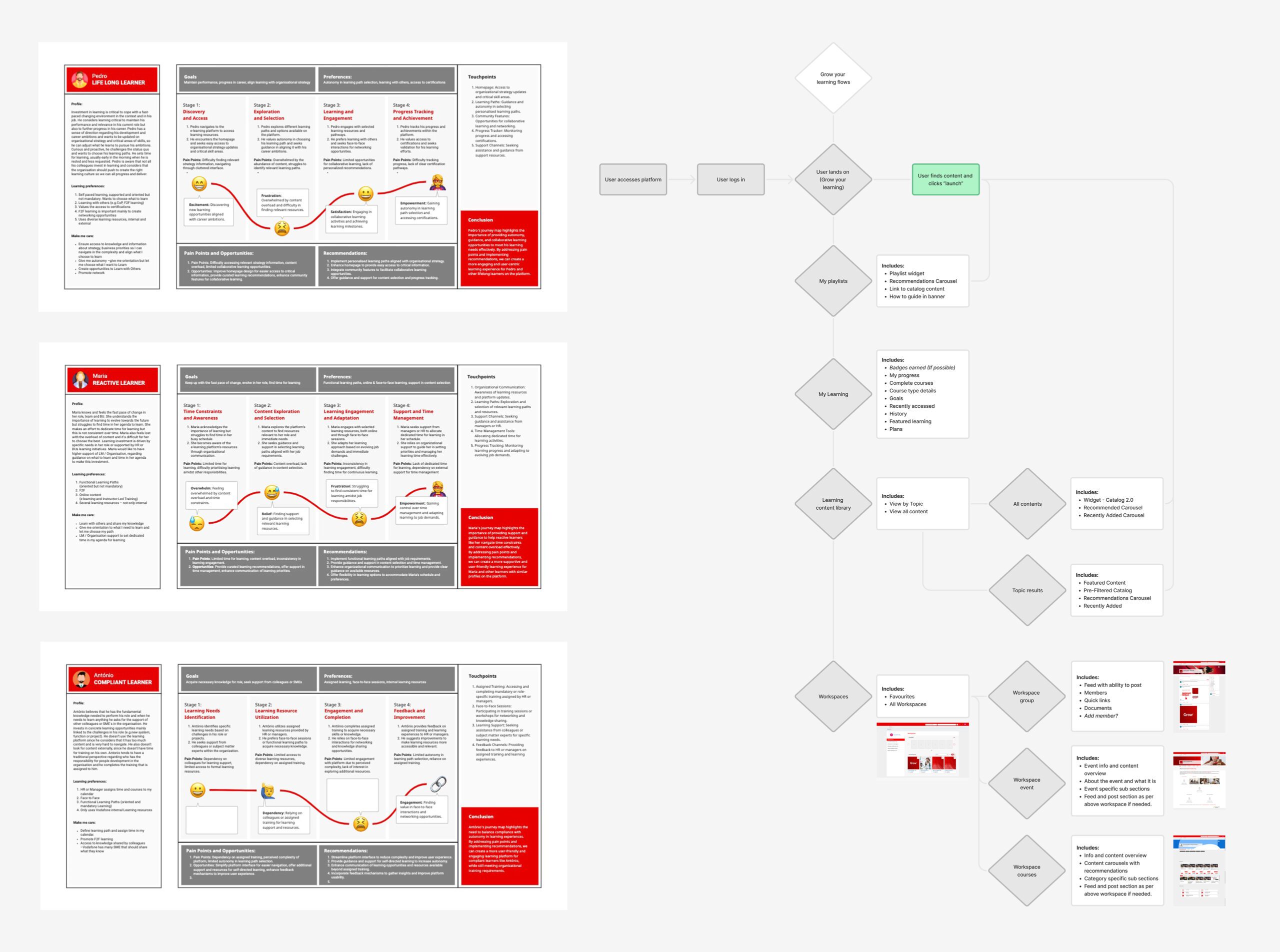
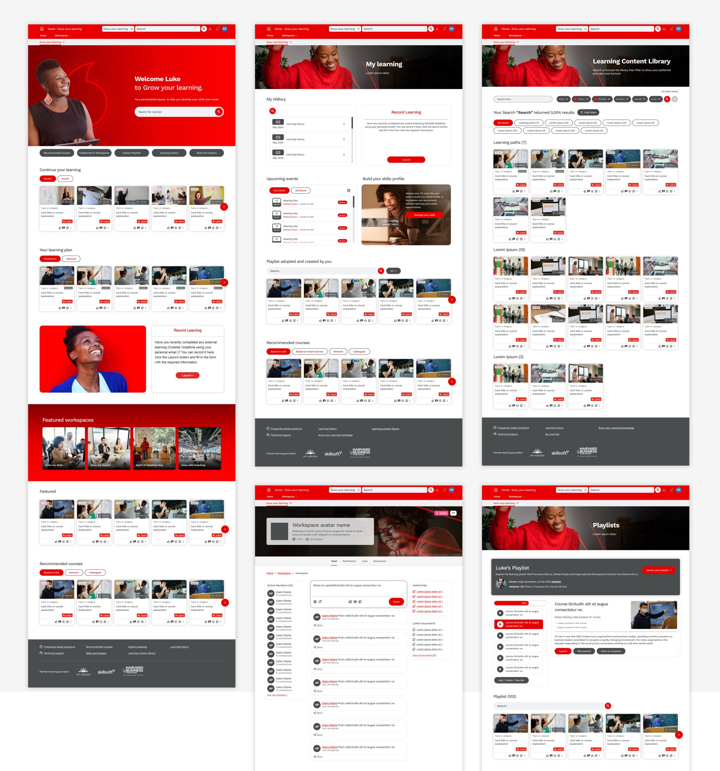
The project aimed to address significant usability issues on the corporate learning platform, which served users with varying learning approaches and needs. Feedback showed that users faced difficulties with navigation, identifying mandatory training, and finding relevant, personalised content. By refining these areas, we sought to enhance both ease of use and motivation, ultimately fostering a more supportive learning environment.
🚩 The Problem
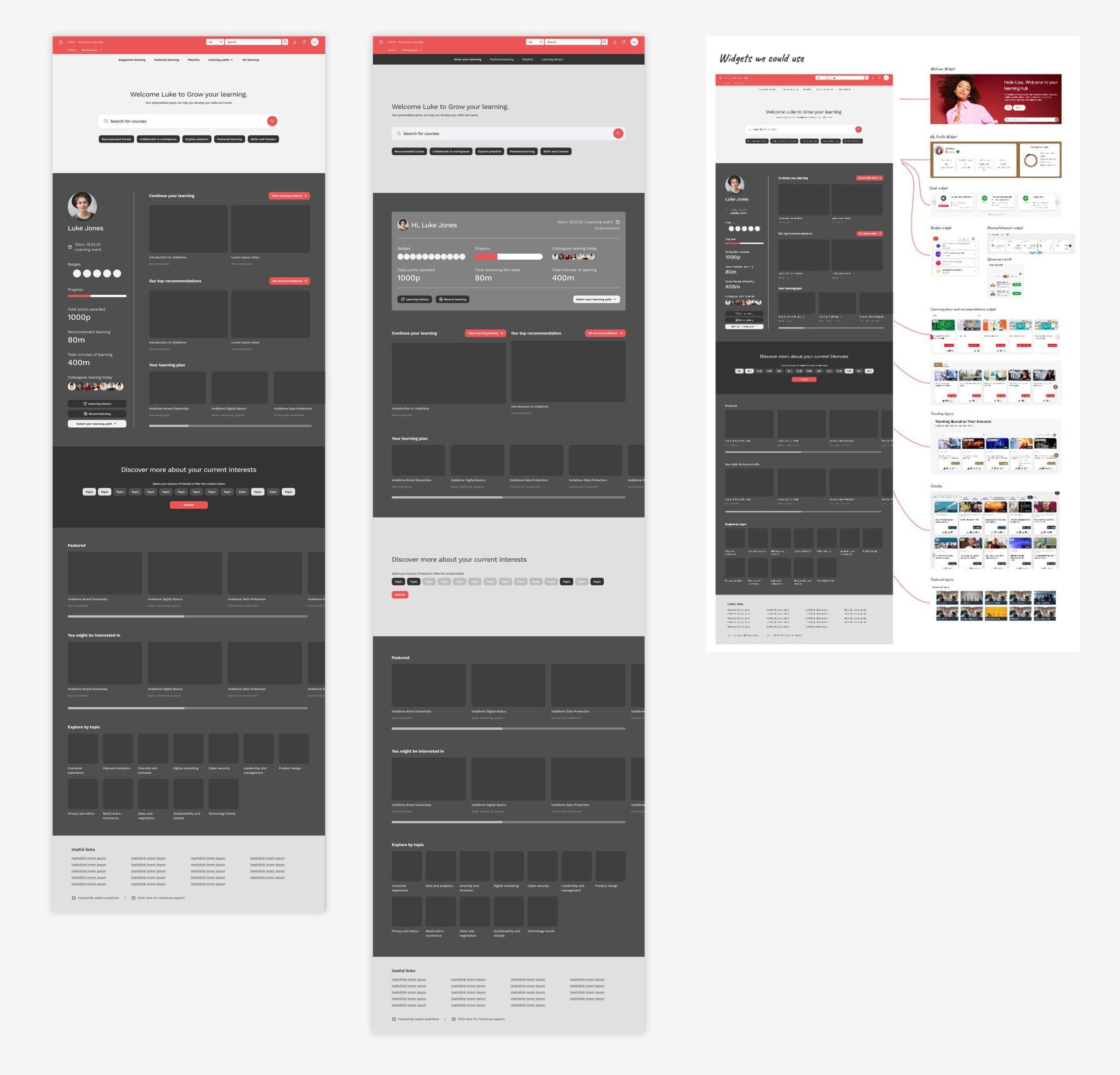
The existing platform presented several usability challenges, including confusing navigation, unclear indicators for mandatory training, and a lack of personalization in the learning experience. Many users struggled to find content suited to their learning goals, with proactive learners feeling limited by generic recommendations, while less-engaged users missed clear guidance. Additionally, the interface lacked gamification elements, which could enhance motivation.
Summary
🎯 The Objective
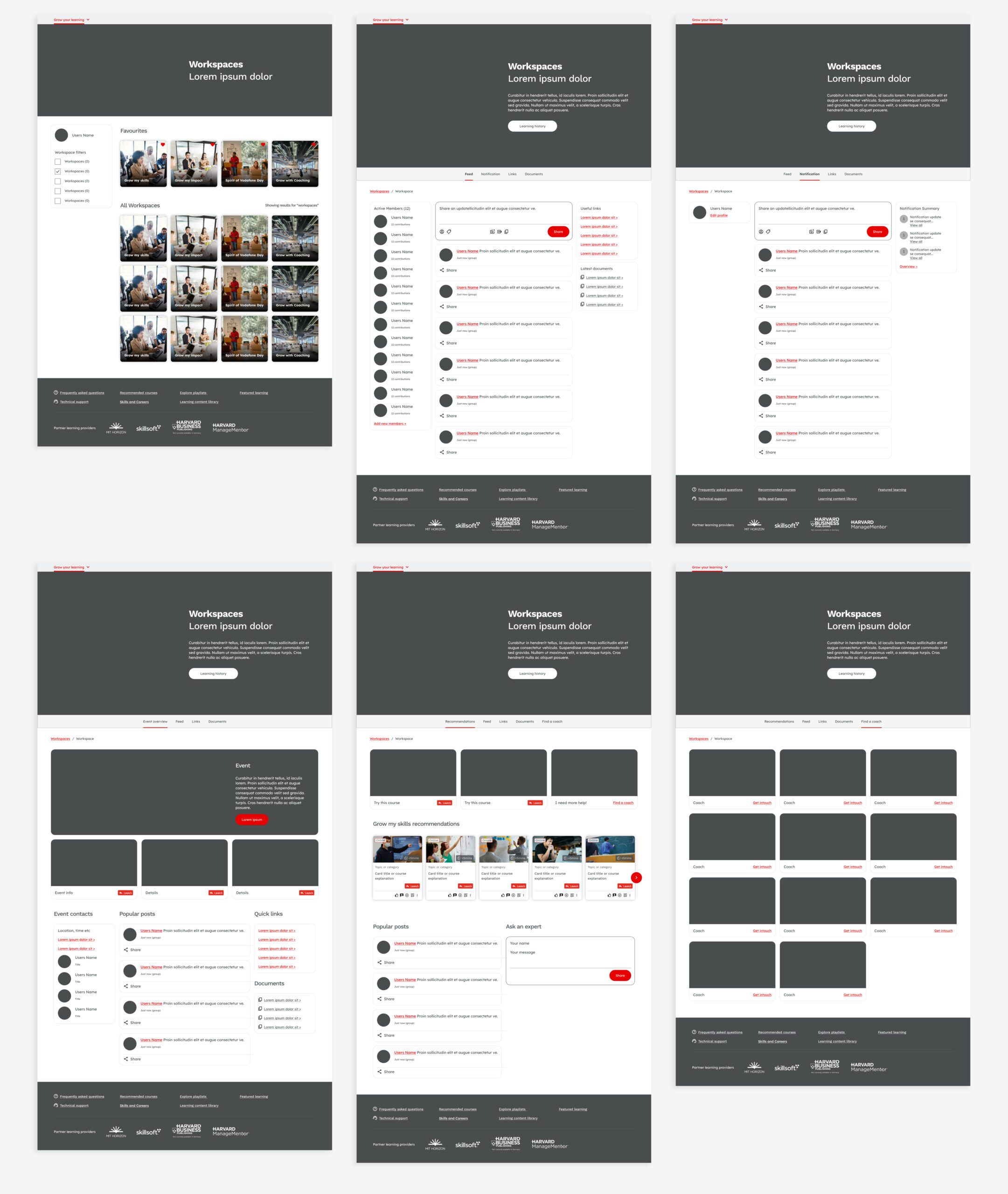
Our objective was to redesign the platform to be more user-centered and engaging, addressing key pain points identified through feedback. We aimed to simplify navigation, making it easier to find and access key learning resources. Introduce personalised recommendations to align with each user’s unique learning goals as well as adding gamification features, such as achievement badges, to increase course completion rates and overall engagement
👤 Involvement
As the UX lead, I guided the project through each phase, from initial research to final design implementation. I conducted multiple rounds of user testing, analysing feedback across several sessions to identify patterns in user needs and frustrations. My role also involved close collaboration with product managers, developers, and stakeholders to ensure that our design solutions aligned with technical capabilities and strategic goals.
Conclusion
🚀 Results
The redesign achieved notable improvements in user satisfaction and engagement. Users reported clearer navigation and found it easier to identify mandatory training, thanks to newly added visual indicators. Personalised learning paths and recommendations were well-received, allowing users to engage with content that felt relevant to their goals. Additionally, the gamification elements helped boost course completion rates, as users responded positively to achievements and progress tracking.
🏁 Conclusion
This project transformed the learning platform into a more intuitive and engaging space that caters to diverse user needs. The iterative, feedback-driven approach not only improved user satisfaction but also laid a solid foundation for ongoing enhancements based on real user insights. The redesign succeeded in making the platform a more supportive and motivating enviro
Contact
Noble Panacea | Ecommerce
UX, UI, Design System & Motion Design
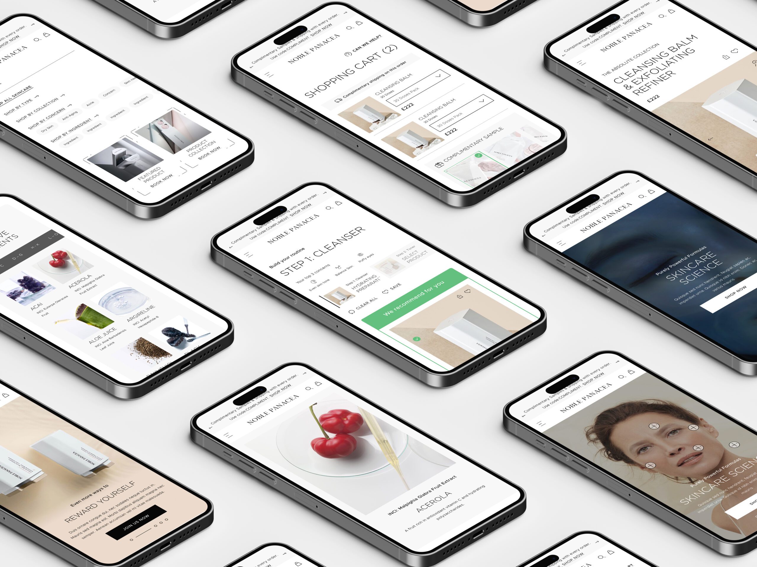
Clarks, a global e-commerce company and retailer specializing in shoe manufacturing since 1825, engaged me to work alongside another designer at Like Digital. Our mission was to develop UX strategies and UI solutions focusing on key user journeys defined by the business.
🚩 The Problem
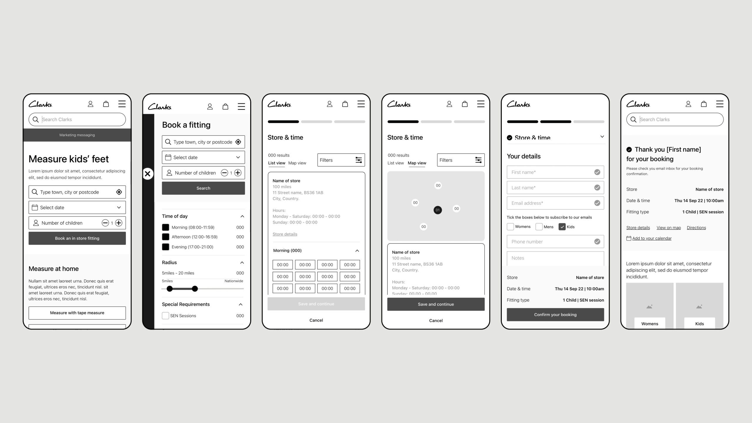
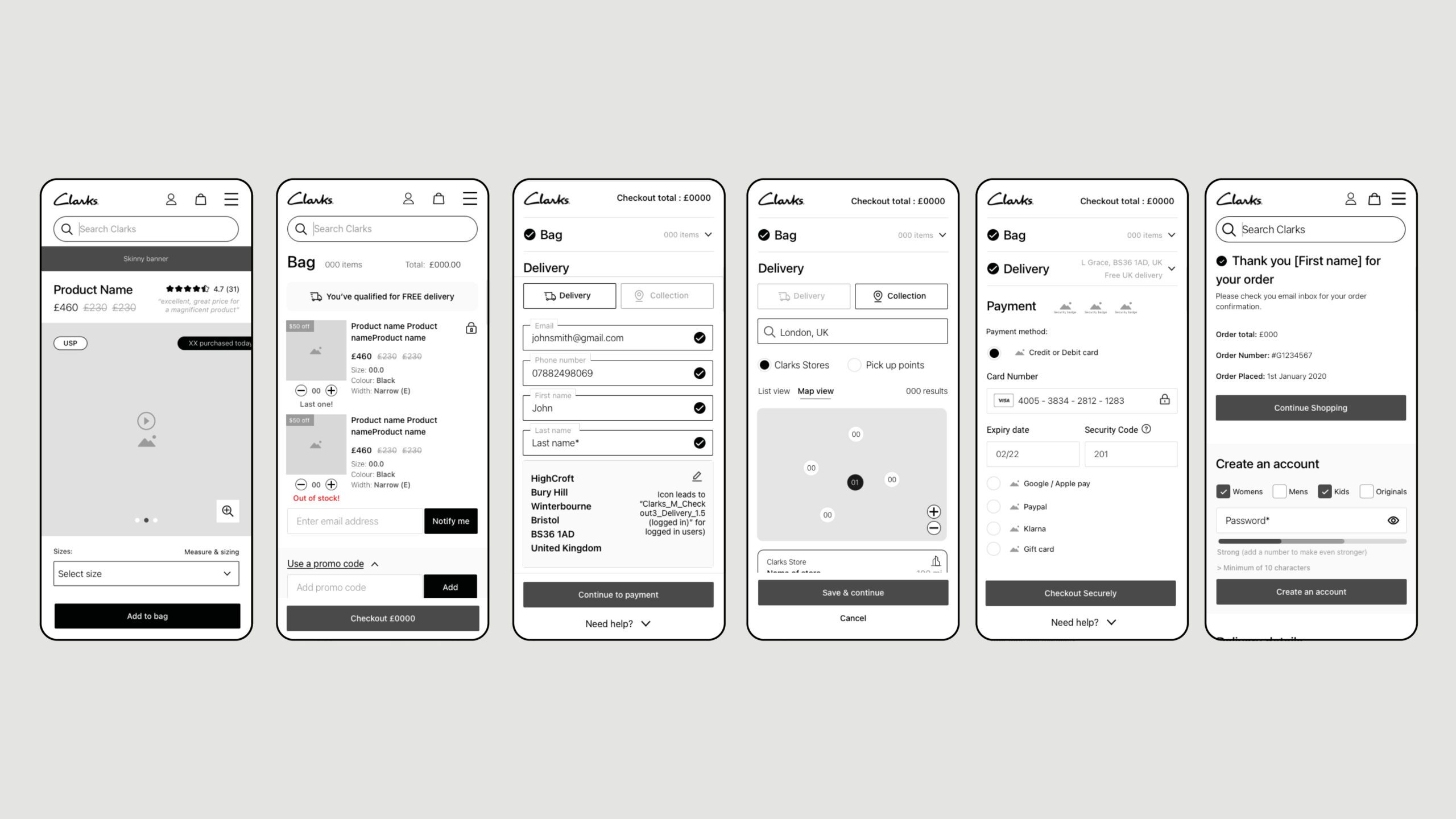
One of Clarks’ unique selling propositions (USPs) is the fitting booking process, but the existing user journey presented challenges. Additionally, a critical concern was the high drop-off rate during the checkout process, which needed to be addressed to enhance the website’s overall success.
Summary
🎯 The Objective
Our objective was to refine and simplify key user journeys, particularly the fitting booking and checkout processes. We aimed to streamline decisions for users and improve their overall experience on the website.
👤 Involvement
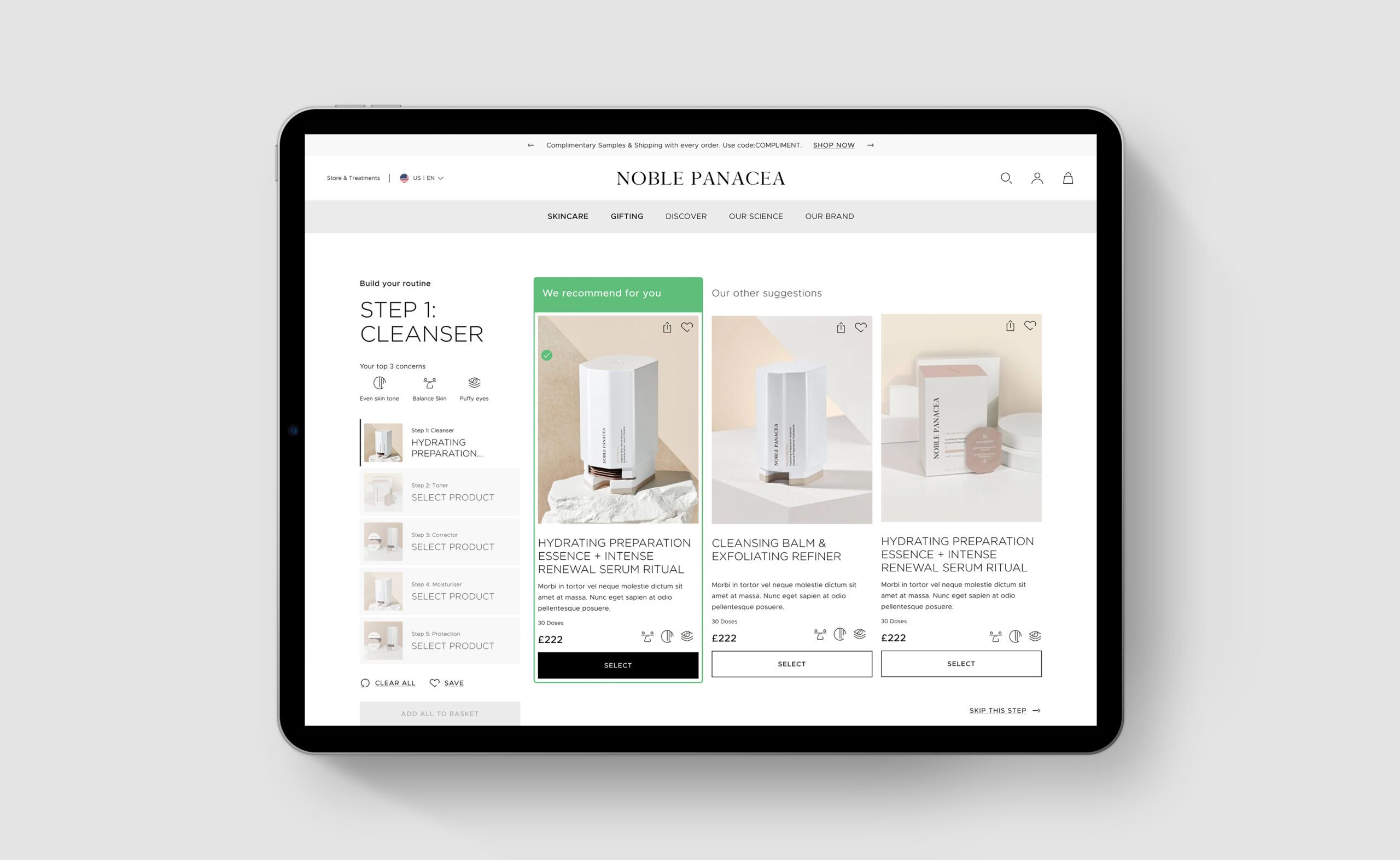
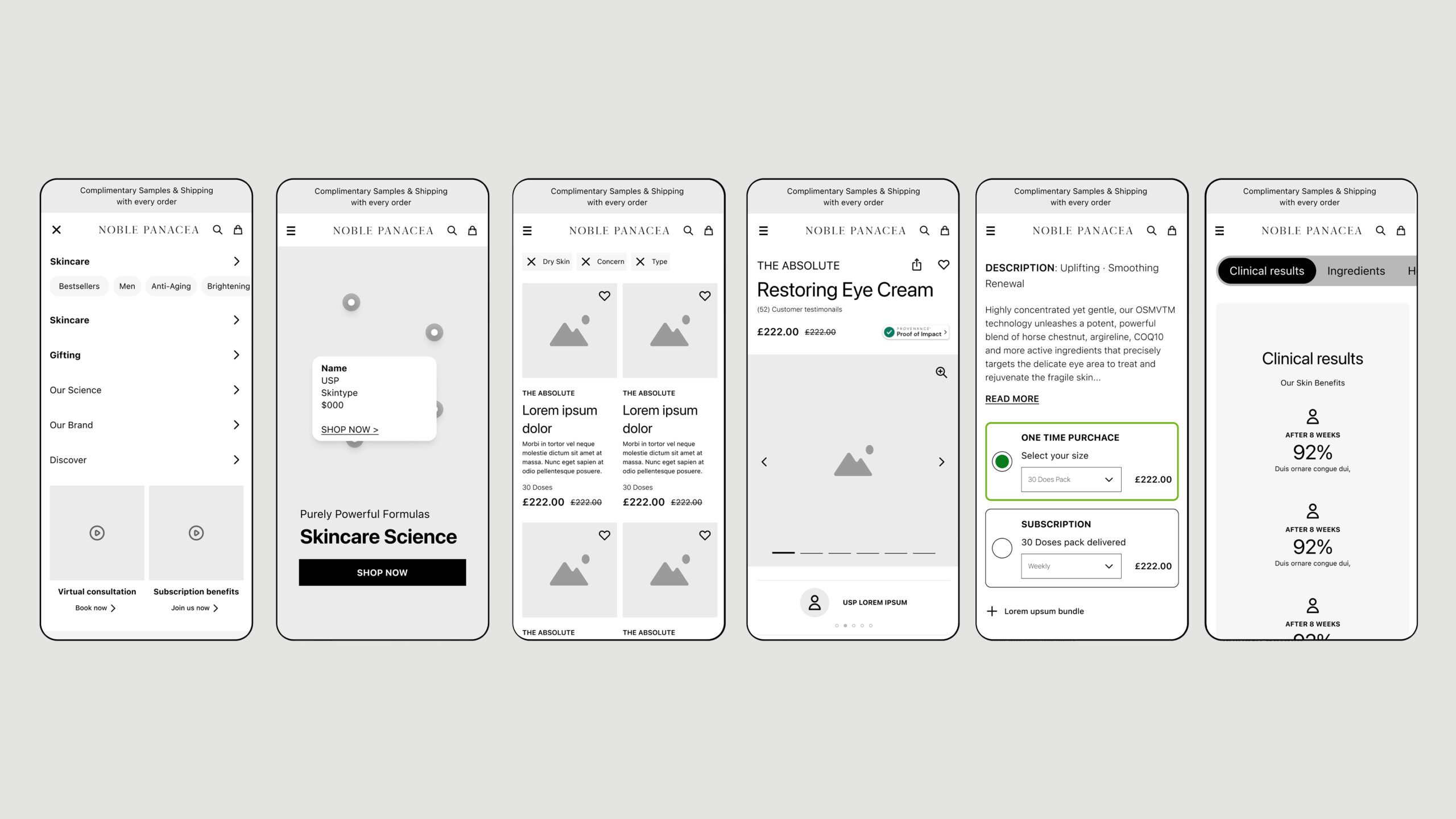
As the lead UI designer for this project, I could build a team to collaborate with me to deliver an effective user interface. Working with tight deadlines, I emphasised the importance of an efficient workflow. For the fitting booking journey, we simplified the process by allowing users to quickly select a store and view available time slots without advancing to the next step prematurely. For the checkout journey, we reduced the process to three key decisions: Bag, Delivery, and Payment, creating a single-page checkout that facilitated a smooth transition from start to finish.
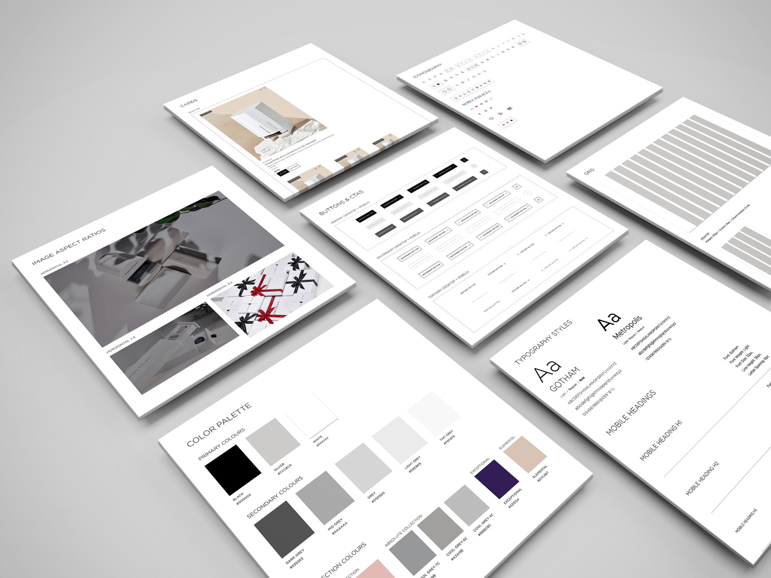
The UI design drew inspiration from the Nike website, featuring a predominantly white colour scheme accented with vibrant colours for key call-to-action buttons. Accessibility was a priority, and we worked closely with an accessibility agency to ensure our designs were inclusive and effective.
Conclusion
🚀 Results
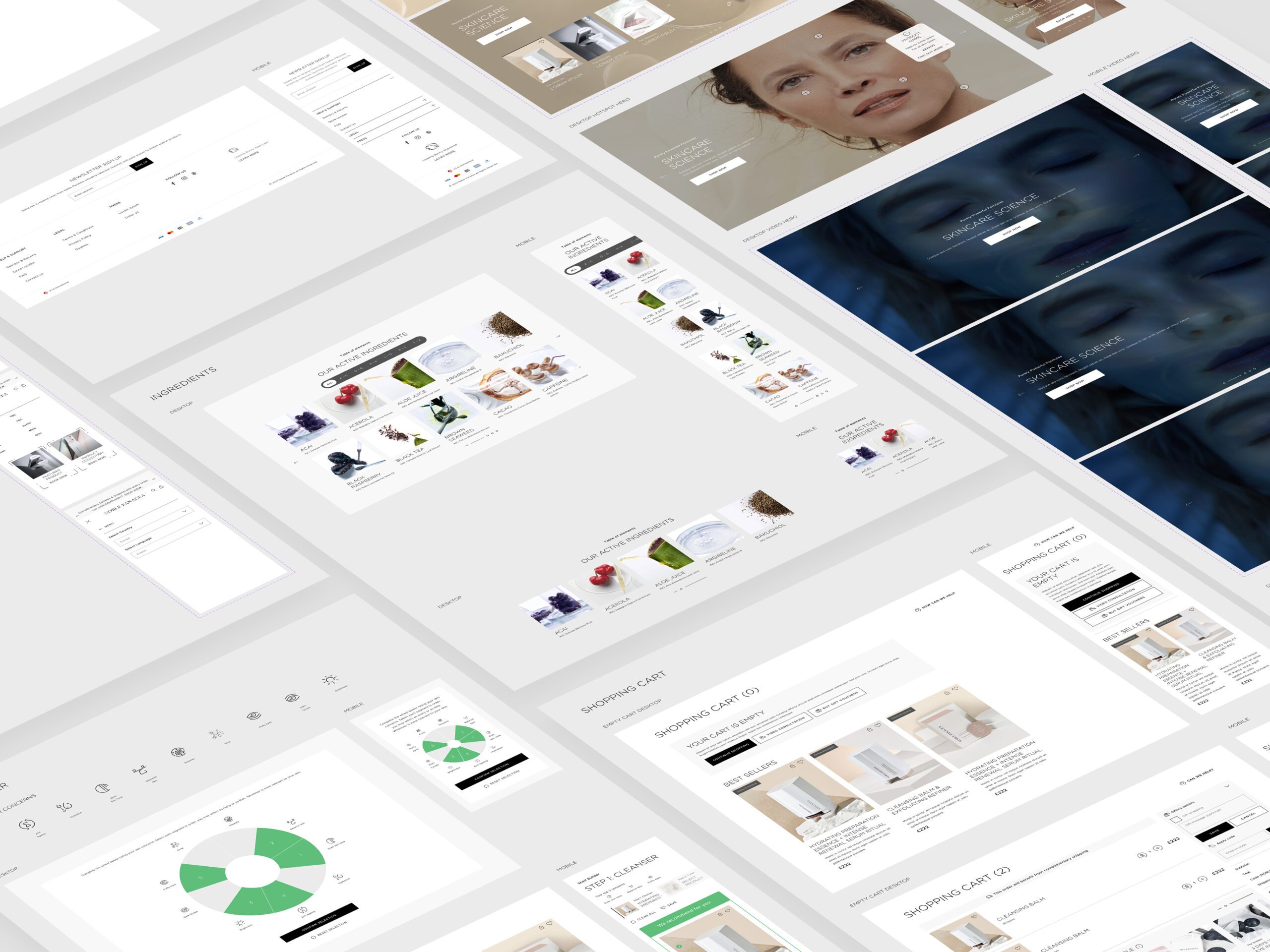
We developed over 200 components, each with various adaptations and functionalities, ensuring versatility while maintaining consistency across different regions. Each component was meticulously annotated to facilitate a seamless transition to development, including detailed animation requirements.
🏁 Conclusion
Through a collaborative and user-centered design approach, we successfully enhanced Clarks’ key user journeys, ultimately contributing to improved user experience and engagement on their e-commerce platform.
Contact
Arsenal & Citroën | Game
UX, UI, Design System & Motion Design
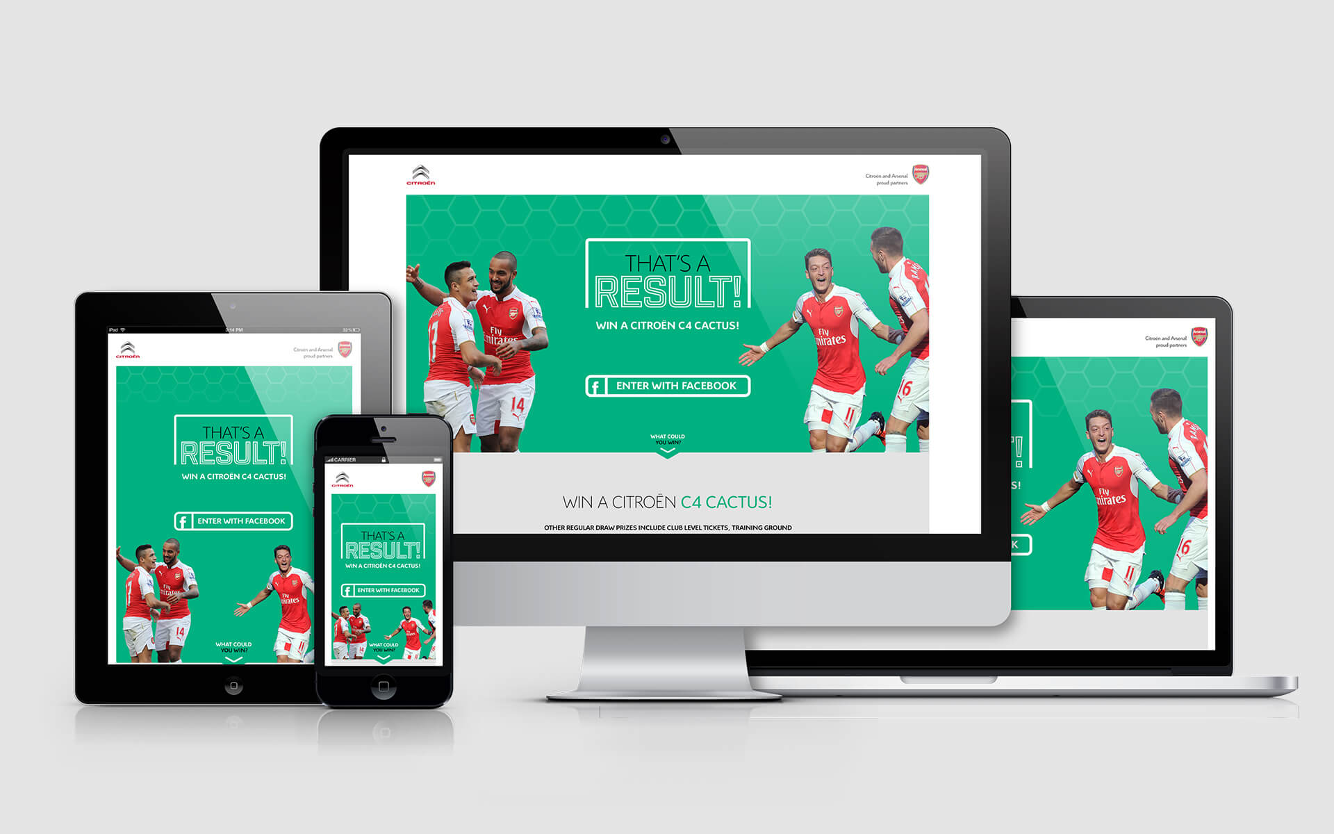
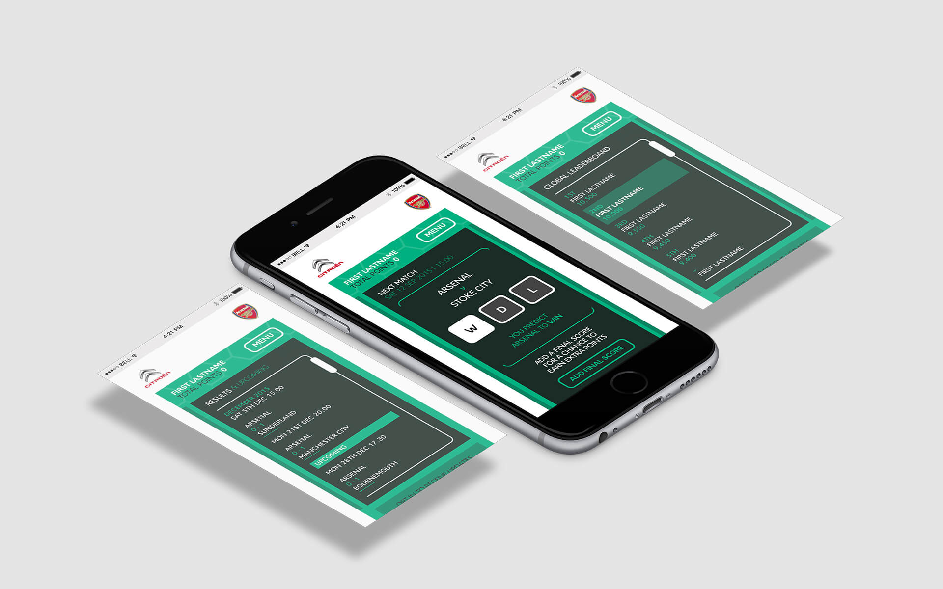
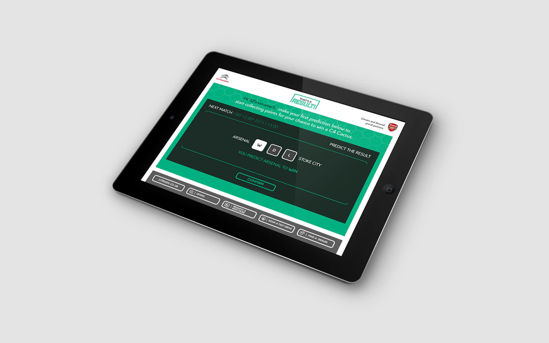
We were approached by Arsenal and Citroën to promote their partnership to Arsenal fans. Our solution was to create a predictor web app where users could compete for the most accurate predictions, with a Citroën car as the main prize. The goal was to encourage fans to return each week to predict Arsenal’s match results.
🚩 The Problem
To effectively engage Arsenal fans and promote the partnership with Citroën, we needed to create an interactive platform that would drive user engagement and foster a sense of community among participants.
Summary
🎯 The Objective
Our objective was to develop a fun and competitive predictor web app that incentivized users to return weekly and share their experiences with friends, thereby increasing participation and spreading the word about the competition.
👤 Involvement
I collaborated closely with developers to bring the app to life. Key features included rewarding users for social sharing and integrating Facebook to display friend leaderboards, which encouraged healthy competition. I also created a style guide and comprehensive handover documentation to ensure a seamless transition for the development team.
Conclusion
🚀 Results
The app was incredibly well received among fans, growing to approximately 10,000 active users in its first season. Due to the positive results, Citroën and Arsenal decided to continue the competition for the next two seasons.
🏁 Conclusion
The predictor web app successfully promoted the partnership between Arsenal and Citroën, driving user engagement and fostering community spirit among fans while delivering an enjoyable and competitive experience.
Contact