TERMINI Brand

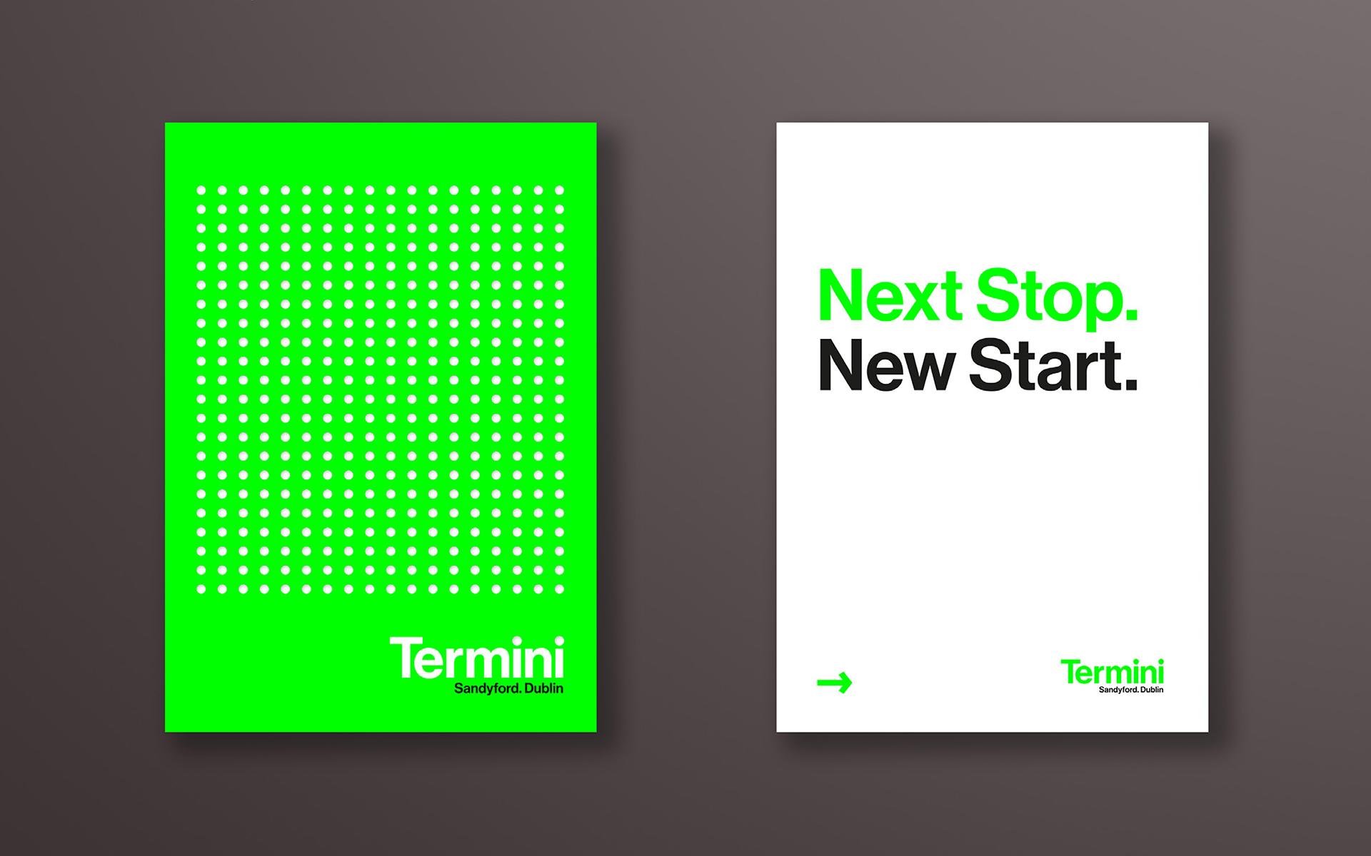
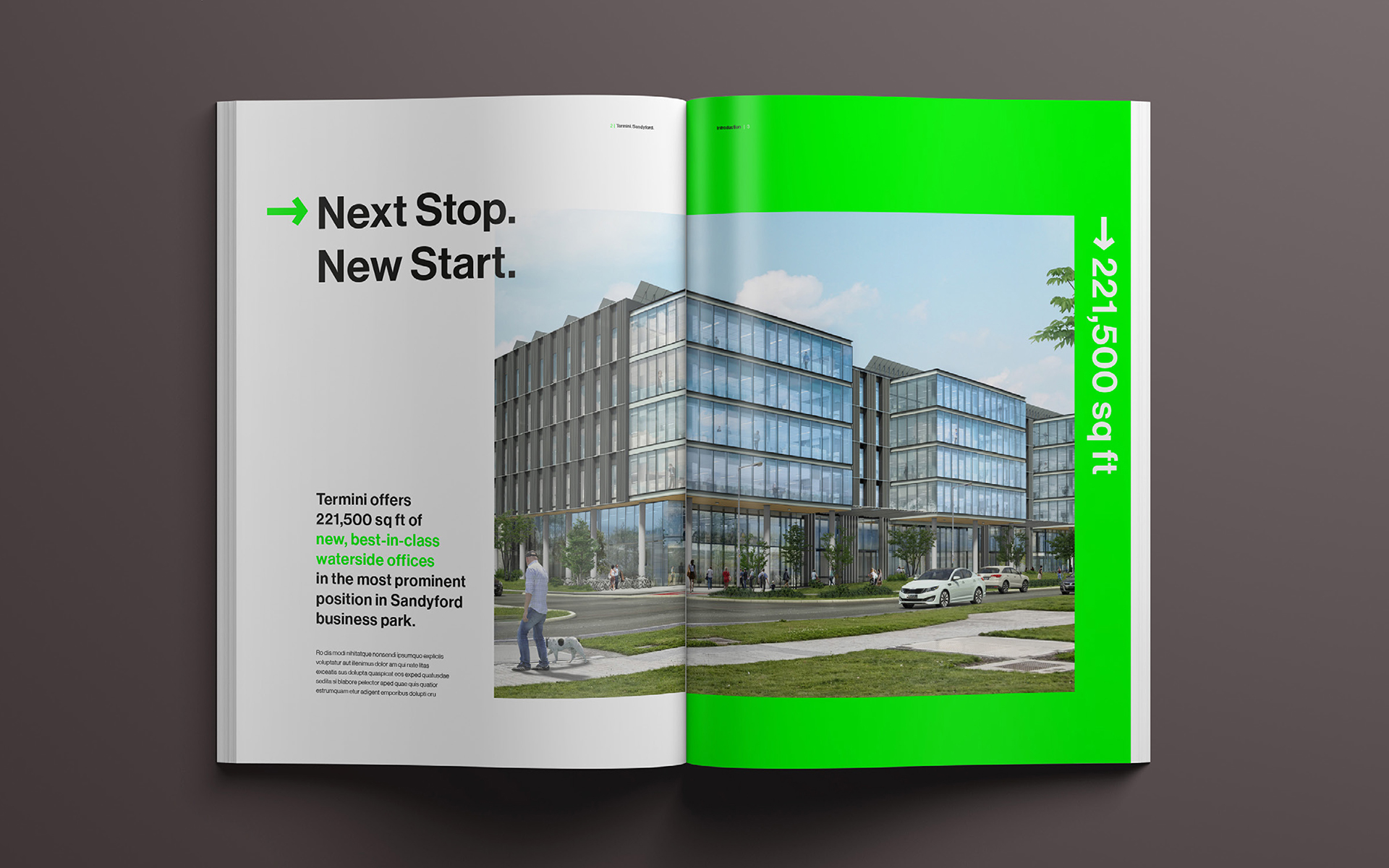
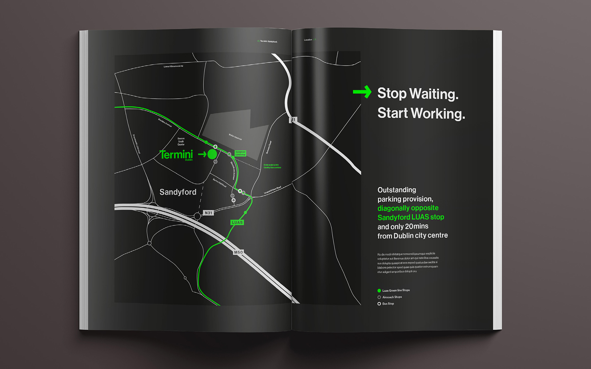
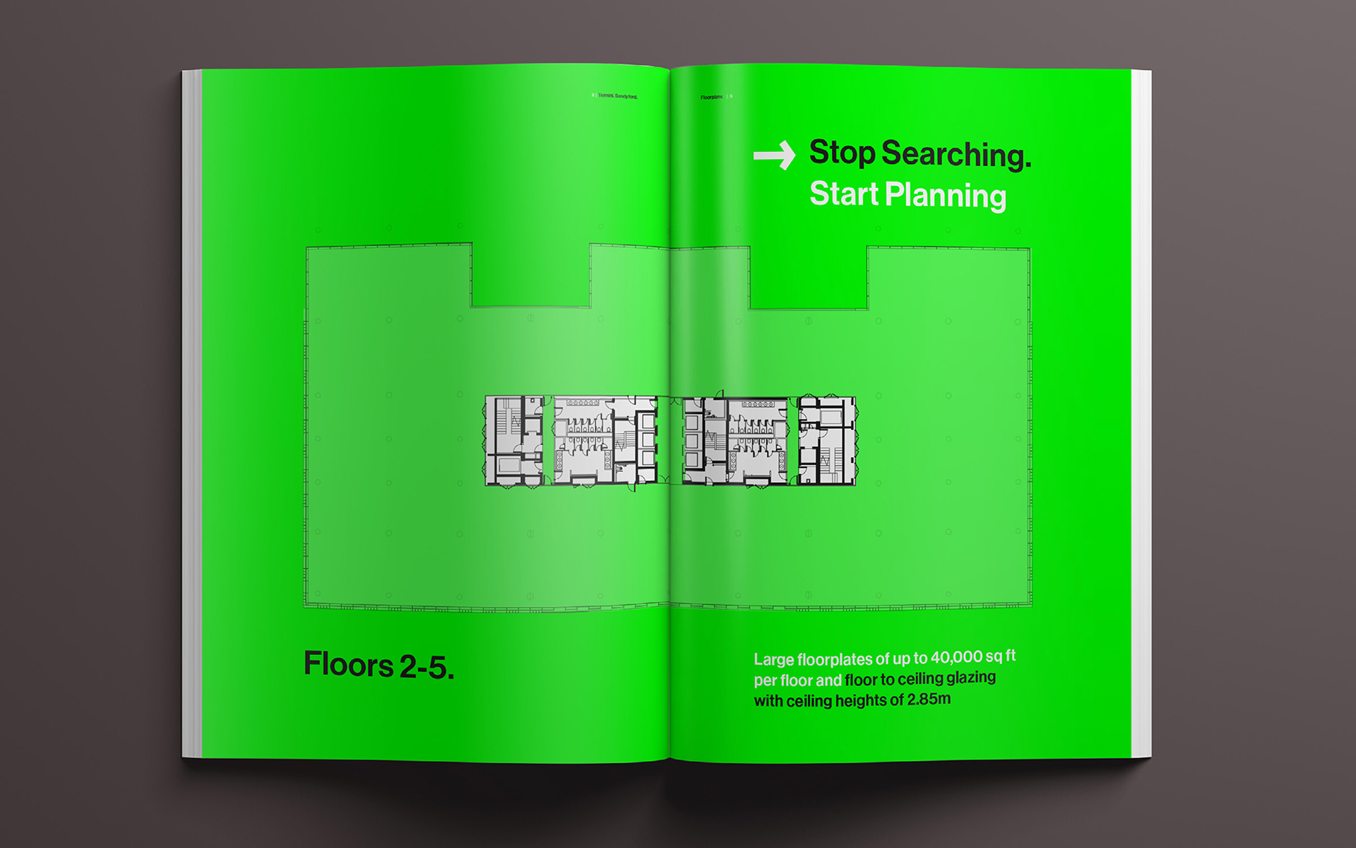
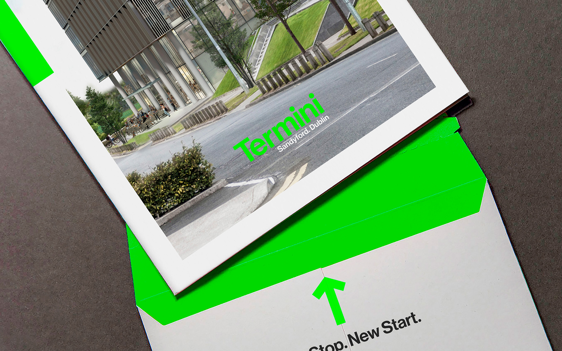
The opportunity to pitch for Termini’s brand and campaign creation for their new flagship office building in Sandyford, Dublin was a momentous invitation. At the heart of this venture was the focal point of emphasizing the site’s connectivity to the city, a critical selling feature tailored to attract the attention of the vast tech companies based in Dublin. The objective was clear: crafting a brand that not only stood out but resonated profoundly with this audience.


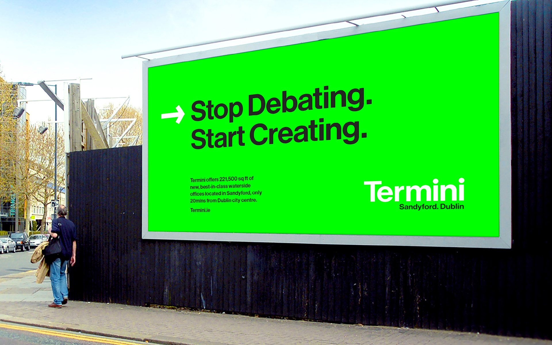
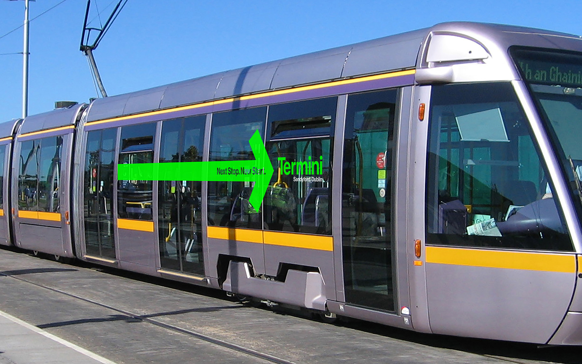
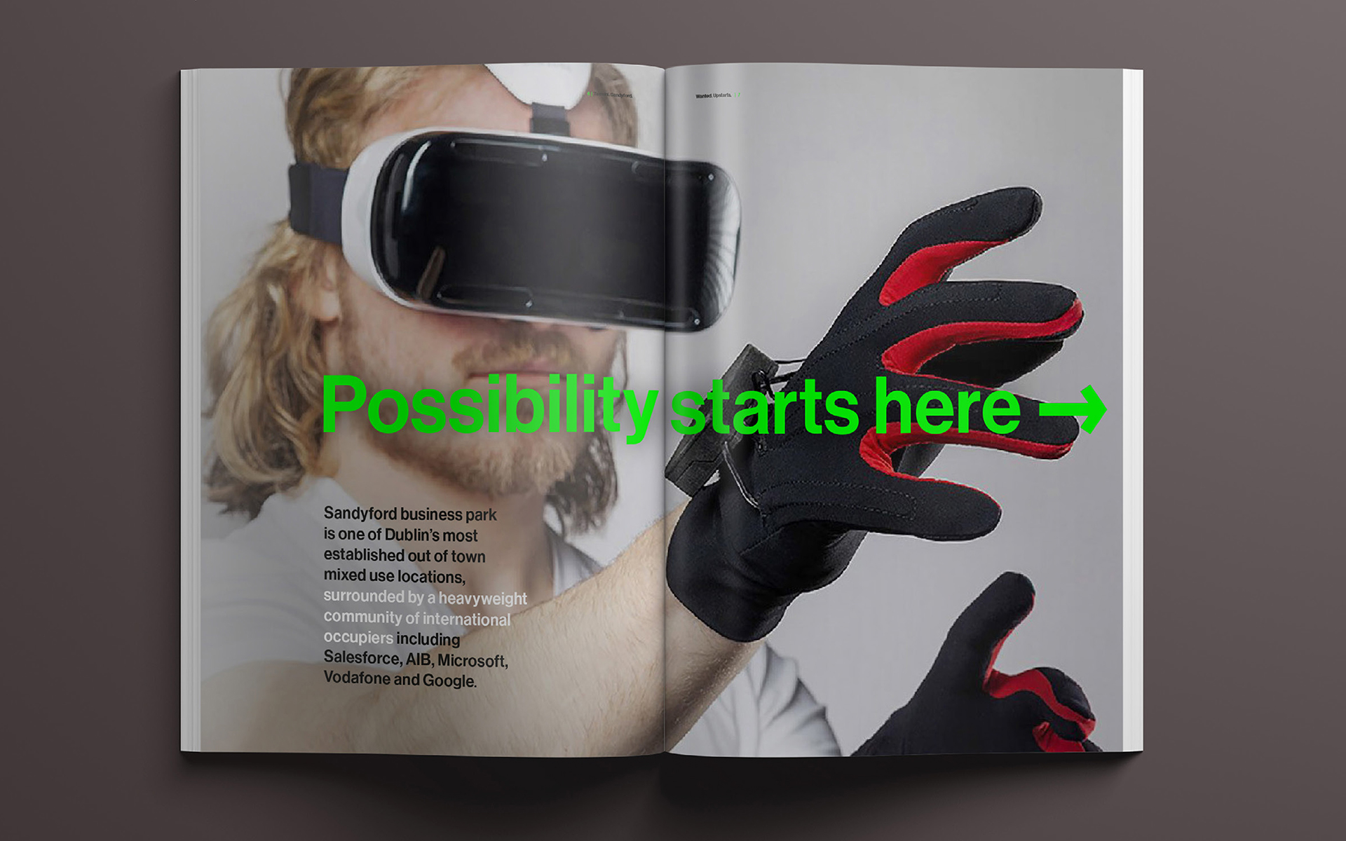
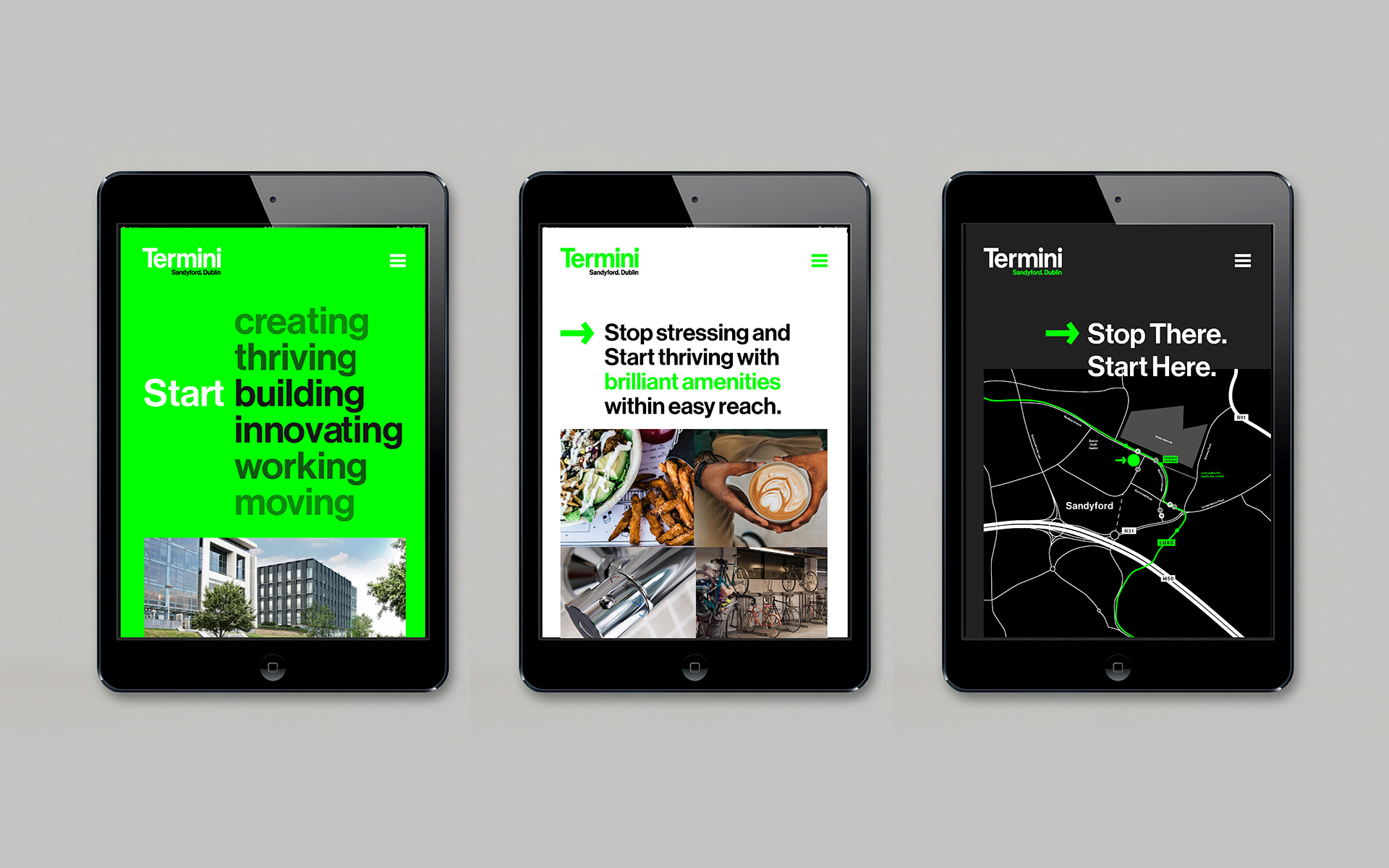
Understanding the landscape, we recognised that a substantial element in reaching and engaging these tech giants lay within the digital realm. The brand and campaign needed to harness the power of digital offerings in advertising and website presence. This entailed crafting a narrative that highlighted not only the physical connections to the city but also the digital infrastructure and capabilities that would cater to the tech-savvy audience.

Termini_Brochure_Cover
Termini_Brochure_Spread1
Termini_Brochure_Spread2
Termini_Brochure_Spread3
Termini_Brochure_Spread4

Our pitch aimed to encapsulate this essence—melding the physical proximity of Termini to Dublin’s bustling tech hub with an innovative, digitally savvy brand identity. We envisaged a campaign that seamlessly integrated both worlds, portraying Termini not just as a physical space but as a digital ecosystem primed for the needs of modern tech enterprises.

In essence, our strategy revolved around creating a brand narrative that bridged the physical and digital landscapes, amplifying Termini’s appeal to the tech-centric audience and positioning it as the epitome of connectivity, both in the physical and virtual realms.

Termini_Website

Next Project

Previous Project

111 Buckingham palace road

When tasked with pitching a campaign to promote the availability of the 4th floor at 111BPR, catering specifically to tech and media companies, our approach was centered on crafting a narrative that resonated with this discerning audience. Recognizing the need for a campaign that not only stood out but also encapsulated the essence of the space, we conceptualized the 4th floor as bold and confident.

To translate this vision into a compelling campaign, we devised a strategy that echoed the boldness of the floor’s potential. Every aspect of the campaign, from visuals to messaging, was meticulously curated to exude confidence and vibrancy. The visuals were designed to be striking and modern, capturing attention and evoking a sense of innovation. The messaging was crafted to convey a sense of assurance and opportunity, positioning the 4th floor as the ideal space for forward-thinking tech and media companies.

The campaign aimed to communicate the unique qualities of the 4th floor—its spaciousness, adaptability, and modern amenities—tailored specifically to meet the needs of companies in these industries. By aligning the campaign’s tone, visuals, and messaging with the bold and confident character of the floor, we sought to create an impactful narrative that would resonate deeply with the target audience, inviting them to envision themselves thriving in this dynamic space.

Next Project

Previous Project

Satellite Brand

After Six months at Satellite, the directors entrusted me with a monumental task—to spearhead the rebranding of Satellite Creative. The challenge was multifaceted as it coincided with a studio refurbishment and a celebratory event marking Satellite’s remarkable 21 years in business. A pivotal aspect of this rebranding effort revolved around revamping the company’s digital presence, especially through its website.

satellite stationery satellite stamp satellite launch email

For the Satellite Creative rebranding project, the brand guidelines became a compass navigating the transformation. These guidelines meticulously detailed the refreshed brand identity, encapsulating the essence of Satellite’s evolution over 21 years. They outlined the updated logo usage, defining its variations, clear spacing, and minimum sizes for optimal visibility across digital and print mediums. The guidelines delved into the color palette, introducing a vibrant yet sophisticated spectrum reflecting Satellite’s innovative spirit. They specified typography choices for consistency in communication and outlined image guidelines, emphasizing the style and tone for visuals that resonated with Satellite’s brand persona. Additionally, these guidelines incorporated a distinct voice, defining the brand’s tone for messaging across various platforms. This comprehensive manual served as a foundation for maintaining consistency, ensuring that every element reflected the revitalized Satellite Creative identity across the website, marketing collateral, and beyond.

satellite guideline document 1 satellite guideline document 2 satellite guideline document 4 satellite guideline document 3 satellite guideline document 5 satellite guideline document 6

Recognising the pivotal role of a website in today’s business landscape, we approached the rebranding with a digital-first mindset. The website served as the cornerstone of Satellite Creative’s online identity. It needed to encapsulate not only the refreshed brand essence but also narrate the journey of 21 years of excellence in the creative industry.

Our strategy entailed crafting a website that seamlessly wove together the new brand identity with a user-centric digital experience. We meticulously designed the website to reflect the refreshed Satellite Creative persona while ensuring intuitive navigation, compelling visuals, and engaging content. It became a digital canvas to showcase the evolution of Satellite’s creativity and expertise over two decades.

Next Project

Previous Project

Go move brand

When invited to pitch for the naming and rebranding of England Athletics’ under 11s athletics program, our focus was on crafting an identity that not only resonated with the young athletes but also reflected the essence of the program’s aspirations and values. Winning the pitch meant a commitment to breathing life into this brand and shaping it into a vibrant, engaging entity.

go move logo go move merchandise go move tshirt go move posters

Our approach involved diving deep into understanding the program’s objectives, audience demographics, and the essence of athletics for young participants. The goal was to create a brand that not only encapsulated the energy and enthusiasm of the athletes but also fostered a sense of inclusivity and encouragement.

With a strategic blend of creativity and purpose, we embarked on a journey to name and conceptualise a brand that would not only stand out but also inspire and motivate young athletes. The brand development process focused on visual elements, messaging, and storytelling that resonated with the aspirations and spirit of under 11s participating in athletics.

go move website go move portal

As the project evolves, our team is dedicated to bringing this brand to life—infusing it with energy, optimism, and a sense of camaraderie. Through collaborative efforts with England Athletics, we aim to create an identity that not only represents the program but also becomes a source of pride and inspiration for young athletes embarking on their athletic journeys.

Next Project

Previous Project

Ale and coffee house brand

When approached by Casual Dining Group to assist in developing a brand for their pitch targeting two sites at Heathrow Airport, the task was to craft a compelling identity for a pub brand, marking their inaugural entry into this specific sector. Our collaboration involved a strategic approach to not just create a brand but to tailor it explicitly for the tender process.

alecoffeehouse logo
alecoffeehouse signage alecoffeehouse icon alecoffeehouse glassalecoffeehouse cup

Understanding the significance of creating a standout proposition in the competitive airport environment, our team delved into conceptualizing a brand that resonated with the airport’s dynamic ambiance while retaining the inviting essence of a pub setting. We meticulously crafted a brand identity that merged the warmth and familiarity of a pub experience with the fast-paced, travel-centric atmosphere of Heathrow Airport.

Every element, from the brand’s name and logo to its visual identity and messaging, was thoughtfully designed to capture the essence of conviviality and comfort, curated specifically for the discerning audience frequenting the airport. The brand concept was centered around providing travelers with a welcoming space to unwind, fostering a sense of community amidst the bustling airport environment.

The brand development process catered precisely to the tender requirements, aligning with the vision that Casual Dining Group aimed to present. Our collaborative effort resulted in a brand identity that resonated deeply with the airport’s clientele, ultimately contributing to the success of Casual Dining Group’s pitch, securing them the coveted sites at Heathrow Airport.

alecoffeehouse advert alecoffeehouse billboard

Next Project

Previous Project

Citroën C1

The Citroën C1 printed and digital brochure was our introduction to revamping the range. I played a significant role from the project’s start, guiding decisions on content segmentation, print artwork, and personally crafting the chosen illustrative direction, drawing each element myself.

Citroen C1 brochure spread

We were also tasked with translating the print design’s visual richness into a dynamic digital brochure. This involved integrating inline videos to showcase the car in action, augmenting its features and performance. Interactive elements were strategically placed, allowing users to engage with sliders for customisation and explore 360-degree views for a comprehensive understanding.

The fusion of print design principles with digital innovation was pivotal. It ensured that the digital brochure retained the essence of the print version while leveraging technology to create an immersive and informative experience.

Our journey with the Citroën C1 exemplified the seamless integration of print and digital design. This harmonious blend elevated storytelling, allowing audiences to not only learn about but experience the vehicle, fostering a deeper connection and understanding.

Citroen C1 brochure interactive

Next Project

Previous Project

C–RANGE brochures

After successfully crafting the C1 brochure, our next step was to extend the newly established brochure style to encompass all vehicles within the range. This involved a meticulous process of creating illustrations that highlighted each product’s unique personality and features. However, the challenge expanded beyond mere visual translation; we had to ensure these brochures seamlessly translated to an interactive format.

Citroen brochures c4 cactusCitroen brochures c4 cactus Citroen brochures c4 cactus

Embracing the digital sphere, our focus extended beyond static representations. We recognized the significance of interactivity in engaging modern audiences. Thus, while maintaining the essence of each vehicle’s personality through illustrations, we strategically integrated interactive elements into the brochure design. This required a careful balance between visual appeal and functional interactivity

Citroen brochures c4 Citroen brochures c4 Citroen brochures c4
Citroen brochures c3 Citroen brochures c3 Citroen brochures c3

Our approach involved envisioning how these brochures would function in an interactive environment. We deliberated on user experience, ensuring that the digital format not only retained the charm of the print version but also offered engaging elements such as clickable features, animated segments, and intuitive navigation. This ensured that the essence of the product’s personality shone through while adapting seamlessly to the interactive medium, creating an immersive and captivating experience for potential customers exploring the vehicle range.

Citroen brochures c3 picasso Citroen brochures c3 picasso Citroen brochures c3 picasso
Citroen brochures berlingo multispace Citroen brochures berlingo multispace Citroen brochures berlingo multispace

Next Project