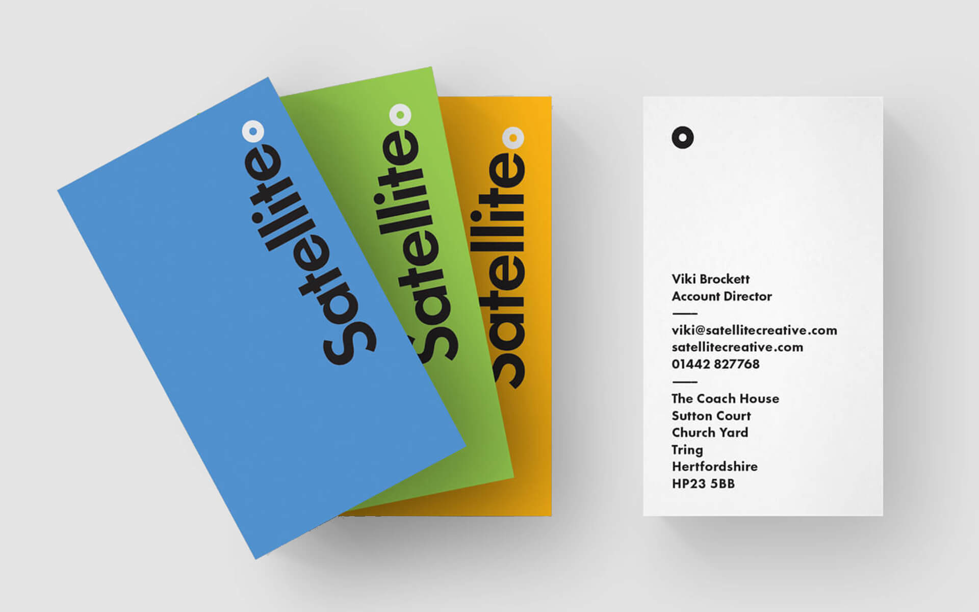
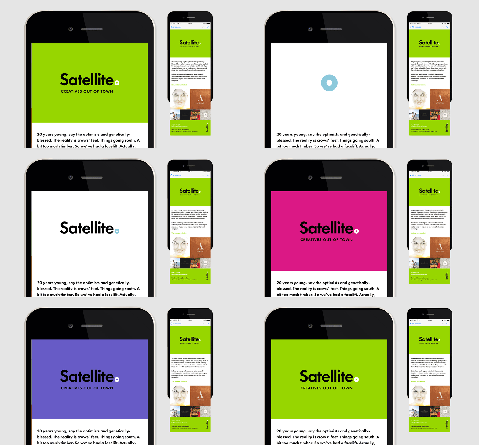
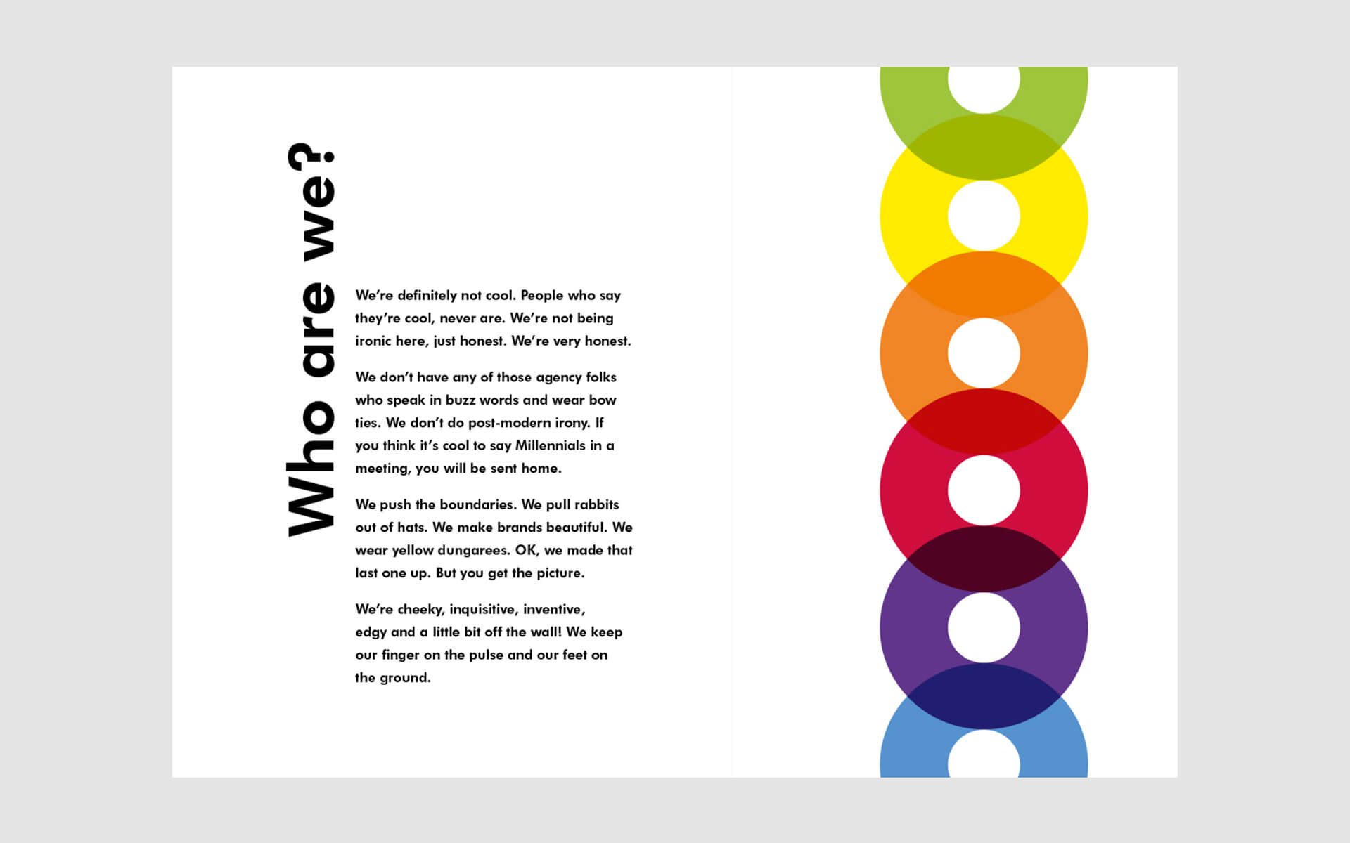
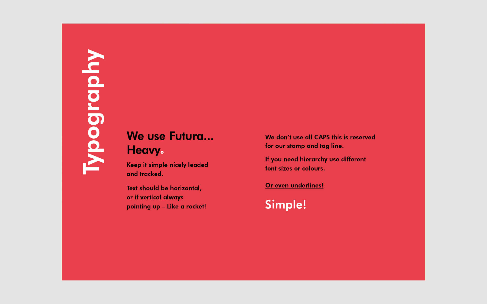
For the Satellite Creative rebranding project, the brand guidelines became a compass navigating the transformation. These guidelines meticulously detailed the refreshed brand identity, encapsulating the essence of Satellite’s evolution over 21 years. They outlined the updated logo usage, defining its variations, clear spacing, and minimum sizes for optimal visibility across digital and print mediums. The guidelines delved into the color palette, introducing a vibrant yet sophisticated spectrum reflecting Satellite’s innovative spirit. They specified typography choices for consistency in communication and outlined image guidelines, emphasizing the style and tone for visuals that resonated with Satellite’s brand persona. Additionally, these guidelines incorporated a distinct voice, defining the brand’s tone for messaging across various platforms. This comprehensive manual served as a foundation for maintaining consistency, ensuring that every element reflected the revitalized Satellite Creative identity across the website, marketing collateral, and beyond.
