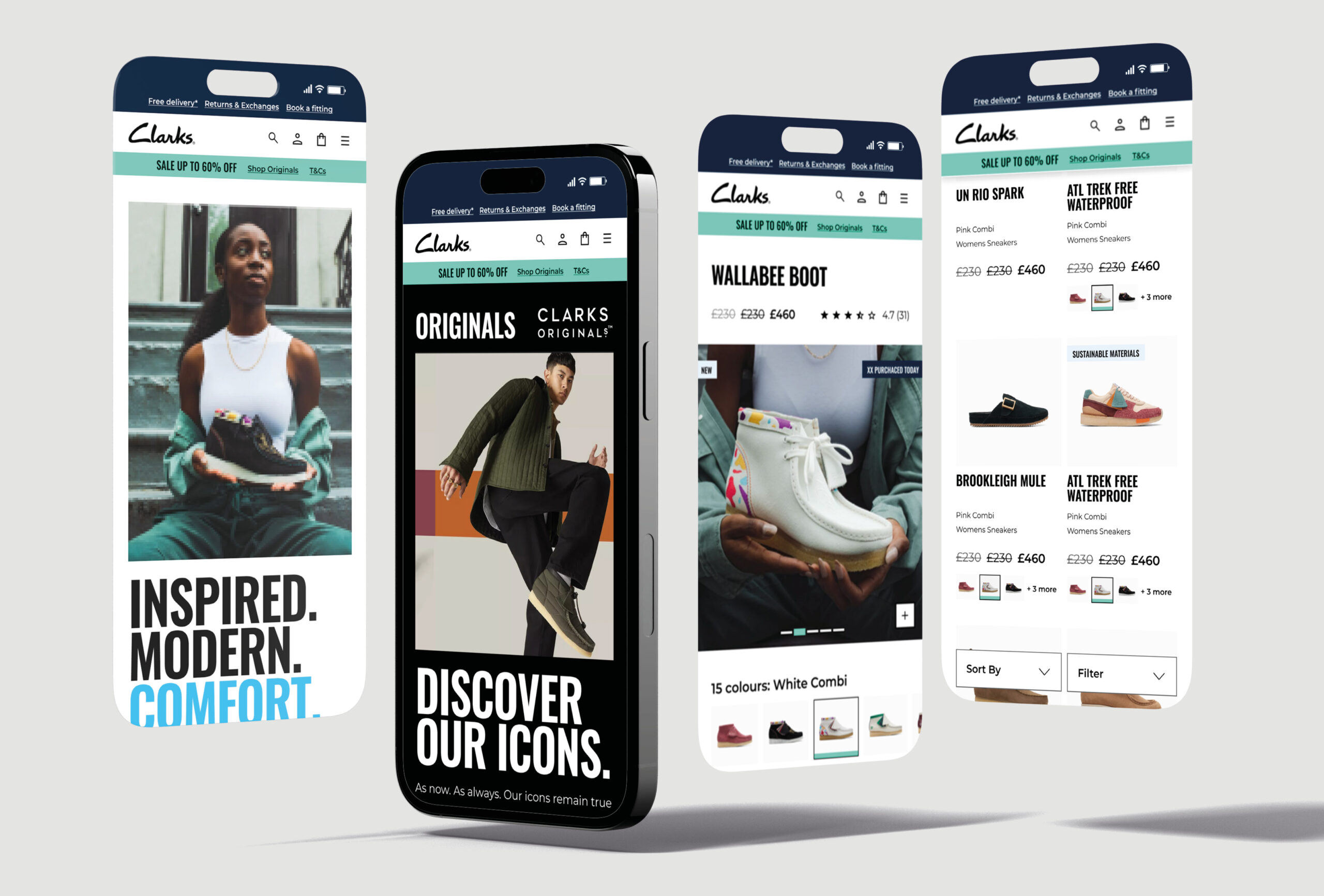
Clarks Global website

UX, UI, DESIGN SYSTEM & ANIMATION

Clarks is a global, multi-billion e-commerce company and retailer, originating in Britain and specialising in the manufacture of shoes since 1825. I was asked to work with one other designer at Like Digital to provide UX strategies and UI solutions with a focus on some key user journeys defined by the business.
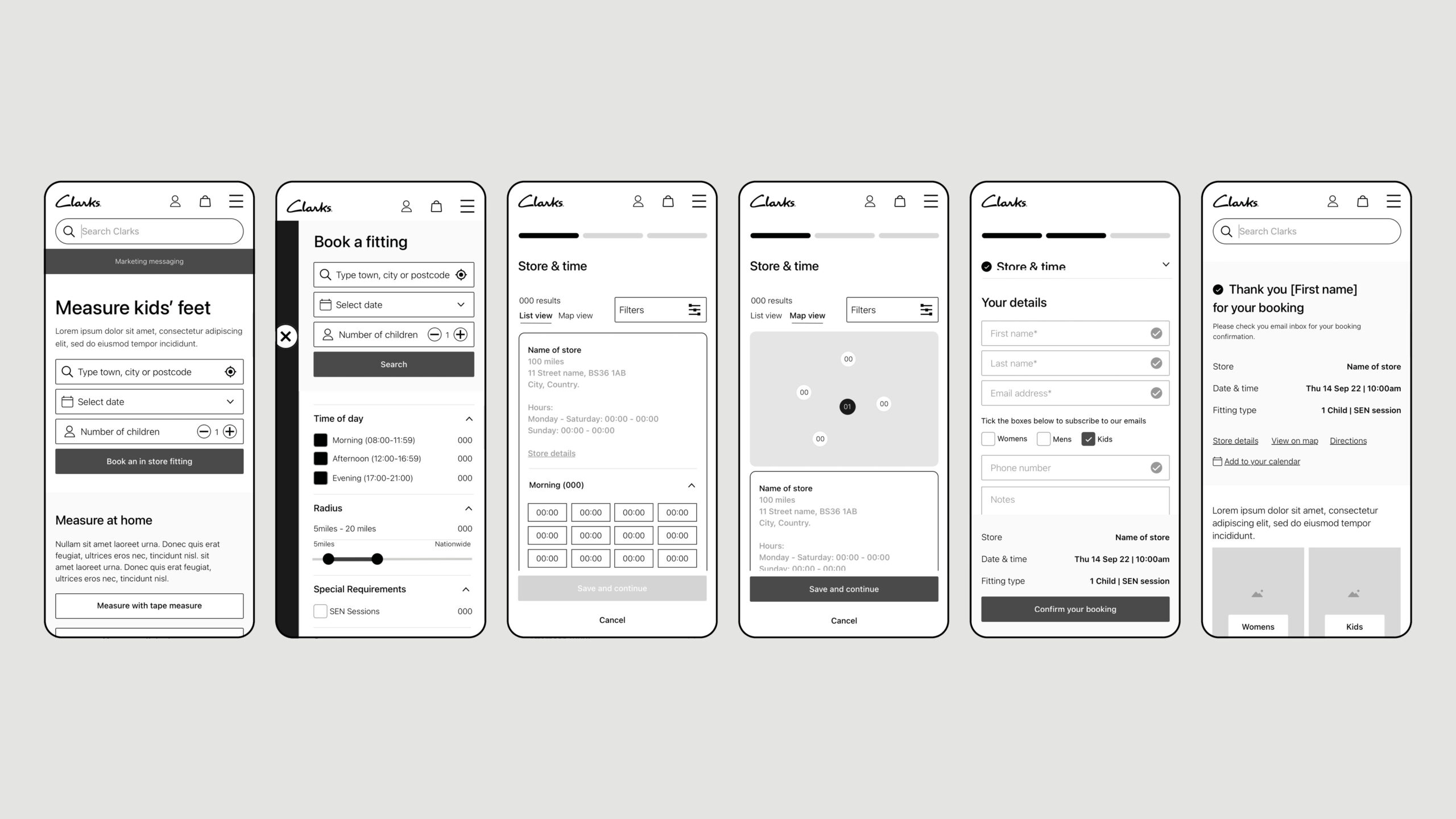
 

KEY UX JOURNEYS –  BOOKING AN IN-STORE FITTING
Another key journey for Clarks was the booking of a fitting, this is one of Clarksí USPS. We took insights from the previous user journey and refined and simplified the decisions we need the user to make. Key of which is selecting a store and time slot. We solved this by allowing users to quickly select a store and see available time slots without moving onto the next step of the journey.

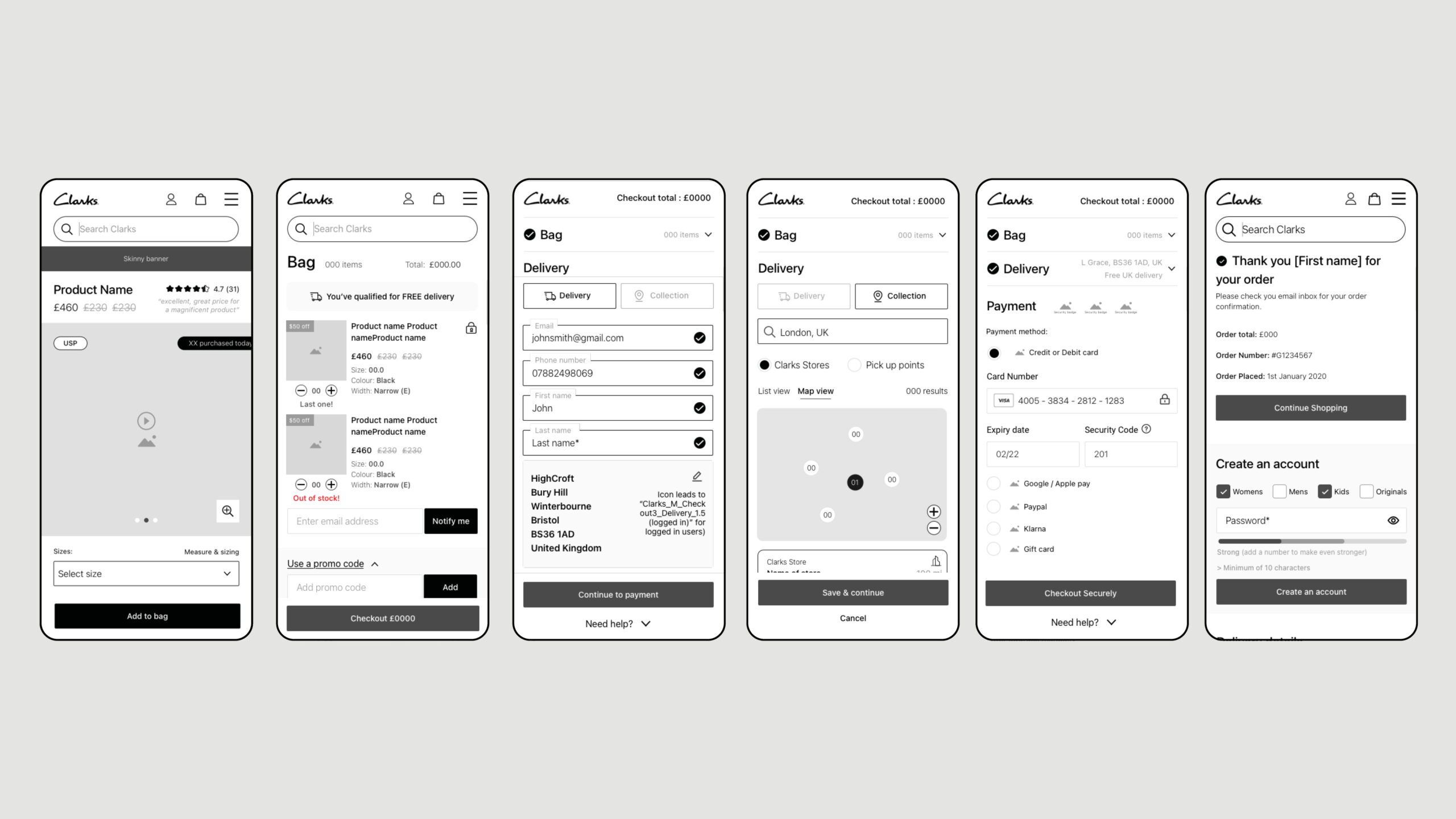
KEY UX JOURNEYS – CHECKOUT
One of the key journeys Clarks were seeing a higher than average of drop off from was checkout. This is a vital journey and itís simplicity would be key to the websites success. We simplified the journey to 3 decision, Bag, Delivery and Payment. This was designed as a single page checkout designed to get the user from start to finish as quickly and easily as possible.

UI DESIGN`
I was asked to lead the UI phase of this project selecting a team to work along side me. Deadlines for delivery were incredibly tight so an efficient work flow was key. The user interface was inspired by the Nike website and was predominantly white with hints of colour for key CTAs. Accessibility plays a key part in the UI of this site so we worked closely with an accessibility agency to advise and review out designs.

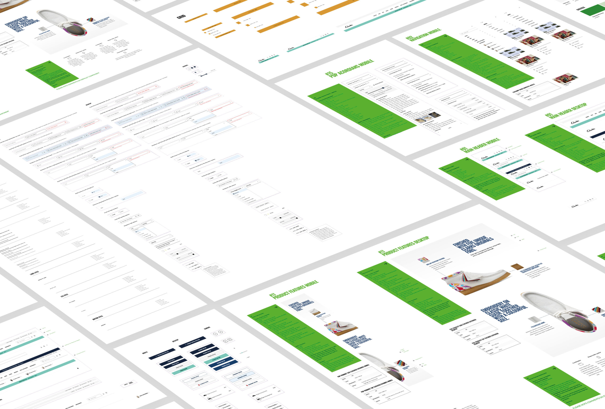
DESIGN SYSTEM
We designed over 200 components with different variations and capabilities. This allows the website to not only be versatile but also remain consistent throughout and across each region. Every component was annotated to allow a seamless transition to development along with any animation requirements.

Previous Project