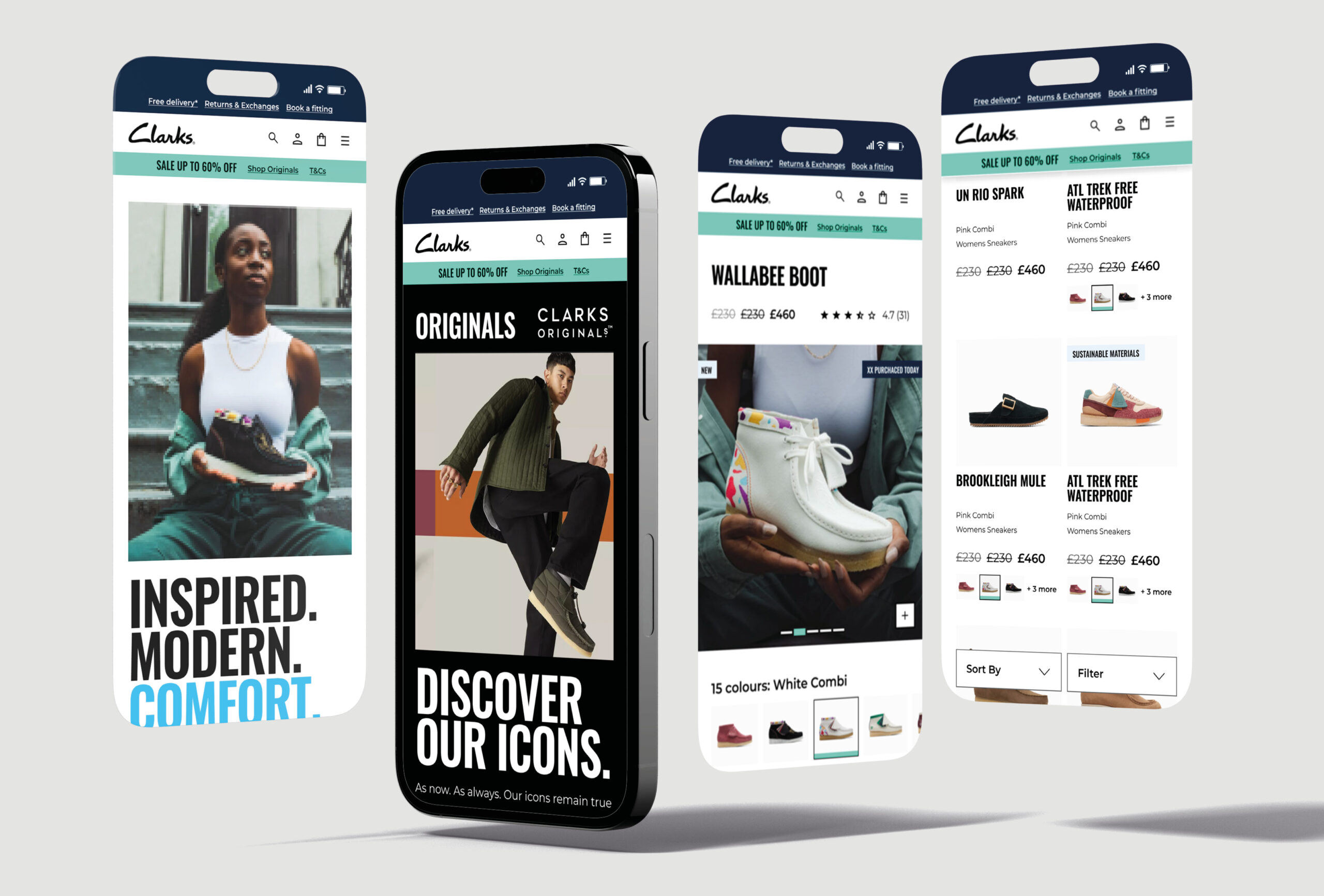
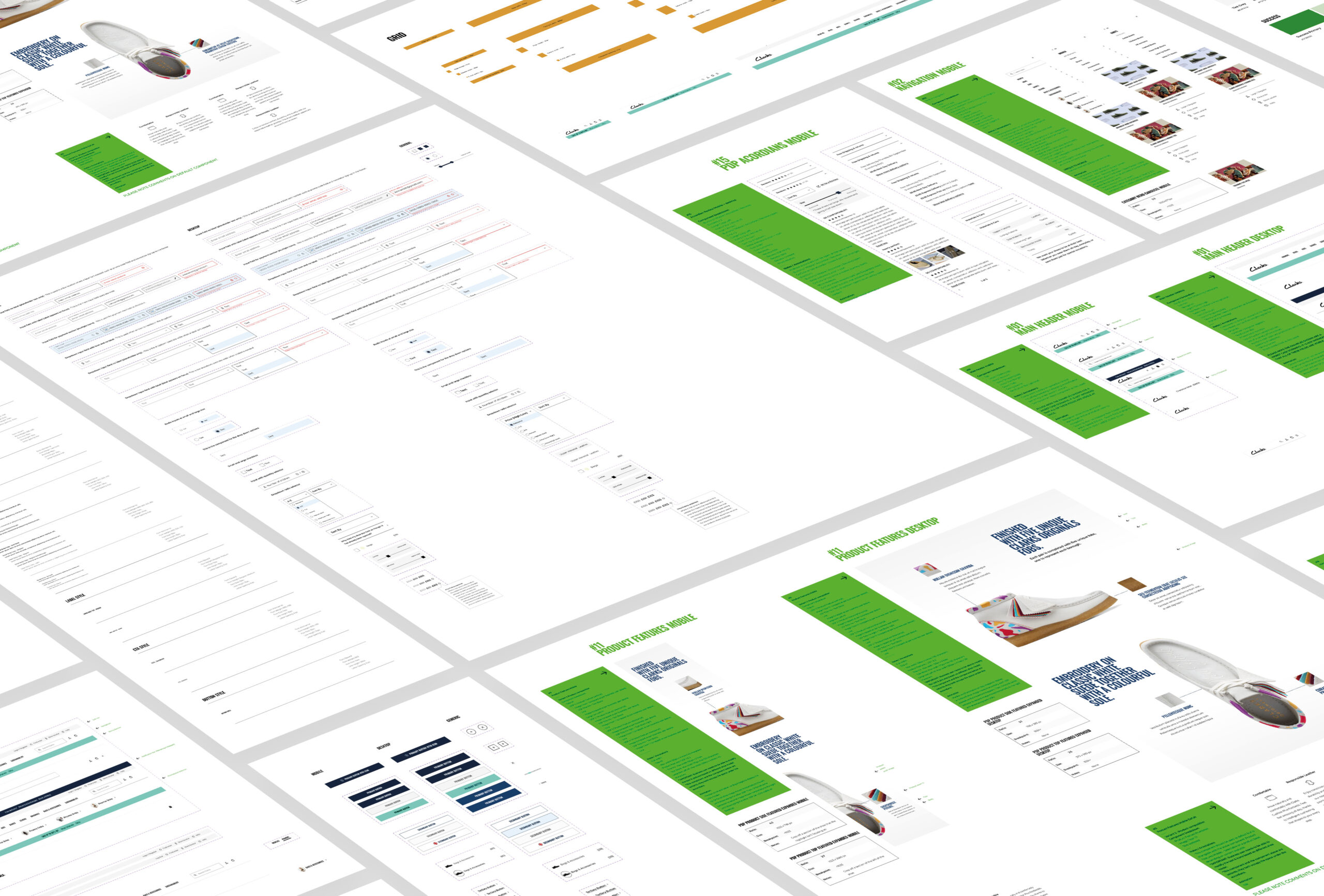
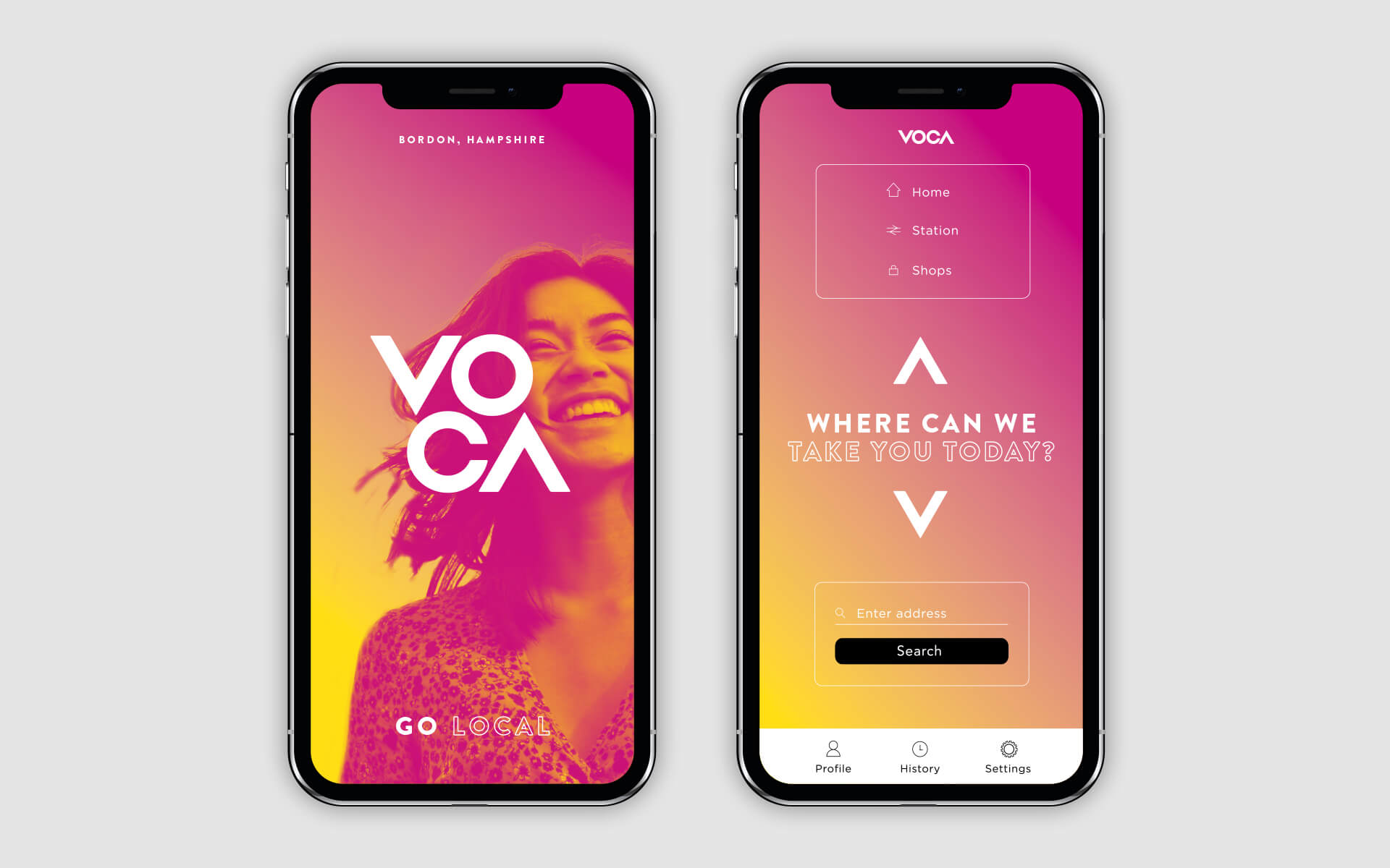
UX, UI, DESIGN SYSTEM & ANIMATION
Clarks is a global, multi-billion e-commerce company and retailer, originating in Britain and specialising in the manufacture of shoes since 1825. I was asked to work with one other designer at Like Digital to provide UX strategies and UI solutions with a focus on some key user journeys defined by the business.
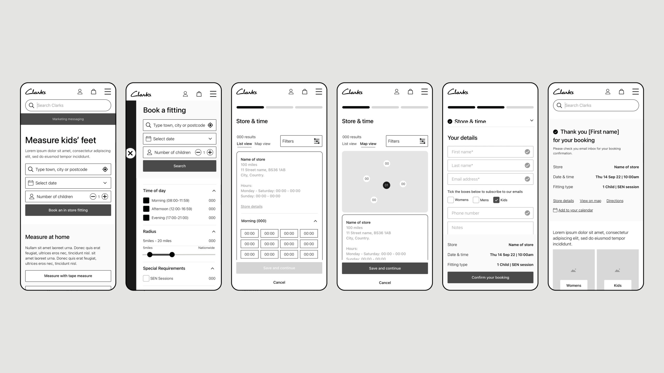
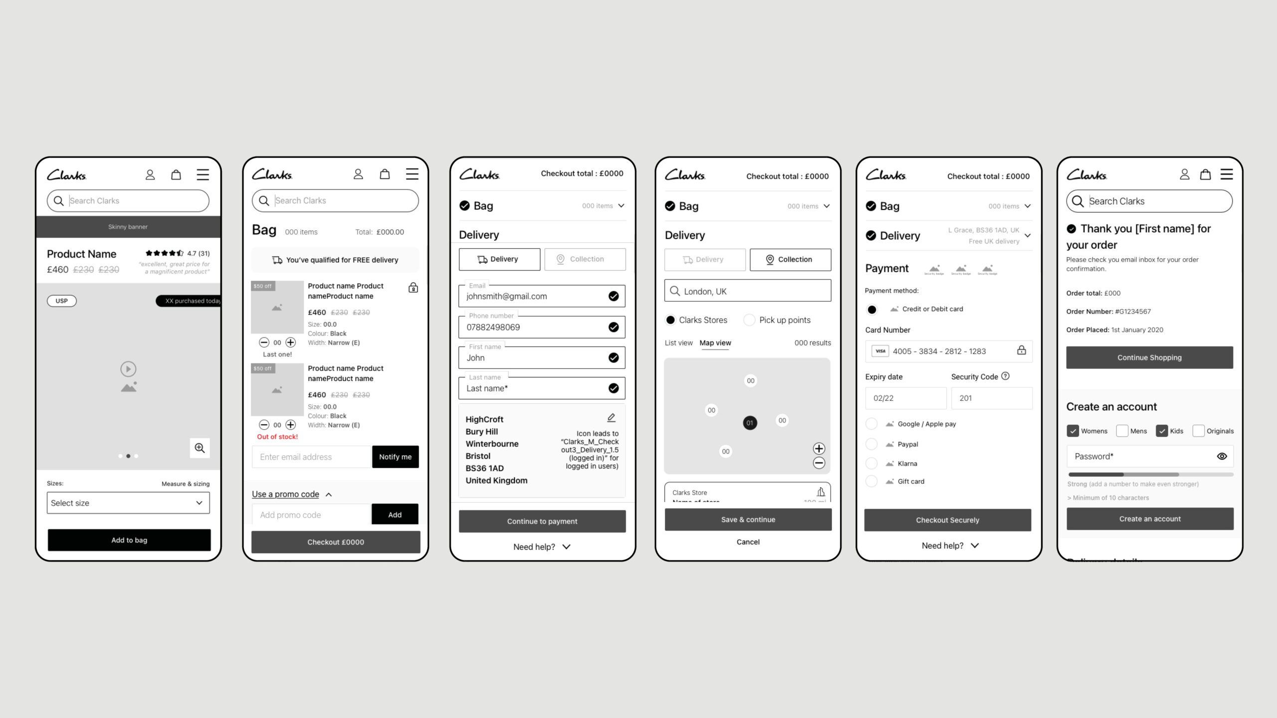
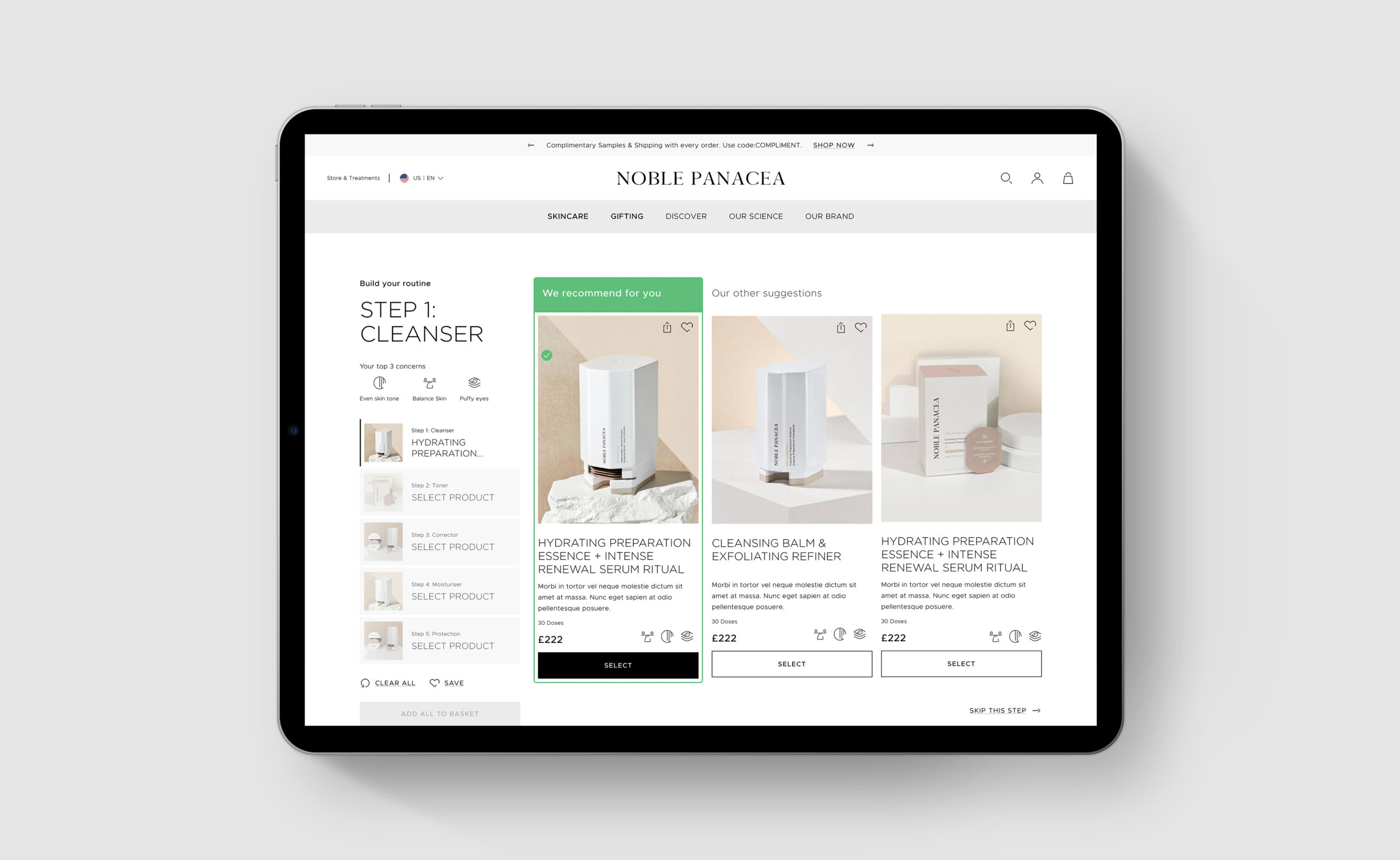
KEY UX JOURNEYS – BOOKING AN IN-STORE FITTING
Another key journey for Clarks was the booking of a fitting, this is one of Clarksí USPS. We took insights from the previous user journey and refined and simplified the decisions we need the user to make. Key of which is selecting a store and time slot. We solved this by allowing users to quickly select a store and see available time slots without moving onto the next step of the journey.